Propensity score method: a non-parametric technique to reduce model dependence
Introduction
In clinical researches, an important task is to estimate the causal effect of an intervention on patient-important outcomes. Causal effect can be estimated using randomized controlled trial (RCT), in which both measured and unmeasured confounding factors are balanced in both treatment and control arms. While RCT is the gold standard to assess biological efficacy of an intervention, this design is sometimes not feasible due to ethical problem and/or lack of funding (1,2). In contrast, observational studies utilizing electronic medical records are cheap and easy to access (3). Furthermore, such observational studies are conducted in real world setting and can evaluate the clinical effectiveness of an intervention. There are situations in which an intervention shows biological efficacy in RCTs, but loses its clinical effectiveness in real world setting (4). Therefore, observational studies are widely used in clinical researches in spite of their numerous inherent shortcomings. The major limitation in using observation data to estimate causal effect is the confounding factors. Traditionally, these confounding factors can be adjusted with multivariate models (5-7). However, the distribution of confounding factors may be different between intervention and control groups, and model extrapolation can be wrong (8). Furthermore, regression models have specific assumptions and specifications such as linearity, normal distribution of error term and interaction (9). Frequently, these assumptions are arbitrarily made without empirical evidence. As a result, the causal effect estimated with regression models can vary substantially depending on different specifications and assumptions of the model. This is termed model dependence in the literature (8).
Propensity score method is employed to solve the problem of imbalance in baseline characteristics between intervention and control groups. Initially, the treatment status is used as dependent variable, and regressed on pretreatment covariates with logistic regression model. Propensity score, or the probability of assigning to the treatment, can be calculated with the fitted model. Then propensity score is used for subsequent causal effect inference. Propensity score is considered as nonparametric although parametric regression model is used to estimate propensity score. Other advanced models such as random forest, naïve Bayes and repeated partitioning can be used to estimate propensity score. Propensity matching or stratification is nonparametric. The two-step procedure in causal effect estimation is considered doubly robust by Ho and coworkers in that if either propensity score matching or parametric model is correct, the causal estimates can be consistent (8). The article will show how to perform propensity score analysis (PSA) with R packages (10). Readers may consult other references for detailed mathematical descriptions of PSA (11-13).
Working example
To illustrate PSA using R, I create a dataset including continuous (x.cont) and categorical (x.cat) pretreatment covariates. The functional form between treatment (treat) and covariates includes high order terms and interaction, reflecting the complexity in real world setting. Furthermore, the outcome (y) is regressed on treatment and pretreatment covariates. A total of 1,000 subjects are created.
PSA with MatchIt package
The MatchIt package contains useful functions to perform PSA. The first step is to install the package and load it to the workspace. The package rgenoud should also be installed if you want to perform genetic matching.
The main function matchit() performs PSA. The first argument passes a formula to the function, which defines how the pretreatment covariates influence the treatment assignment. In research practice, investigators usually specify a main effect model without interactions and high-order terms. The method argument passes string values including “nearest” (nearest neighbor matching), “exact” (exact matching), “full” (full matching), “genetic” (genetic matching), “optimal” (optimal matching), and “subclass” (subclassification). The default option is the nearest neighbor matching. The discard argument specifies whether to discard observations fall outside of the common support, not allowing them to be used in matching process. The “both” value dictates to discard observations that are outside of the common support in both treatment and control groups.
Balance can be checked with summary() function.
The output of generic function summary() is important in assessing balance after PSA. The “Means Treated” and “Means Control” columns show the weighted means for the treated and control groups. “SD Control” is the standard deviation for the control group. “Mean Diff” is the mean difference between control and treated groups. The last three columns show the median, mean and maximum distance between empirical quantile functions of the treated and control groups. A value greater than 0 indicates deviations between the two groups in some part of quantile distributions. The last table shows the number of observations that have been matched or discarded. These statistics can be visualized with generic plot() function.
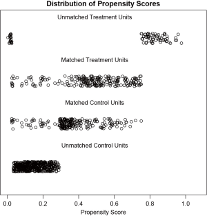
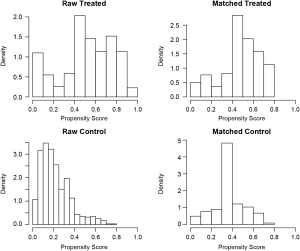
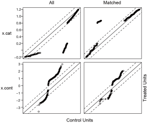
Figure 1 is a jittered plot showing matched and unmatched observations, as well as their distribution on propensity score values. It appears that many observations with high PS in the treated group and many with low PS in the control group are excluded. Figure 2 are histograms showing the density of PS distribution in the treated and control groups before and after matching. Before matching (raw) treated groups have significantly higher PS than the control group. After matching the density distributions of the two groups become somewhat similar. Quantile-quantile (QQ) plot compares the probability distributions of a given covariate for the treated and control groups by plotting their quantiles against each other. The points on the QQ plot will lie on the y=x line if two distributions are similar. The results show that although the points are not located on the y=x line exactly after matching, it is much improved as compared to law data (Figure 3).
Checking balance with PSAgraphics package
The PSAgraphics package provides several functions for evaluating balance of covariates in each stratum (14). So in this section, I first create strata containing treated and control groups, trying to balance covariates between both groups.
In the above example, subclassification is used to form strata in which the distribution of covariates in treated and control groups are as similar as possible.
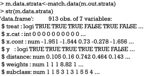
Matched dataset can be stored to an object using match.data() function. In addition to original variables, three variables distance, weights and subclass were added. The subclass variable denoted the stratum to which an observation belongs. Next I will install the PSAgraphics package and proceed to examine covariate balance within each stratum.
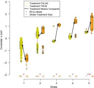
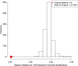
The box.psa() function depicts a pair of side-by-side boxplots for each stratum to compare the difference between treated and control groups on a given covariate. If balance=TRUE, it calls bal.ms.psa() function to draw a histogram of a permutation distribution and reference statistic to assess balance across strata (Figure 4). Balance statistic is defined as:

Where  is the balance statistic, the subscript α is to denote a particular subclassification scheme, K is the total number of stratum, and
  and
and  are mean values of the control and treated group within stratum k. Note that smaller value of the balance statistic indicates a better balance on that given covariate. The histogram is drawn by randomly assigning observations to strata and in our example it generated 1,000 balance statistics. By comparing our original balance () to the mass of permutation distribution, we conclude that the subclassification method has balanced the covariate x.cont as much as possible (e.g., it is the smallest among all randomly generated balance statistics).
By pressing enter as indicated by output message, there pops up a series of boxplots comparing the difference on x.cont between treated and control groups within each stratum. Means of the two groups are connected by a heavy solid line, with the slope of the line indicate size of the difference. Figure 5 shows that the balance of x.cont within each stratum is unsatisfactory and the distribution changes moderately across strata. The sizes (number of observations) of groups are printed below corresponding boxplots. The “balance=TRUE” argument adds Kologmorov-Smirnov p-values to the graph for the test of equivalence of control/treatment distributions within each stratum.
PSAgraphics package has special function cat.psa() for balance check of categorical variable. The argument of the function is similar to box.psa() function as described above.
The function produces side-by-side barplots comparing proportion of cases in each category (Figure 6). The sizes of treatment groups within strata are printed at the top of the bars. It is noted that the subclassification method generates a poorly matched strata. Along with the barplot, cat.psa() function also produces a cross-tabulation between treatment and categorical covariate across strata.
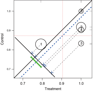
It may be interesting to compare outcomes between treatment groups across strata. The following function circ.psa() is designed for this purpose. While the R code to draw circles is simple, the key lessons are how to interpret the output plot.
In Figure 7, stratum is represented by a circle with the circle size proportional to the number of observations in each stratum. The number within each circle is the stratum number. Because the outcome variable y is binary denoted by 0 and 1, the mean of y in each treatment group is equal to the proportion of outcome events. The center of circle projecting to the x-axis corresponds the outcome means for the treated group, and that projecting to the y-axis is the outcome means for the control group. Circles below the solid identity line (y=x) are those with treatment effect larger than control group, and vise versa. The dashed blue line parallel to the identity line is the mean difference of the outcome. The cross symbols represent the distribution of strata difference. The horizontal and vertical dashed lines represent the (weighted) means for the treated and control groups respectively. Rug plots on vertical and horizontal sides of the graph show marginal distributions of control and treatment outcome measures. Along with the graph, circ.psa() output a summary statistics for the means on outcome variables in treatment groups across strata. The weighted means for each treatment group are given under objects “wtd.Mn.TRUE” and “wtd.Mn.FALSE”. The following objects “ATE”, “se.wtd”, “approx.t”, “df” and “CI.95” respectively represent average treatment effect, weighted standard error (15), approximate t statistics, degree of freedom and 95% confidence interval for the direct adjustment estimator (shown as the heavy green line in Figure 7).
Since the above methods indicate that the balance was not achieved by the matching method, one needs to modify model specifications in calculating logistic-regression based propensity scores. Higher order terms and interactions can be added as follows.
The summary output of the object m.out.right is omitted to save space. The percent balance improvement of distance is approximately 80%, which is significantly greater than 60% in the original matching. In practice, the matching process can be repeated until the model with best balance statistics is obtained.
Effect estimation after PSA
Any parametric analyses can be performed on the matched dataset obtained with PSA. The procedures are the same to that would have been used without PSA. This is left to readers for practices. Also they can consult the excellent tutorial written by Ho and colleagues on how to perform analysis after matching using Zelig package (16).
Acknowledgements
None.
Footnote
Conflicts of Interest: The author has no conflicts of interest to declare.
References
- Albert RK. "Lies, damned lies ..." and observational studies in comparative effectiveness research. Am J Respir Crit Care Med 2013;187:1173-7. [Crossref] [PubMed]
- Zhang Z. Big data and clinical research: perspective from a clinician. J Thorac Dis 2014;6:1659-64. [PubMed]
- Zhang Z. Big data and clinical research: focusing on the area of critical care medicine in mainland China. Quant Imaging Med Surg 2014;4:426-9. [PubMed]
- Singal AG, Higgins PD, Waljee AK. A primer on effectiveness and efficacy trials. Clin Transl Gastroenterol 2014;5:e45. [Crossref] [PubMed]
- Yeh RW, Mauri L. Choosing methods to minimize confounding in observational studies: do the ends justify the means? Circ Cardiovasc Qual Outcomes 2011;4:581-3. [Crossref] [PubMed]
- Quartey G, Feudjo-Tepie M, Wang J, et al. Opportunities for minimization of confounding in observational research. Pharm Stat 2011;10:539-47. [Crossref] [PubMed]
- Pfeiffer RM, Riedl R. On the use and misuse of scalar scores of confounders in design and analysis of observational studies. Stat Med 2015;34:2618-35. [Crossref] [PubMed]
- Ho DE, Imai K, King G, et al. Matching as nonparametric preprocessing for reducing model dependence in parametric causal inference. Political Analysis 2007;15:199-236. [Crossref]
- Zhang Z. Multivariable fractional polynomial method for regression model. Ann Transl Med 2016;4:174. [Crossref] [PubMed]
- Keller B, Tipton E. Propensity score analysis in R: a software review. Journal of Educational and Behavioral Statistics 2016;41:326-48. [Crossref]
- Patorno E, Grotta A, Bellocco R, et al. Propensity score methodology for confounding control in health care utilization databases. Epidemiology Biostatistics and Public Health 2013;10:1-16.
- Li M. Using the propensity score method to estimate causal effects: a review and practical guide. Organizational Research Methods 2013;16:188-226. [Crossref]
- Little RJ, Rubin DB. Causal effects in clinical and epidemiological studies via potential outcomes: concepts and analytical approaches. Annu Rev Public Health 2000;21:121-45. [Crossref] [PubMed]
- Helmreich JE, Pruzek RM. PSAgraphics: an RPackage to support propensity score analysis. Journal of Statistical Software 2009;29:1-23. [Crossref]
- Conniffe D. Evaluating state programmes: “Natural experiments” and propensity scores. Economic and Social Review 2000;31:283-308.
- Ho D, Imai K, King G, et al. MatchIt: nonparametric preprocessing for parametric causal inference. Journal of Statistical Software 2011;42:1-28. [Crossref]


