Hierarchical cluster analysis in clinical research with heterogeneous study population: highlighting its visualization with R
Introduction
Hierarchical cluster analysis (HCA), also known as hierarchical clustering, is a popular method for cluster analysis in big data research and data mining aiming to establish a hierarchy of clusters (1-3). As such, HCA attempts to group subjects with similar features into clusters. There are two types of strategies used in HCA: the agglomerative and the divisive strategy. With agglomerative clustering directing from “the leaves” to “the root” of a cluster tree, the approach is called a “bottom up” approach (4). Divisive clustering is considered a “top down” approach directing from the root to the leaves. All observations are initially considered as one cluster, and then splits are performed recursively as one moves down the hierarchy.
Clinical research is usually characterized by heterogeneous patient populations despite the use of long list of inclusion/exclusion criteria (5,6). For instance, sepsis and/or septic shock are typically treated as a disease entity in clinical trials. However, there are significant heterogeneities in patients with sepsis with respect to infection sites, coexisting comorbidities, inflammatory responses and timing of treatment (7,8). Traditionally, these factors are considered as confounding factors and can be addressed by multivariable regression modeling (9). However, such a method primarily focuses on prediction and adjustment, and fails to classify a mixed population into a more homogeneous one. Clustering analysis aims to classify mixed population into more homogenous groups based on available features. Each cluster has its own signature for identification (10,11). For instance, investigators may be interested in how physiological signals predict differently on the occurrence of subacute events (e.g., sepsis, hemorrhage and intubation) in intensive care unit (ICU). For instance, physiological signatures of hemorrhage were found to be similar in patients from surgical and medical ICU, indicating similarity between these two subgroups (12). In this article, we aim to provide some basic knowledge on the use of HCA and its visualization by dendrograms and heat maps.
Understanding HCA
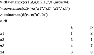
Suppose the data consists of four observations (x1 to x4) and each contains two feature variables (a, b).
The matrix df is consistent with the output of a case report form (CRF) where each row represents an observation, and a column represents a variable (features). To facilitate a clear understanding, we assigned two-dimensional features to the observations. During the first step, the distance between the observations is calculated.
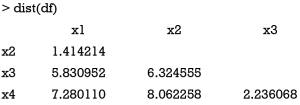
The dist() function calculates the distance between each pair of observations. There exist a variety of methods to calculate the distance (Table 1) (13,14). By default, dist() function uses Euclidean distance, and this can be modified using the method argument. Next, Euclidean distance is checked between x2 and x3:


Full table
which is exactly the value displayed in the above tabular output.
From the dist() output table, it appears that x1 and x2 are the closest to each other and they are merged at the first step, leaving clusters {x1, x2}, {x3} and {x4} to be merged further. At each step, clusters/observations with the shortest distance are merged. Distance between clusters should be defined. Additionally, there are different methods (also called linkage criteria) to define the distance between two clusters (Table 2). The default method in hclust() function is the complete linkage clustering, in which the distance between two clusters is the distance between those two elements (one in each cluster) that are farthest away from each other (15). The minimum distance between the remaining set of observations/clusters was the one between x3 and x4 (d=2.24). The distances between other pairs of observations/clusters are: d({x1, x2}, x3) is 6.32, d({x1, x2}, x4) is 8.06. After combination of x3 and x4, there are only two clusters {x1, x2} and {x3, x4}, and they are merged as the latest. The results can be visualized with generic plot() function.

Full table
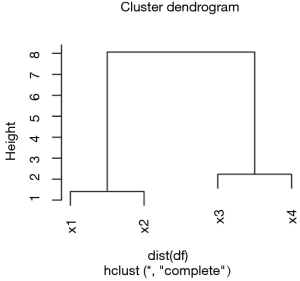
The height axis displays the distance between observations and/or clusters (Figure 1). The horizontal bars indicate the point at which two clusters/observations are merged. For example, x1 and x2 are merged at a distance of 1.41, which is the minimum distance among all other distances. Observations x3 and x4 are merged at the value of 2.24. Finally, {x1, x2} and {x3, x4} are merged by a distance of 8.06. This easy example has illustrated the basic principles underlying HCA.
Worked example
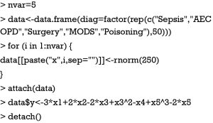
To illustrate how to perform HCA using R, we simulated a worked example. In the example, there are five variables (x1 to x5) represented by columns. Each row represents a patient. There is a factor variable named “diag” to categorize patients into different subgroups.
In real clinical research, the variables x1 to x5 can be any continuous variable such as blood pressure, heart rate, temperature and laboratory measurements. They are centered by mean and scaled by standard deviation, resulting in a normal distribution. The variable y can be an outcome variable such as cost, length of stay in ICU and hospital. If the outcome variable is binary, transformation to an appropriate scale is required, e.g., the logit scale.
Statistical quantity
A variety of statistical quantities can be explored. In its original design, HCA analyzes at individual level. Each patient takes one row and each column represents one feature variable. Such analysis provides information on the similarity between individual patients. However, in big data mining, typically thousands of patients are involved and it is more feasible to explore features in subgroups. Summary statistics such as median, mean, variance, correlation and regression coefficients can be explored. In the present example, suppose we are interested in the regression coefficient of each feature variable for the outcome y. We do not attempt to adjust these models. As a result, we need to fit regression models for each combination of feature variables and subgroups (5×5=25). Fitting these models one by one would be time-consuming and error-prone, therefore an R syntax is needed that is able to repeat the same regression model function. In R, it is not wise to use loop functions, instead the lapply() can apply a user-defined function across variables. Let’s see how it works.
While the lapply() repeats the regression function across variables x1 to x5, lmList() is employed to perform regression analysis across subgroups (16). Note that the first formula argument of lmList() allows a grouping factor specifying the partitioning of the data according to which different lm fits will be performed. The data argument specifies the data frame containing the variables named in the formula. Here we vary the data argument in each cycle, ensuring each lm fit employs different feature variables. The index [2] extracts regression coefficient of lm models. Because the lapply() function returns a list, we need to transform it into a data frame for further analysis.
Also, the t() function is used to transpose the data frame, making the rows represent variables and the columns represent the subgroups. Next, we rename the row names by using x1 to x5.
Heat map
A heat map is a graphical representation of data where the individual values contained in a matrix are represented as colors (17). The orders of columns and rows are reordered to facilitate better presentation of dendrograms. Dendrograms are used to describe the similarity between clusters and/or observations. There are a variety of heat map packages in R. heatmap() is a base function shipped with R installation. Other heat map packages include d3heatmap to create interactive heat maps, fheatmap to plot high quality, elegant heat map using ‘ggplot2’ graphics, heatmap.plus to allow non-identical X- and Y-dimensions, heatmap3 to provide more powerful and convenient features, and pheatmap to offer more control over dimensions and appearance. In this case we use heatmap.2() function contained in gplots package. It provides good control over annotations and labels, and also draws a color key to map data values to colors.
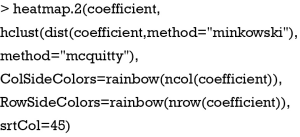
The heatmap.2() function first takes a numeric matrix of the values to be plotted. The method used to calculate distance can be specified using distfun for distance (dissimilarity) between both rows and columns, and hclustfun for computing the hierarchical clustering. Suppose one attempts to use “minkowski” method for distance calculation and “mcquitty” method for computing clustering, the following code can do the task:
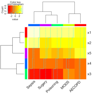
ColSideColors argument takes a character vector of length ncol(x) containing the color names for a horizontal side bar that may be used to annotate the columns of x. Here we used the rainbow color style for annotating the columns. RowSideColors is used for vertical side bar with the same usage as that of ColSideColors. srtCol argument is used to control the angle of column labels in degrees from horizontal. The result is shown in Figure 2. As indicated by the color key, more negative values are represented by more dark red color and positive values are represented by light yellow. The histogram shows the number of values in each color strip. The dendrogram shows the dissimilarity between columns and rows. The results show that surgery and poisoning patients are the most similar subgroups. Variable x3 is negatively correlated with y across subgroups and x1 is positively correlated with y.
Add scatter plot to the heat map
To better illustrate how variables correlate with outcome y, it would be interesting to visualize scatter plots in heat map. However, the aforementioned heat map packages do not provide this function. One approach is to draw each scatter plot within a panel with the lattice package (18). Then background of each panel is filled with colors corresponding to coefficient values. Also, the dendrogram can be passed to the legend of xyplot() function using dendrogramGrob function (19). The order of lattice panels should be rearranged to the order that is consistent with HCA. Finally, the strip labels can be moved to the left and top of the plot. Next, let’s take a close look at how each step is carried out and readers can adapt these codes into their own needs.
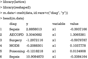
Firstly, the data frame needs to be reshaped to be utilized by the xyplot() function. The reshape2 package can do this task perfectly. Because we change the wide format to long format, only the melt() function is used.
Note that the variables x1 to x5 disappear and their values are stacked on the value column. A new variable named “variable” is created to denote the original variable name x1 to x5. ID variables diag and y remain unchanged.
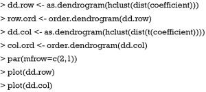
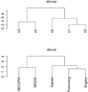
Next, we define the order of rows and columns according to the HCA. With the help of the dist() and hclust() function, this task can be easily done with several lines of code. Furthermore, the users can visualize the dendrograms and compare them with the results produced by heatmap.2() function.
Note that the dd.row and row.order correspond to the variables x1 to x5, and the dd.col and col.ord correspond to the subgroups (Figure 3). This is important for reordering rows and columns of the coefficient data frame. The next code reorders the rows and columns according to the HCA order. The data frame coeff.order is then rescaled to ensure that its values are integers. Such values can help to map themselves to colors as defined by palette.
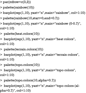
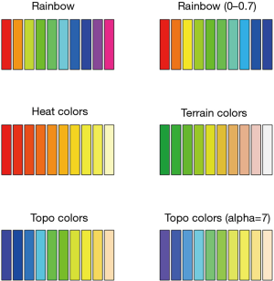
One attractive feature of heat map is the use of colors to highlight differences between individual elements. Therefore, the color style is important to make the heat map attractive and informative. In R colors can be represented by index into palette, color name and hex constant. When a col argument is assigned a vector of numeric index, each numeric value represents one color in the vector of colors defined by palette. To help readers better understand how palette works in R, a series of simple examples are used by varying color styles and some relevant arguments.
The output is shown in Figure 4. There are a variety of color styles to select. In the figure we show rainbow, heat, terrain and topo colors. The start and end arguments are used to define the range of hue. The alpha argument takes a number in between 0 and 1 to specify the transparency. With the understanding of palette colors, we proceed to define the palette for our heat map.
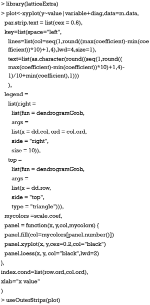
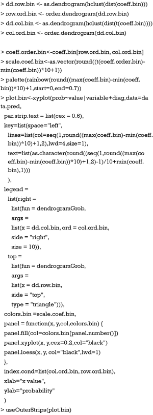
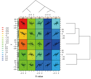
In the example, rainbow color is added to the palette. The number of colors is determined by the range of coefficients. A numeral 1 is added to make sure that the minimum value refers to the first color in the palette. At this stage, it is well prepared to draw a heat map with scatter plot in each panel. We need another package called “latticeExtra” which provides several new high-level functions and methods, as well as additional utilities such as panel and axis annotation functions. Figure 5 is produced by the following codes.
The first argument of xyplot() is a formula indicating that plots of y (on the y-axis) versus value (on the x-axis) will be produced conditioned on variables variable and diag. Remember that variable and diag are factor variables indicting x variables and subgroups, respectively. This formula produces one panel for each unique combination of these two factor variables. The data argument passes a data frame containing values for any variables in the formula. Here, m.data contains all variables specified in the formula. The size of strip text can be controlled with par.strip.text argument. Key takes a list that defines a legend to be drawn on the plot. In the example, we want the key to show the corresponding coefficient values of colors, and this key is displayed on the left. The key is composed of lines and texts, where each line has a color and each text represents the coefficient value corresponding to the line color in the same row. The legend argument allows the use of arbitrary “grob”s (grid objects) as legends. Here we use the dendrogramGrob function to create a grob (a grid graphics object) that can be manipulated as such. The first argument of dendrogramGrob should be an object of dendrogram. Recall that dd.col corresponds to the subgroups and thus we assign it to the right argument. Ord argument takes col.ord. By default, dendrogram is displayed in that a child node is joined to its parent as a “stair” with two lines (“rectangle”). If one wants to join child node to parent directly with a straight line, the type should be assigned “triangle”, as we have done for top dendrogram. A panel function is defined to allow for customized output. In the example, we need to display lowess smooth lines, scatter points and background in each panel. Of note, the background of each panel is different, which is determined by the coefficient values. Here, panel.number() is used to extract corresponding index number of mycolors. Each numeric value of the vector mycolors refers to a color in the palette that has been defined previously. By default, the xyplot() function ranges panels alphabetically by levels of each conditioning variable. In order to avoid lines of dendrograms intersecting with each other, we need to reorder the panels. This is done by the use of index.cond argument. In our example, the index.cond is a list. It is as long as the number of conditioning variables, and the i-th component is a valid indexing vector for levels(g_i), where g_i is the i-th conditioning variable in the plot. The second component of of index.cond list is col.ord which corresponds to the second conditioning variable diag.
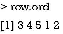
As shown above, the order of row.ord is {3, 4, 5, 1, 2}, which is consistent with the order of x variables in Figure 5 {x3, x4, x5, x1, x2}. The last line uses useOuterStrips function from the latticeExtra package, which moves strips to the top and left boundaries when printed, instead of in every panel as usual. When there are two conditioning variables, it seems redundant to display strips in every panel.
With binary outcome variable
In clinical research, there are more situations when researchers have to deal with binary outcome variables such as occurrence of event of interest, and mortality. As such, we can display probability of outcome in the vertical axis and the values of x on the horizontal axis. Here we created a new binary variable y.bin
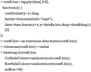
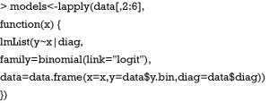
Again we need to extract coefficients of logistic regression models for every unique combination of subgroups and diagnosis. Here, a string “binomial” indicating the error distribution is assigned to the family argument, and the link function is “logit”. This is the standard argument for logistic regression model. Coefficient obtained in this way has no direct clinical relevance, but its exponentiation gives the odds ratio.
Here, we created a heat map with similar argument to that displayed in Figure 2, except that values are coefficients estimated from logistic regression models.
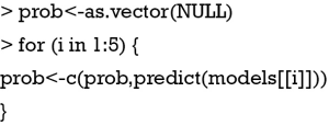
Then, the predicted probability can be estimated using predict.lmList() function. The function returns a vector whose order should be given more attention. If one intends to build also the confidence interval, the se.fit argument should be “TRUE” to allow estimation of standard error of each point estimate.
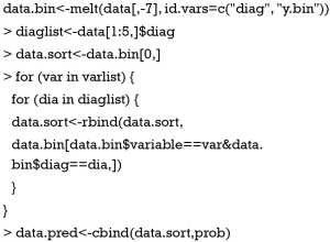
Because the order of melted data.bin and prob are not consistent, we need some lines of code to arrange them. Alternatively, one may save predicted probability and standard error as a data frame, and the order can be different. Users can try it.
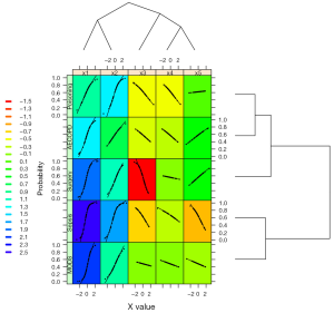
The following codes are similar to that described in the above example with minor adaptations.
The output is shown in Figure 6. This time the vertical axis represents the probability of the binary outcome. The black dot is the predicted probability, and thus each x value corresponds to one probability value.
Acknowledgements
None.
Footnote
Conflicts of Interest: The authors have no conflicts of interest to declare.
References
- Muntaner C, Chung H, Benach J, et al. Hierarchical cluster analysis of labour market regulations and population health: a taxonomy of low- and middle-income countries. BMC Public Health 2012;12:286. [Crossref] [PubMed]
- Petushkova NA, Pyatnitskiy MA, Rudenko VA, et al. Applying of hierarchical clustering to analysis of protein patterns in the human cancer-associated liver. PLoS One 2014;9:e103950. [Crossref] [PubMed]
- Murtagh F. Hierarchical Clustering. In: Lovric M. editor. International Encyclopedia of Statistical Science. Berlin, Heidelberg: Springer; 2014:633-5.
- Gil-Garcia RJ, Badia-Contelles JM, Pons-Porrata A. A General Framework for Agglomerative Hierarchical Clustering Algorithms. IEEE 2006:569-72.
- Iwashyna TJ, Burke JF, Sussman JB, et al. Implications of Heterogeneity of Treatment Effect for Reporting and Analysis of Randomized Trials in Critical Care. Am J Respir Crit Care Med 2015;192:1045-51. [Crossref] [PubMed]
- Ruan SY, Lin HH, Huang CT, et al. Exploring the heterogeneity of effects of corticosteroids on acute respiratory distress syndrome: a systematic review and meta-analysis. Crit Care 2014;18:R63. [Crossref] [PubMed]
- Kalil AC, Florescu DF. Severe sepsis: are PROWESS and PROWESS-SHOCK trials comparable? A clinical and statistical heterogeneity analysis. Crit Care 2013;17:167. [Crossref] [PubMed]
- Ma PL, Peng XX, Du B, et al. Sources of Heterogeneity in Trials Reporting Hydroxyethyl Starch 130/0.4 or 0.42 Associated Excess Mortality in Septic Patients: A Systematic Review and Meta-regression. Chin Med J (Engl) 2015;128:2374-82. [Crossref] [PubMed]
- Zhang Z. Model building strategy for logistic regression: purposeful selection. Ann Transl Med 2016;4:111. [Crossref] [PubMed]
- Murtagh F, Contreras P. Algorithms for hierarchical clustering: an overview. WIREs Data Mining Knowl Discov 2012;2:86-97. [Crossref]
- Blasius J. Greenacre M. editors. Visualization and Verbalization of Data. Boca Raton: Chapman and Hall/CRC, 2014:xlii+350.
- Moss TJ, Lake DE, Calland JF, et al. Signatures of Subacute Potentially Catastrophic Illness in the ICU: Model Development and Validation. Crit Care Med 2016;44:1639-48. [Crossref] [PubMed]
- Shahid R, Bertazzon S, Knudtson ML, et al. Comparison of distance measures in spatial analytical modeling for health service planning. BMC Health Serv Res 2009;9:200. [Crossref] [PubMed]
- Murtagh F. A Survey of Recent Advances in Hierarchical Clustering Algorithms. Comput J 1983;26:354-9. [Crossref]
- Defays D. An efficient algorithm for a complete link method. Comput J 1977;20:364-6. [Crossref]
- Bates D, Mächler M, Bolker B, et al. Fitting Linear Mixed-Effects Models Using lme4. Journal of Statistical Software 2015;67:1-48. [Crossref]
- Toddenroth D, Ganslandt T, Castellanos I, et al. Employing heat maps to mine associations in structured routine care data. Artif Intell Med 2014;60:79-88. [Crossref] [PubMed]
- Sarkar D. Lattice: Multivariate Data Visualization with R. New York: Springer; 2008:1.
- Maindonald J, Braun WJ. editors. Data Analysis and Graphics Using R – an Example-Based Approach (Cambridge Series in Statistical and Probabilistic Mathematics). 3rd ed. Cambridge: Cambridge University Press; 2009:538.

