In-depth mining of clinical data: the construction of clinical prediction model with R
Introduction to Clinical Prediction Models
Background
For a doctor, if there is a certain “specific function” to predict whether a patient will have some unknown outcome, then many medical practice modes or clinical decisions will change. Such demand is so strong that almost every day we will hear such a sigh “If I could know in advance, I would certainly not do this!”. For example, if we can predict that a patient with malignant tumor is resistant to a certain chemotherapy drug, then we will not choose to give the patient the drug; if we can predict that a patient may have major bleeding during surgery, then we will be careful and prepare sufficient blood products for the patient during the operation; if we can predict that a patient with hyperlipidemia will not benefit from some lipid-lowering drug, then we can avoid many meaningless medical interventions.
As a quantitative tool for assessing risk and benefit, the clinical prediction model can provide more objective and accurate information for the decision-making of doctors, patients and health administrators, so its application is becoming more and more common. Under this kind of rigid demand, researches of clinical prediction model are in the ascendant.
The current medical practice model has evolved from empirical medicine to evidence-based medicine and then to precise medicine. The value of data has never been more important. The rapid development of data acquisition, data storage and analysis and technology of prediction in the big data era has made the vision of personalized medical treatment become more and more possible (1,2). From the perspective of the evolvement of medical practice models, accurately predicting the likelihood of a certain clinical outcome is also an inherent requirement of the current precise medical model.
This paper will summarize the researches of clinical prediction model from the concept, current application status, construction methods and processes, classification of clinical prediction models, necessary conditions for conducting such researches and the current problems.
Concept of clinical prediction model
Clinical predictive model refers to using a parametric/semi-parametric/non-parametric mathematical model to estimate the probability that a subject currently has a certain disease or the likelihood of a certain outcome in the future (3). It can be seen that the clinical prediction model predicts the unknown by the knowing, and the model is a mathematical formula, that is, the known features are used to calculate the probability of the occurrence of an unknown outcome through this model (4,5). Clinical prediction models are generally modeled by various regression analysis methods, and the statistical nature of regression analysis is to find the “quantitative causality.” To be simple, regression analysis is a quantitative characterization of how much X affects Y. Commonly used methods include multiple linear regression model, logistic regression model and Cox regression model. The evaluation and verification of the effectiveness of prediction models are the key to statistical analysis, data modeling, and project design, and it is also the most demanding part of data analysis technology (6).
Based on the clinical issues we have studied, clinical prediction models include diagnostic models, prognostic models and disease occurrence models (3). From a statistical point of view, prediction models can be constructed as long as the outcome of a clinical problem (Y) can be quantized by the feature (X). The diagnostic model is common in cross-sectional studies, focusing on the clinical symptoms and characteristics of study subjects, and the probability of diagnosing a certain disease. The prognostic model focuses on the probability of outcomes such as recurrence, death, disability, and complications in a certain period of time of a particular disease. This model is common in cohort studies. There is another type of prediction model that predicts whether a particular disease will occur in the future based on the general characteristics of the subject, which is also common in cohort studies. There are many similarities among the diagnostic model, the prognostic model and the disease occurrence model. Their outcomes are often dichotomous data and their effect indicators are the absolute risks of the outcome occurrence, that is, the probability of occurrence, not the effect indicators of relative risk such as relative risk (RR), odds ratio (OR) or hazard ratio (HR). At the technical level of the model, researchers will face with the selection of predictors, the establishment of modeling strategies, and the evaluation and verification of model performance in all of these models.
Applications of clinical prediction models
As described in the background part, clinical prediction models are widely used in medical research and practice. With the help of clinical prediction models, clinical researchers can select appropriate study subjects more accurately, patients can make choices more beneficial for themselves, doctors can make better clinical decisions, and health management departments can monitor and manage the quality of medical services better and allocate medical resources more rationally. The effects of clinical prediction models are almost reflected in any of the three-grade prevention system of diseases:
Primary prevention of disease
The clinical prediction model can provide patients and doctors with a quantitative risk value (probability) of diagnosing a particular disease in the future based on current health status, offering a more intuitive and powerful scientific tool for health education and behavioral intervention. For example, the Framingham Cardiovascular Risk Score based on the Framingham’s studies on heart clarified that lowering blood lipids and blood pressure could prevent myocardial infarction (7).
Secondary prevention of disease
Diagnostic models often use non-invasive, low-cost and easy-to-acquire indicators to construct diagnostic means with high sensitivity and specificity and to practice the idea of “early detection, early diagnosis, early treatment”, which has important significance of health economics.
Tertiary prevention of disease
The prognostic model provides quantitative estimates for probabilities of disease recurrence, death, disability and complications, guiding symptomatic treatment and rehabilitation programs, preventing disease recurrence, reducing mortality and disability, and promoting functional recovery and quality of life.
There are several mature prediction models in clinical practice. For example, Framingham, QRISK, PROCAM, and ASSIGN scores are all well-known prediction models. The TNM staging system for malignant tumors is the most representative prediction model. The biggest advantage of TNM is that it is simple and fast, and the greatest problem is that the prediction is not accurate enough, which is far from the expectations of clinicians. The need to use predictive tools in clinical practice is far more than predicting disease occurrence or predicting the prognosis of patients. If we can predict the patient’s disease status in advance, for example, for patients with liver cancer, if we can predict whether there is microvascular infiltration in advance, it may help surgeons to choose between standard resection and extended resection, which are completely different. Preoperative neoadjuvant radiotherapy and chemotherapy is the standard treatment for T1-4N+ middle and low rectal cancer. However, it is found during clinical practice that the status of lymph nodes estimated according to the imaging examinations before surgery is not accurate enough, and the proportion of false positive or false negative is high. Is it possible to predict the patient’s lymph node status accurately based on known characteristics before radiotherapy and chemotherapy? These clinical problems might be solved by constructing a suitable prediction model.
Research approach of clinical prediction models
Clinical prediction models are not as simple as fitting a statistical model. From the establishment, verification, evaluation and application of the model, there is a complete research process of the clinical prediction model. Many scholars have discussed the research approaches of clinical prediction models (8-11). Heart Magazine recently published a review, in which the authors used risk score for cardiovascular diseases (CVD) as an example to explore how to construct a predictive model of disease with the help of visual graphics and proposed six important steps (12):
- Select a data set of predictors as potential CVD influencing factors to be included in the risk score;
- Choose a suitable statistical model to analyze the relationship between the predictors and CVD;
- Select the variables from the existing predictors that are significant enough to be included in the risk score;
- Construct the risk score model;
- Evaluate the risk score model;
- Explain the applications of the risk score in clinical practice.
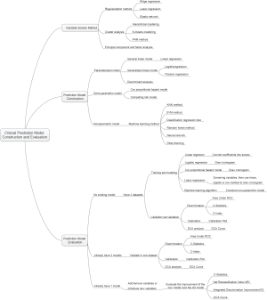
The author combined literature reports and personal research experience and summarized the research steps as shown in Figure 1.
Clinical problem determine research type selection
Clinical prediction models can answer questions about etiology, diagnosis, patients’ response to treatment and prognosis of diseases. Different research types of design are required for different problems. For instance, in regard to etiology studies, a cohort study can be used to predict whether a disease occurs based on potential causes. Questions about diagnostic accuracy are suitable for cross-sectional study design as the predictive factors and outcomes occur at the same time or in a short period of time. To predict patients’ response to treatment, cohort study or randomized controlled trial (RCT) can be applied. For prognostic problems, cohort study is suitable as there are longitudinal time logics for predictors and outcomes. Cohort study assessing the etiology requires rational selection of study subjects and control of confounding factors. In studies of diagnostic models, a “gold standard” or reference standard is required to independently diagnose the disease, and the reference standard diagnosis should be performed with blind method. That is to say, reference standard diagnosis cannot rely on information of predictors in prediction models to avoid diagnostic review bias. Assessing patients’ response to treatment is one type of interventional researches. It is also necessary to rationally select study subjects and control the interference of non-test factors. In studies of prognostic model, there is a vertical relationship between predictors and outcomes, and researchers usually expect to obtain outcome of the disease in the natural status, so prospective cohort study is the most common prognostic model and the best type of research design.
Establishment of study design and implementation protocol, data collection and quality control
Good study design and implementation protocol are needed. First, we need to review the literatures to determine the number of prediction models to be constructed:
- At present, there is no prediction model for a specific clinical problem. To construct a new model, generally a training set is required to construct the model and a validation set to verify the prediction ability of the model.
- There are prediction models at present. To construct a new model, a validation set is applied to build the new model and the same training data set is applied to verify the prediction ability of the existing model and the new model respectively.
- To update the existing models, the same validation set is used to verify the prediction ability of the two models.
With regard to the generation of training data sets and validation data sets, data can be collected prospectively or retrospectively, and the data sets collected prospectively are of higher quality. For the modeling population, the sample size is expected to be as large as possible. For prospective clinical studies, the preparation of relevant documents includes the research protocol, the researcher’s operation manual, the case report form, and the ethical approval document. Quality control and management of data collection should also be performed. If data is collected retrospectively, the data quality should also be evaluated, the outliers should be identified, and the missing values should be properly processed, such as filling or deleting. Finally, the training data set for modeling and the validation set for verification are determined according to the actual situations. Sometimes we can only model and verify in the same data set due to realistic reasons, which is allowed, but the external applicability of the model will be affected to some extent.
Establishment and evaluation of clinical prediction models
Before establishing a prediction model, it is necessary to clarify the predictors reported in the previous literature, determine the principles and methods for selecting predictors, and choose the type of mathematical model applied. Usually a parametric or semi-parametric model will be used, such as logistic regression model or Cox regression model. Sometimes algorithms of machine learning are used to build models and most of these models are non-parametric. Because there are no parameters like regression coefficients, the clinical interpretation of such nonparametric models is difficult. Then fit the model and estimate the parameters of the model. It is necessary to determine the presentation form of the prediction model in advance. Currently, there are four forms commonly used in prediction models:
- Formula. Use mathematical formulas directly as the prediction model tool.
- Nomogram. The regression coefficients of the regression model are transformed into scores through appropriate mathematical transformations and plotted as a nomogram as a predictive model tool.
- Web calculator. The nature is also to convert the regression coefficients of the regression model into scores by appropriate mathematical operations, and to make it into a website for online use.
- Scoring system. The regression coefficients of the regression model are transformed into a quantifiable scoring system through appropriate mathematical operations.
The first form is mainly for linear regression model, which is a deterministic regression. The latter forms are based on parametric or semi-parametric models, the statistical nature of which is the visual representation of the model parameters. The researchers can make choices based on actual conditions. After the model is built, how to evaluate the pros and cons of the model? The evaluation and verification of the model are of higher statistical analysis technology. For example, the discrimination, calibration, clinical effectiveness and other indicators of the prediction models are evaluated to determine the performance of the models.
Validation of clinical prediction models
The effect of the prediction model is prone to change as the scenario and the population change. Therefore, a complete study of prediction model should include validation of the model. The content of the validation includes the internal validity and external validity of the model. Internal validity reflects the reproducibility of the model, which can be validated through cross-validation and Bootstrap with the data of the study itself. External validity reflects the generalizability of the model and needs to be validated with data sets not from the study itself, which are temporally and geographically independent, or completely independent.
Internal and external validation of the model are necessary steps to assess the stability and applicability of the model. The data sets for internal validation and external validation should be heterogeneous, but not to a certain extent. Generally, data from the original institution are used as training set to build the model and a part of the internal data are randomly selected to perform internal validation. Data from other institutions are selected as the external verification data set. Of course, it is best to do external data set validation. I will introduce several methods to verify internal validity.
- Split-half method. Randomly divide the existing data into two parts, one for building the model and the other for validating the model. The data is divided into two parts by the semi-division method for “internal verification”. Since only half of the data is used to build the model, the model is relatively unstable. Studies with small sample sizes are not suitable for this method.
- Cross-validation method. This method is a further evolution of the split-half method. The half-fold cross-validation and the ten-fold cross-validation are commonly used. The half-fold cross-validation method is to divide the original data into two parts, one for establishing and the other for validating the model. Then exchange the rolls of the two parts and mutually verifying each other. The ten-fold cross-validation method is to divide the data into ten parts, and to uses nine parts for establishing the model, and the other part for verifying the model. By establishing and verifying the model ten times in this way, a relatively stable can be constructed.
- Bootstrap method. The conventional Bootstrap internal validity analysis method is to randomly sample a certain number of returnable cases in the original data set to build a model, and then use the original data set to verify the model. By doing random sampling, establishment and validation for 500–1,000 times, 500–1,000 models can be obtained, and the parameter distributions of the model can be summarized. Therefore, the final parameter values of the model can be determined. Bootstrap method is a fast-developing method in recent years. This method develops in the background of computer numeration increase. It is proved that models acquired through this method have higher stability than through the previous two methods. It can be speculated that Bootstrap method will be increasingly applied internal validity analysis of the prediction models. Of course, if conditions are met, we should do external validation of prediction models as much as possible to improve the external applicability of the models.
Assessment of clinical effectiveness of clinical prediction models
The ultimate goal of the clinical prediction models is whether the clinical prediction model changes the behaviors of doctors/patients, improves patients’ outcomes or cost effect, which is the clinical effect study of the clinical prediction models. From the methodological point of view, generally the training set and the validation set are divided according to the new prediction model. For example, for predicting dichotomous outcome, we can assess the clinical effectiveness by assessing the sensitivity and specificity of the model. For predicting survival outcomes, we generally evaluate whether patients can be classified into good or poor prognosis according to the prediction model. For instance, the score of each subject is calculated by Nomogram, and the patients are classified into good prognosis group and poor prognosis group according to a certain cutoff value, then a Kaplan-Meier survival curve is drawn. Decision Curve Analysis is also a commonly used method for predicting clinical effectiveness of models. From the perspective of the final purpose of the prediction model construction and study design, the best clinical effectiveness assessment is to design randomized controlled trials, and usually cluster randomized controlled trials are used to assess whether the application of prediction models can improve patient outcomes and reduce medical costs.
Update of clinical prediction models
Even with well-validated clinical prediction models, the model performance is degraded over time due to changes of disease risk factors, unmeasured risk factors, treatment measures, and treatment background, which is named the calibration drift. Therefore, clinical prediction models need to evolve and update dynamically. For example, the frequent update of the most commonly used malignant tumor TNM staging system is also because of these reasons.
Current researches of clinical prediction model can be roughly divided into three categories from the perspective of clinicians
- Prediction models are constructed with traditional clinical features, pathological features, physical examination results, laboratory test results, etc. The predictive variables in this type of models are more convenient for clinical acquisition and are the construction of these models is more feasible.
- With the maturity of radiomics research methods, more and more researchers are aware that certain manifestations or parameters of imaging represent a specific biological characteristic. Using the massive imaging parameters of color Doppler ultrasound, CT, MR or PET combined with clinical features to construct prediction models can often further improve the accuracy of the prediction models. The modeling of this type of method is based on screening the features of radiomics. The pre-workload of this type is much larger than the first method, and close cooperation between clinical department and imaging department is needed.
- With wide use of high-throughput biotechnology such as genomics and proteomics, clinical researchers are attempting to explore featured biomarkers for constructing prediction models from these vast amounts of biological information. Such prediction models are a good entry point for the transformation of basic medicine into clinical medicine, but such researches require strong financial support as various omics tests of the clinical specimens need to be done. However, the input and output of scientific research are directly proportional. As the saying goes, “Reluctant children can’t entrap wolves.” Although there is nobody willing to entrap the wolf with a child, the reason is the same. Once the researches willing to put money in omics analysis are well transformed into clinic, generally the researches can yield articles with high impact factors. In addition, biological samples must be obtained, otherwise there is foundation to launch such researches.
The necessary conditions to conduct clinical prediction model from the perspective of clinicians
- Build a follow-up database of a single disease and collect patient information as completely as possible, including but not limited to the following: demographic characteristics, past history, family history, personal history; disease-related information such as important physical and laboratory findings before treatment, disease severity, clinical stage, pathological stage, histological grade; treatment information: such as surgical methods, radiotherapy and chemotherapy regimens, dose and intensity; patients’ outcomes: for cancer patients, consistent follow-ups are required to obtain their outcomes, which is an extremely difficult and complex task. Other information: If there is, such as genetic information. Database construction is a core competency.
- From the previous published articles of prediction models, most of them are based on retrospective datasets, and a fraction of them are based on prospective datasets. Such researches are easier to carry out compared with RCT, and they belong to areas of real-world study that we are now proposing. Real-world study and RCT should be two same pearls on the crown of clinical study and complement each other. In the past, we overemphasized the importance of RCT and ignored the great value of real-world data. RCT data have the highest quality without doubt, but the data have been screened strictly, therefore the extrapolation of the evidence is limited. Real-world data come from our daily clinical practice, which reflects the efficacy of clinical interventions more comprehensively, and the evidence has better external applicability. However, the biggest problems of real-world study are that the data quality varies wildly and there are too many confounding factors that is difficult to identify. Therefore, it is necessary to use more complicated statistical methods to find the truth from the complicated confounding factors. It is not easy to sift sand for gold, and solid statistical foundation is like a sifter for gold. Here we need to understand that confounding factors exist objectively, because the occurrence of any clinical outcome is not the result from a single factor. There are two levels of correction for confounding factors. One is correction at the experimental design stage, which is the top-level correction, such as equalizing confounding factors between groups by randomization and enough sample size. This is also the reason why RCT is popular: as long as the sample size is enough and randomization is correct, the problem of confounding factors is solved once and for all. The second is after-effect correction through statistical methods, which is obviously not as thorough as the RCT correction, but the second situation is closer to the real situation of our clinical practice.
- Sample size. Because there are many confounding factors in real-world research, a certain sample size is necessary to achieve sufficient statistical efficacy to discern the influence of confounding factors on the outcome. A simple and feasible principle for screening variables by multivariate analysis is that if one variable is included in multivariate analysis, there should be 20 samples of the endpoint, which is called “1:20 principle” (13,14).
- Clinical research insight. Construction of clinical prediction model is to solve clinical problems. The ability to discover valuable clinical problems is an insight that is cultivated through widely reading and clinical practice.
Issues currently faced in the development of prediction model
- Low clinical conversion rate. The main reason is that the clinical application of the prediction model needs to be balanced between the accuracy and the simplicity of the model. Imagine if there is a model that is as easy to use as TNM staging, but more accurate than TNM staging, what choices would you make?
- Most of the clinical prediction models were constructed and validated based on retrospective datasets and validation is rarely performed in the prospective data. Therefore, the stability of the results predicted by the models was comparatively poor.
- Validation of most clinical prediction models is based on internal data. Most articles have only one dataset. Even if there are two datasets, one to construct and the other to validate, but the two datasets often come from the same research center. If the validation of the prediction model can be further extended to dataset of another research center, the application value of the model will be greatly expanded. This work is extremely difficult and requires multi-center cooperation. Moreover, most of the domestic centers do not have a complete database for validation, which comes back to the topic “database importance” discussed earlier.
Brief summary
The original intention of the clinical prediction model is to predict the status and prognosis of diseases with a small number of easily collected, low-cost predictors. Therefore, most prediction models are short and refined. This is logical and rational in an era when information technology is underdeveloped and data collection, storage and analysis are costly. However, with the development of economy and the advancement of technology, costs of data collection and storage have been greatly reduced and technology of data analysis is improving. Therefore, clinical prediction model should also break through the inherent concept, with application of larger amounts of data (big data) and more complex models as well as algorithms (machine learning and artificial intelligence) to serve doctors, patients, and medical decision makers with more accurate results.
In addition, from the perspective of a clinical doctor conducting clinical researches, the following four principles should be grasped when conducting researches of clinical prediction models:
- Building a better clinical prediction model is also an inherent requirement of precise medicine;
- How to get high quality data? Database construction is the core competitiveness, while prediction model is only a technical method;
- We need to raise awareness that RCT is as important as real-world study. Both are ways to provide reliable clinical evidence;
- Validation of the models requires internal and external cooperation, so we should strengthen the internal cooperation of scientific research and improve the awareness of multi-center scientific research cooperation.
Variable screening method in multivariate regression analysis
Background
Linear regression, Logistic regression and Cox proportional hazards regression model are very widely used multivariate regression analysis methods. We have introduced details about the principle of computing, application of associated software and result interpreting of these three in our book Intelligent Statistics (15). However, we talked little about independent variable screening methods, which have induced confusion during data analysis process and article writing for practitioners. This episode will focus more on this part.
Practitioners will turn to statisticians when they are confronted with problems during independent variable screening, statisticians will suggest the application of automatic screening in software, such as Logistic regression and Cox regression in IBM SPSS, which have suggested seven methods for variable screening as follow (16,17):
- Conditional parameter estimation likelihood ratio test (Forward: Condition);
- Likelihood Ratio Test of Maximum Partial Likelihood Estimation (Forward LR);
- Wald chi-square test (Forward: Wald);
- Conditional parameter estimation likelihood ratio test (Backward: Condition);
- Likelihood Ratio Test of Maximum Partial Likelihood Estimation (Backward: LR);
- Wald chi-square test (Backward: Wald);
- Enter method (all variable included, default method).
Actually, in clinical trial report, many authors will adopt one of these screening methods. I am going to talk about: they will perform univariate regression analysis of every variable one by one firstly; those with P value less than 0.1 will be included in the regression formula (here P value could be less than 0.05 or 0.2, but in common condition, P value can range between 0.05–0.2). This method is very controversial. For practitioners, how to choose a better method is really an optional test. To be honest, there is no standard answer. But we still have some rules for better variable screening:
- When the sample size is larger enough, statistical test power is enough, you can choose one from those six screening methods we mentioned before. Hereby we introduce a method which can help you evaluate the test efficiency quickly: 20 samples (events) are available for each variable. For example, in Cox regression test, if we include 10 variables associated with prognosis, at least 200 patients should be recruited to evaluate endpoint events, such as death (200 dead patients should be included instead of 200 patients in total). Because those samples without endpoint event won’t be considered to be test effective samples (13,14).
- When the sample size is not qualified for the first condition or statistical power is not enough for some other reasons, widely used screening method in most clinical report should be applied. You can perform univariate regression analysis of every variable one by one firstly; those with P value less than 0.2 will be included in the regression formula. As we mentioned before, this method is quite controversial during its wide application.
- Even the second screening method will be challenged during practice. Sometimes we find some variables significantly associated with prognosis may be excluded for its disqualification in already set-up screening methods. For example, in a prostate cancer prognosis study, the author find Gleason score is not significantly associated with prognosis in the screening model, while Gleason score is a confirmed factor for prostate cancer prognosis in previous study. What should we do now? In our opinion, we should include those variables significantly associated with prognosis in our analysis though they may be disqualified in statistical screening method for professional perspective and clinical reasons.
To sum up, the author recommends the third variable screening method. The univariate analysis results and clinical reasons, sample size and statistical power should be considered at the same time. We will explain it in detail below.
Disputes and consensus
The discussion about variable screening has been going on for a long time. Statistician consider it with very professional perspective, however clinical doctors will not always stick to these suggestions. It is very hard to distinguish the right and the wrong for actual problem during clinical study, such as small simple size; limited knowledge to confirm the exact factors for the outcome. However, we still have some standards for reference during screening. During the review about good quality clinical studies published on top magazines, 5 conditions will be considered during variable screening (18):
- Clinical perspective. This is the most basic consideration for variable screening. Medical statistical analysis can be meaningless if it is just statistical analysis. Based on professional view, confirmed factors significantly associated with outcome, such as Gleason score in prostate cancer, should be included in regression model. We do not need to consider its statistical disqualification in variable screening.
- Screening based on univariate analysis. Independent variable included in multivariate analysis based on the results of the univariate analysis. Variables with significant P value should be included in multivariate regression. If P<0.1, we think it is “significant”. Sometimes P<0.2 or P<0.05 will be considered “significant”. P value can range according to sample size. Big sample size will be with small P value. Small sample size will be with relatively big P value. This screening method is quite common in already published articles, even in top magazines. Though this method has been questioned by statisticians, it is still being used for no method because no more precise and scientific option available now. Even statisticians could not find better replacement. Before we find better option to replace this one, it is better to have one than to have none.
- The variables would be chosen based on the influence of the confounding factor “Z” on the test factor or the exposure factor “X”. To be specific, we will observe if “X” will affect dependent variable “Y” when “Z” change or not. First run the basic model that only includes “X”, record the regression coefficient β1, and then add “Z” to the model to see how much the β1 changes. It is generally considered that the β1 change exceeds 10%, and the variable needs to be adjusted, otherwise it is not needed. This method is different from the second one because of quantification of confounding factor effect. This is not perfect because the effect “Z” and “X” exert on “Y” could be affected by other confounding factors. This thought may lead to logical confusion. Complicated methodological problem will be left for further exploration by the smart ones. In our opinion, this is acceptable option for variable screening, especially for those programs with very specific targets. We can confirm the effect of “X” on independent “Y”. This effect is real and what we do can regulate these confounding factors.
- Choosing right number of variables that will eventually be included in the model. is very important. This is a realistic problem. If the sample size is large enough and the statistical performance is sufficient, we can use the variable screening method provided by the statistical software to automatically filter the variables, and we can filter out the variables that are suitable for independent impact results in statistical. “Ideal is full, the reality is very skinny”. Sometimes we will consider a lot of variables, while the sample size is pretty small. We have to make compromise between statistical efficiency and variable screening. Compromise can bear better results (13,14).
- Above we listed four commonly used variable screening methods. Many other variable screening methods, such as some methods based on model parameters: determination coefficient R2, AIC, likelihood logarithm, C-Statistics, etc. can be an option also. The fact that too many variable screening methods is a good evidence to support a view that there is no best available during practice. This article aims to help us find the right screening method instead of confirming the best one or worst one. Choosing the fittest one according to actual condition is the goal of this article.
The methods for recruiting different types of variables
Continuous variable
For continuous variable, there is a good protocol for reference. If the relationship between variable and the outcome is linear, you can include the continuous variable in the regression formula. If not, you can transform it into dichotomous variable or ordinal categorical variable, then put them into the regression formula. We have already changed former continuous variable into categorical variable by this way. We do this transformation because the variable may be not linear to the outcome. Some other relationship instead of linear one may present.
Continuous variable transformation summary
When continuous variable is included in regression model, the original variable, as far as possible, should be included in this model and actual needs should be considered also. The variable can be transformed based on some rules. Two-category grouping, aliquot grouping, equidistant grouping, and clinical cut-off value grouping are present for better professional explanation. By optimal truncation point analysis, we convert continuous variables into categorical variables and introduce them into the regression model as dummy variables. In regression model, the continuous variable can be present in different ways. We will give specific examples as follow. No matter which way it will present, the general principle is that this change is better for professional interpretation and understanding (19-21).
Normal transformation
For continuous variables which are in normal distribution, this is not a problem. However, when we confronted with data which is not fit normal distribution, we can make transformation based on some function, then these data will be normalized. And it will fit the regression model. Original data can be normalized by different function, such as Square Root method, LnX method, Log10X method and (1/X) etc., according to its own character. If you have normalized the original data, you should interpret the variable after normal transformation instead of the original ones in the regression model or you can reckon the effect of the original independent variable exerting on the original dependent variable according to the function used in the transformation.
For example, the authors have done normality test in the article they published in JACC, 2016 (21). The original expression is as follows: Normality of continuous variables was assessed by the Kolmogorov-Smirnov test. The method of normality test includes using the parameters of the data distribution (the skewness value and the kurtosis value) and using the data distribution graph (histogram, P-P diagram, Q-Q diagram). Or some nonparametric test methods (Shapiro-Wilk test, Kolmogorov-Smirnov test) will be applied to help us to evaluate the normality of data. In their research, variables such as troponin I, NT-proBNP, or corin is fit abnormal distribution. So, the author describes baseline characters of these recruited objects by median (quartile - third quartile). For example, the median of Troponin I is 4.5 (1.8–12.6) ng/mL. Then multivariable linear regression is performed to analyze corin. The original expression is as follows: multiple linear regression analysis was applied to determine factors influencing corin levels. Levels of troponin I, NT-proBNP, and corin were normalized by Log10 transformation. Variables like troponin I, NT-proBNP, corin have been normalized by function Log10.After that, they have been included into multivariable linear regression. Then, the author performed Cox regression. Though there is no specific requirement for Cox regression, Log10 function was used to normalize troponin I, NT-proBNP and corin. All these three variables have been included in multivariable linear regression model for consistency with original ones.
Transformation for each change of fixed increment
If continuous variable is introduced directly into the model in its original form, the regression parameter is interpreted as the effect of the change in the dependent variable caused by each unit change. However, sometimes the effect of this change may be weak. Therefore, we can transform the continuous independent variables into a categorical variable by fixed interval, in an equidistant grouping, and then introduce them into the model for analysis. This grouping is good for better understanding and application for patients. For example, we include patients whose age range between 31 to 80 years old. We can divide it into groups of 10–40, 41–50, 51–60, 61–70, 71–80 according to10 years age interval. Then five already set dummy variables will be included into the model for analysis. However, if the variable range a lot, grouping according to the methods we mentioned before will lead to too many groups and too many dummy variables, which will be quite redundant during analysis. It will be very hard for clinical interpretation too. In the opposite, some data with a small range and cannot be grouping again, it cannot be transformed into categorical variable also. Then, what should we do when we are confronted with these two situations?
Here, we can refer to an article published in JACC, 2016 (19). We find in the model, the author used a lot of “per”, such as per 5% change, per 0.1 U, per 100 mL/min etc. This is transformation of continuous variables in fixed increments per change, which has been present in “per + interval + unit”. We will illustrate 2 examples in this article. The mean of oxygen uptake efficiency slope is 1,655 U and 5–95% population will change from 846 to 2,800 U. It is really a big range. If the original data is put into formula, per 1 U change will lead to very week change of HR, which is meaningless in clinical practice. If it is transformed into categorical variables, many groups will appear. So, the author includes per 100 U change into the model and finds that the mortality risk will decrease 9% (HR =0.91, 95% CI: 0.89–0.93) when oxygen uptake efficiency slope increases in per 100 U. Another example is variable Peak RER. The median is 1.08 U and 5–95% population will change from 0.91–1.27 U. It is really a small range. If the original data is put into formula, per 1 U change will lead to very big change of HR. In clinical practice, patients with a change of 1 U are quite rare and this outcome will be of limited practicality. It will be very hard for categorical variable transformation too for its small range. So, the author includes per 0.1U change into the model and finds that the mortality risk will decrease 6% (HR =0.94, 95% CI: 0.86–1.04) when Peak RER increases per 0.1 U. However, it is not statistically significant.
Then, how can we do this transformation? If we want to change the factor from each1 unit to 100 units, it will be 100 times larger. We only need to divide the original variable by 100 and then to include into the model. Similarly, if we want to change the factor from 1 unit to 0.1 unit, the change is reduced by 10 times. It is only necessary to multiply the original variable by 10 and include it into the regression model.
Transformation of each standard deviation
In clinical study, we get another transformation method: independent variable change at per SD increase. Let us see an article published in JACC in 2016 (20). Age and systolic pressure are included in the model as per SD increase. The age increase at per SD, the risk of atherosclerotic heart disease (ASCVD) increases by 70% (HR =1.70, 95% CI: 1.32–2.19). Systolic blood pressure (SBP) increased at per SD, the risk of ASCVD increases by 25% (HR =1.25, 95% CI: 1.05–1.49). Here the author has put continuous variable into the model with the form of per SD increase. Assuming that the variables are fit to normal distribution, the area within the mean ±1 SD interval is 68.27%, while the mean value is ±1.96, the area within the SD interval is 95%. If the mean value is ±2.58, the area within the SD interval is 99%. We can tell that if the data range within 4 SD, about 95% samples will be covered. Therefore, new variables, especially for those rare ones which are still unclear in clinical interpretation, we can put per SD into the model. This can guide the patient to see that he or she is within the range of several standard deviations of the population distribution level according to his or her actual measurement results, and then to assess how much the corresponding risk will change.
It is very simple to do this kind of transformation. We can do it by these two ways:
- Before constructing the regression model, the original continuous variables should be normalized, and the normalized independent variables are brought into the regression model. The regression coefficient obtained is the influence of the dependent variable on each dependent SD. (Attention: Only independent variables are normalized here).
- If the original variables are not normalized, the original variables can be directly brought into the model, and the Unstandardized Coefficients are obtained, and then the standard deviation of the independent variables is calculated by multiplying the standard deviation of the independent variables, which is also called Standardized Coefficients. This is the effect of the dependent variable for each additional SD of the independent variable.
Rank variable
Rank variable is very common. It is a kind of ordered multi-category variable. Generally, multiple data may present in the same variable and these data are rank correlated with each other. For example, the grade of hypertension (0= normal, 1= high normal, 2= Grade 1, 3= Grade 2, 4= Grade 3), the level of urine protein (0=−, 1=±, 2=+, 3=++, 4=+++, 5=++++), the effect of drug (invalid, improvement, cure), they are all rank variable. It is different from non-ordered multi-category variable. Ordered multi-category variable presents monotonic increasing or decreasing. When ordered multi-category variable are in Logistic regression model, these variables are not suggested to be brought in directly as continuous variables unless per one-unit change can lead to the same risk ratio change in the outcome. However, mostly it will not change so ideally. So, we suggest to treat ordered multi-category variable as dummy variables, and you can compare each level with another. When the outcome is not linear related, the optimal scale regression should be used to explore the effect inflection point.
Non-ordered & multi-categorical variable
Non-ordered & multi-categorical variable is very common variable style. Usually, there are several possible values in a multi-categorical variable, while there is no hierarchical relationship between each other. For example, race (1= white, 2= black, 3= yellow, 4= others), method of drug administration (1= oral, 2= hypodermic, 3= intravenous, 4= others), they are all non-ordered multi-category variables. When non-ordered multi-category variable are in Logistic or Cox regression model, we need to set dummy variable before we brought them in the model. We will introduce the dummy variable setting methods in the follow.
Dummy variable setting methods
- Indicator: this method is used to specify the reference level of the categorical variable. The parameter calculated here is referred to the last or first level of the variable. It is depending on whether you choose the first or last in the following Reference Category.
- Simple: this method can calculate the ratio of each level of the categorical variable compared to the reference level.
- Difference: this method can compare the categorical variable with the mean of all levels. It is totally the opposite of Helmert. So, it is also called Reversed Helmert. For example, mean of level 2 can be compared with the mean of level 1; the mean of level 3 can be compared with that of level 1 and level 2 respectively and so forth. If the coefficient becomes small at a certain level and is not statistically significant, the effect of the categorical variable on the risk ratio is reached its plateau. This option is generally used for ordered-categorical variables, such as smoking doses. Assuming that the researchers analyze them as independent non-ordered multi- category variable, it will be meaningless.
- Helmert: we will compare the level of categorical variable with the mean of the following levels. If the coefficient of a certain level increases and is statistically significant, it indicates that the categorical variable has an impact on the risk rate from this level. It can also be used in ordered-categorical variables.
- Repeated: the levels of the categorical variables are compared with the levels adjacent to them, except for the first level, where the “previous level” is used as the reference level.
Brief summary
We have already summarized the screening methods and variables transformation methods. The absolutely perfect way is not valid in really world. But we can still choose the right way. Comparing with choose one method in haste, we need more scientific solutions. There is one way for reference: you can construct multiple models (mode1, model 2, model 3…) based on previous published clinical trials, especially those with high impact score and get the objective outcome of each model. It actually is sensitivity analysis. Different models will be constructed based on different variables. Some variables, which may be closely related to the true world, will lead to relatively stable outcome even in different models. This is also a way to reach the goal. We will not judge it here. We want to find out the most stable factor for the outcome from results.
During the construction of predictive model, we will have specific consideration except for variables screening in all these possible variables. For example, TNM staging for malignant tumors are widely used for its easily application in clinical practice instead of its prediction value of in prognosis. Actually, TNM staging prediction value is just so-so. Here we have to talk about another question: How can we assess the accuracy and simplicity of the model? More variable may lead to more accurate prediction of a model while it will be much more difficult for clinical application. Sometimes a comprise should be made.
Method of building nomogram based on Logistic regression model with R
Background
The need for prediction models in clinical practice is much more than predicting disease occurrence or patient prognosis. As explained in Section 1, many times we may make a completely different clinical decision if we can predict the patient’s disease state in advance. For example, for patients with liver cancer, if we can predict whether there is microvascular infiltration in advance, it may help surgeons to choose between standard resection and extended resection, which are completely different. Preoperative neoadjuvant radiotherapy and chemotherapy is the standard treatment for T1-4N+ middle and low rectal cancer. However, it is found during clinical practice that the status of lymph nodes estimated according to the imaging examinations before surgery is not accurate enough, and the proportion of false positive or false negative is high. Is it possible to predict the patient’s lymph node status accurately based on known characteristics before radiotherapy and chemotherapy? If we can build such a prediction model, then we can make clinical decisions more accurately and avoid improper decision-making caused by misjudgment. More and more people are becoming aware of the importance of this problem. At present, researchers have made vast efforts to build prediction models or improve existing prediction tools. The construction of Nomogram is one of the most popular research directions.
When do you choose Logistic regression to build a prediction model? This is related to the clinical problems and the clinical outcomes set up. If the outcomes are dichotomous data, unordered categorical data or ranked data, we can choose Logistic regression to construct the model. Generally unordered Logistic regression and ranked Logistic regression are applied in unordered multi-categorical or ranked data outcomes, but the results are difficult to explain. Thus, we generally convert unordered multi-classification or ranked data outcomes into dichotomous outcomes and use dichotomous Logistic regression to construct the model. Outcomes such as “whether liver cancer has microvascular infiltration” and “recurrence of lymph node metastasis before rectal cancer” mentioned above belong to dichotomous outcomes. Dichotomous Logistic regression can be used for constructing, evaluating and validating the prediction model (15).
The screening principles for model predictors are consistent with the principles described in section 2. In addition, we need to consider two points: on the one hand, the sample size and the number of independent variables included in the model should be weighed; on the other hand, we should also weigh the accuracy of the model and the convenience to use the model, to finally determine the number of independent variables entering the prediction model (13,14,17).
In this section, we will use two specific cases to introduce the complete process of constructing a Logistic regression prediction model with R language and drawing a Nomogram. For complex statistical principles, we choose to avoid as much as possible, and we would focus on the R implementation process of this method.
We can summarize the process of constructing and verifying clinical prediction models into the following eight steps (22):
- Identify clinical issues and determine scientific hypotheses;
- Determine research strategies of prediction models according to previous literatures;
- Determine the predictors of the predictive model;
- Determine the outcome variables of the prediction model;
- Construct the prediction model and calculate model predictors;
- Assessment of model discrimination ability;
- Assessment of model calibration;
- Assessment of clinical effectiveness of the model.
Research process of prediction models construction can be referred to Figure 2.
[Case 1] analysis
[Case 1]
Hosmer and Lemeshow studied the influencing factors of low birth weight infants in 1989. The outcome variable is whether to give birth to low birth weight infants (Variable name: “low”; Dichotomous variable; 1= low birth weight, which is infant birth weight <2,500 g; 0= not low birth weight). The possible influencing factors (independent variables) include: maternal pre-pregnancy weight (lwt, unit: pound); maternal age (age, unit: year); whether the mother smokes during pregnancy (smoke, 0= no, 1= yes); number of preterm births before pregnancy (ptl, unit: time); high blood pressure (ht, 0= no, 1= yes); uterus stress to the contraction caused by stimulation, oxytocin, etc. (ui, 0= no, 1= yes); visits to community doctors in the first three months of pregnancy (ftv, unit: time); race (race, 1= white, 2= black, 3= other).
[Case 1] interpretation
In this case, the dependent variable is dichotomous (whether or not a low birth weight infant is delivered). The purpose of the study is to investigate the independent influencing factors of low birth weight infants, which is consistent with the application conditions of binary Logistic regression. As there is only one data set in this case, we can use this data set as the training set to model, and then use Bootstrap resampling method to perform internal model validation in the same data set. It should be noted here that we can also randomly divide the data set into a training set and an internal validation set according to a 7:3 ratio, but we did not do so considering the sample size. We will demonstrate the prediction model construction of low birth weight infants and the rendering of Nomogram with R language below. The data were collected and named “Lweight.sav”, which is saved in the current working path of R language. The data and code can be downloaded from the attachments in this Section for readers to practice. The specific analysis and calculation steps are as follows:
- Screen the independent influencing factors affecting low birth weight infants and construct a Logistic regression model;
- Visualize the Logistic regression model and draw a Nomogram;
- Calculate the discrimination degree (C-Statistics) of the Logistic model;
- Perform internal validation with resampling method and draw the Calibration curve.
[Case 1] R codes and results interpretation
Load the “foreign” package for importing external data in .sav format (IBM SPSS style data format). Load the rms package to build the Logistic regression model and to plot the nomogram (23):
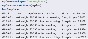
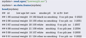
Import the external data in .sav format and name it “mydata”. Then set the data to the structure of data frame, and display the first 6 lines of the data frame.
Data preprocessing: set the outcome variable as a dichotomous variable, define “low birth weight” as “1”, and set the unordered categorical variable “race” as a dummy variable.
Load the data frame “mydata” into the current working environment and “package” the data using function datadist().
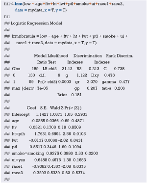
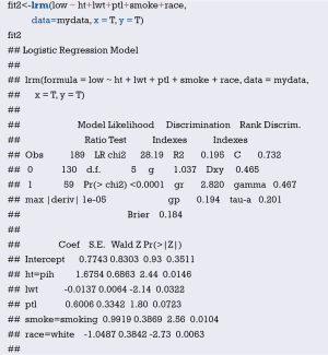
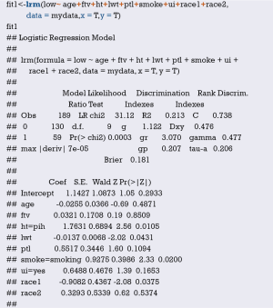
Fit the Logistic regression model using function lrm() and present the results of the model fitting and model parameters. Note: The parameter C of Rank Discrim Indexes. in the model can be directly read. This is the C-statistics of model “fit1”. According to the calculation results, the C-Statistics is 0.738 in this example. The meaning and calculation method of C-Statistic will be further explained in the following sections.
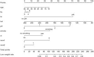
Use function nomogram() to construct the Nomogram object “nom1” and print the Nomogram. The result is shown in Figure 3.
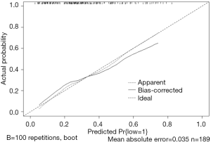
Use the function calibrate() to construct the calibration curve object “cal1” and print the calibration curve. The result is shown in Figure 4.
From the calculation results of Logistic regression model fit1 above and Figure 3, it is obvious that the contribution of some predictors to the model are negligible, such as the variable “ftv”. There are also some predictors that may not be suitable for entering the prediction model as dummy variable, such as “race”, and the clinical operation is cumbersome. We can consider conversing the un-ordered categorical variables into dichotomous variables properly and involve them into the regression model. The adjusted codes are as follows:
First of all, according to the actual situation, we convert the unordered categorical variable “race” into a binominal variable. The standard of conversion is mainly based on professional knowledge. We classify “white” as one category and “black and other” as another.
Use function datadist() to “package” the current data set.
Exclude the variable “ftv” that contributes less to the result from the regression model, then reconstruct model “fit2” and display the model parameters. It can be seen that C-Statistics =0.732.
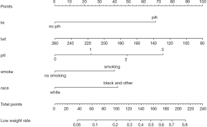
Use the function nomogram() to construct Nomogram object “nom2”, and print the Nomogram. The result is shown in Figure 5.
Nomogram interpretation: It is assumed that a pregnant woman has the following characteristics: pregnancy-induced hypertension, weight of 100 pounds, two premature births, smoking, and black. Then we can calculate the score of each feature of the pregnant woman according to the value of each variable: pregnancy-induced hypertension (68 points) + weight 100 pounds (88 points) + two premature births (48 points) + smoking (40 points) + black (42 points) =286 points. The probability of occurrence of low birth weight infants with a total score of 286 is greater than 80% (22,24). Note that the portion exceeding 80% in this example is not displayed on the Nomogram. Readers can try to adjust the parameter settings to display all the prediction probabilities with the range of 0–1.
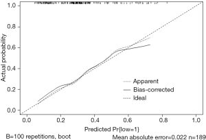
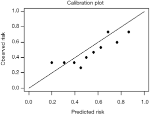
Use function calibrate() to construct the calibration curve object “cal2” and print the calibration curve. The result is shown in Figure 6 below.
Interpretation of calibration curve: In fact, the calibration curve is a scatter plot of the probability of actual occurrence versus prediction. Actually, the calibration curve visualizes the results of Hosmer-Lemeshow fit goodness test, so in addition to the calibration curve, we should also check the results of Hosmer-Lemeshow fit goodness test. The closer to Y = X the prediction rate and the actual occurrence rate are, with p value of Hosmer-Lemeshow goodness-of-fit test greater than 0.05, the better the model is calibrated (24). In this case, the Calibration curve almost coincides with the Y = X line, indicating that the model is well calibrated.
[Case 2] analysis
[Case 2]
Survival in patients with advanced lung cancer from the North Central Cancer Treatment Group. Performance scores rate how well the patient can perform usual daily activities. Total 10 variates:
- inst: Institution code;
- time: Survival time in days;
- status: censoring status 1=censored, 2=dead;
- age: Age in years;
- sex: Male=1 Female=2;
- ph.ecog: ECOG performance score (0=good 5=dead);
- ph.karno: Karnofsky performance score (bad=0-good=100) rated by physician;
- pat.karno: Karnofsky performance score as rated by patient;
- meal.cal: Calories consumed at meals;
- wt.loss: Weight loss in last six months.
The case data set is actually survival data. In order to be consistent with the theme of this Section, we only consider the binominal attribute of the outcome (status 1 = censored, 2 = dead). Again, we select the Logistic regression model to construct and visualize the model, draw Nomogram, calculate C-Statistics, and plot the calibration curve.
[Case 2] R codes and its interpretation
Load survival package, rms package and other auxiliary packages.
Demonstrate with the “lung” data set in the survival package. We can enumerate all the data sets in the survival package by using the following command.
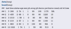
Read the “lung” data set and display the first 6 lines.
You can use the following command to display the variable descriptions in the lung dataset.
Variable tags can be added to dataset variables for subsequent explanation.
According to the requirements of rms package to build the regression model and to draw Nomogram, we need to “package“ the data in advance, which is the key step to draw Nomogram, Use the command “?datadist” to view its detailed help documentation.
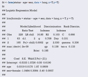
Using “status” as the dependent variable, “age” and “sex” as the independent variables, the Logisitc regression model “fit” was constructed, and the model parameters were shown. It can be seen that C-Statistics =0.666.
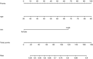
Use function nomogram() to plot Nomogram of the risk estimate for the Logisitc regression model “fit”, as shown in Figure 7.
The graphic interpretation is the same as before.
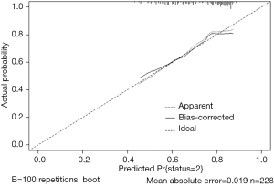
Use the calibrate() function to construct the object of calibration curve “cal” and print the calibration curve. The result is shown in Figure 8.
The graphic interpretation is the same as before.
Brief summary
In summary, this section introduces the construction of Logistic regression prediction model and drawing of Nomogram. It should be noted that to assess the practical value of a prediction model, its operability should be considered as well as the accuracy of its prediction. In addition to the internal validation, external validation is sometimes necessary. In this case, as the external validation data is not obtained, the external validation process is not demonstrated, and validation is only performed in the original data set with Bootstrap method.
Method of building nomogram based on Cox regression model with R
Background
Human beings are always crazy about “fortune-telling”. Whether it is “fortune-telling” in Chinese culture or “astrology” in Western culture, it all shows people’s enthusiasm for this. In this section, we will discuss another scientific “fortune-telling”. It is a model which will assess the prognosis of patients. As an oncologist, you will be confronted with questions like “how long will I survive” from patients suffering cancer during clinical practice. It is really a gut-wrenching question. Mostly, we can tell a median survival time based on the staging of corresponding disease. Actually, clinical staging is the basis for our predication for these patients or in other word it is “predicting model”. We answer this question by median survival time according to its clinical stage. It could bring new questions because it may not be so accurate to predict the survival time of specific individual by median time of a group of people. No can tell whether this specific individual will enjoy better or worse prognosis (15,17).
Is there any possibility we can calculate the survival of every patient by a more accurate and scientific method? The answer is yes. We can firstly construct a mathematical model by Cox proportional hazard model, and then visualize parameter associated with the patient’s survival by Nomogram. This paragraph can relatively accurately calculate the survival probability of each patient. Nomogram in essence is the visualization of regression model. It sets the scoring criteria according to the regression coefficients of all the independent variables, and then gives each scoring value of each independent variable, so that for each patient, a total score can be calculated. A transfer between the occurrence probabilities and the outcome is calculated to by function and the probability of each patient’s outcome can be obtained. For example, we have 40-year-old male pancreatic cancer patient who have went through operation. The clinical stage is IV. The tumor locates in the head of pancreas and intraoperative radiotherapy is applied. Peritoneal metastasis is present. We can calculate the total score according to all this available information by a mathematical model: 40-year-old can be scored 10 points; gender of male can be scored 4 points and so on… Finally, the total score can be obtained. Different score will be with different survival probability in 3 months, 6 months and 1 year. Complicated Cox regression formula now is visual graph. Practitioners can calculate the survival probability of each patient conveniently and relatively accurate “fortune-telling” can be present to each patient. In the previous episode, we talked about Logistic regression Nomogram. Cox regression Nomogram is quite similar with the Logistic Nomogram in interpretation (15,17).
Like the previous episode, the first question is when should we choose Cox regression? It is actually about the method choosing in multiple variable analysis. If the outcome we are observing is survival, or we call it “Time to event” survival outcome, we can choose Cox regression model. We have already introduced how to screen variables in the 2nd section. We should also pay attention to the balance between the numbers of variables you are going to bring in the prediction model and the convenience, practicality of the model. We will show two examples of Nomogram construction with R. Detailed performance of R application will be present here instead of principles of statistics behind.
[Example 1] analysis
[Example 1]
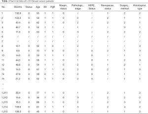
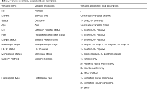
Here we will use the data in [Example 1] to introduce the construction of survival prediction model and corresponding Nomogram. Original data have been simplified for better understanding and practice. The clinical data of 1,215 invasive breast cancer patients is downloaded from TGCA (https://genome-cancer.ucsc.edu/). We have simplified the original data by steps in Table 1. The definition and assignment of variables is present in Table 2. We will try to construct survival prediction model and corresponding Nomogram of this cohort. The readers can download original data and R code in the attachment file of this episode for better practice.
Full table
Full table
[Example 1] analysis
This cohort is about the construction of prognosis predication model. Steps are as follow:
- Cox regression will be used and screening independent prognostic factors based on training sets and predictive models can be built firstly. The data sets used for modeling are generally referred to as training set or internal data set. You can refer to already published Intelligent Statistics and Crazy Statistics (15,17) for the details about data entry, univariable Cox regression and multivariable Cox regression. Finally, we get three independent variables for prognosis: age, PgR, Pathologic_stage.
- Building Nomogram based on these three variables (these 3 have been treated as independent variable in this Cox model)
- Assessing the discrimination efficiency of these models. C-Index will be calculated.
- Validation of this model can be performed by external data set. If external data set is not available, bootstrap resampling methods based on internal data set and Calibration Plot will be recommended for validation (22,24).
Building of Cox regression model-based Nomogram, C-Index calculation, Bootstrap resampling methods and Calibration Plot are emphasized here. All processing can be done by R (R software downloading: https://www.r-project.org/). All data processed will be save as “BreastCancer.sav” and put under the R current running directory. The results will show in Figures 9 and 10.
[Example 1] R codes and its interpretation
Load the rms package and the necessary helper packages.
Data preparation, loading external data in “.sav” style format.
Convert the data set “breast” to data frame format.
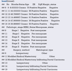
Display the first 6 rows of data in the breast data frame.
Define the endpoint event: define the ending value “Dead” as the endpoint event “dead” .
Set the reference levels of polytomous variable.
Build Cox regression formula by function cph() in rms package.
Build survival function object and define them as surv1, surv2, surv3.
Data integrating by function datadist() (This is compulsory processing in rms package during the construction of regression model).
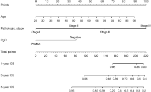
Build Nomogram: “maxscale” means the highest point, which will be set from 100 or 10 points; “un.at” means survival scale setting; “xfrac” means the distance between data axis set and left label, which can regulate parameter value to observe the change of Nomogram. The meaning of other parameter can be found in the help menu of nomgram() function.
Nomogram interpretation: point in Figure 9 is a selected scoring standard or scale. For each independent variable, a straight line perpendicular to the Points axis (through a ruler) is made at that point, and the intersection point represents the score under the value of the independent variable. For example, Age at 25 means 0 point; CEA at 90 means 100 points. The corresponding points of these independent variables of each patient can be calculated in total. We can get total points, which will locate to the survival axis with a perpendicular line. This will indicate the survival rate of this patient (3- or 5-year OS).
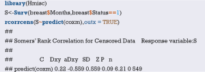
Calculation of C-Index.
The meaning of C-Index in R code is similar to that of ROC. It will range from 0–1. The closer it gets to 1, the greater predicting value of this Cox regression model. Generally speaking, if C-Index equals 0.7, the model is with very good predicting value. In this example, C-Index equals 0.7503 and se(C-Index) equals 0.02992. All results above are the direct output of the software (23).
Calculation complement of C-index.
Standard curve will be built. u should be in accord with the f defined in time.inc in the previous regression model. If ime.inc is 60 in f model, u should be 60.m will be in line with sample size. Standard curve will divide all sample into 3 or 4 groups (in the chart it will present as 3 or 4 points).m means sample size of each group. So, m*3 equals or approximately equals the total sample size.
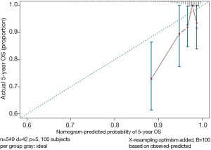
Print and modify the graphic parameters of the standard curve. The modified calibration curve is shown in Figure 10.
Interpretation of modified standard curve: we will validate the predicting efficiency of this Nomogram model based on bootstrap resampling method in internal data set. Lateral axis shows the predicated survival rate of each patient while the vertical axis shows the actual survival rate of each patient. It is ideal if the red line in the picture exactly coincides with the blue dotted line.
[Example 2] analysis
[Example 2]
Survival in patients with advanced lung cancer from the North Central Cancer Treatment Group. Performance scores rate how well the patient can perform usual daily activities. Total 10 variates:
- inst: institution code;
- Time: survival time in days;
- Status: censoring status 1 = censored, 2 = dead;
- Age: age in years;
- Sex: male =1, female =2;
- ph.ecog: ECOG performance score (0= good 5= dead);
- ph.karno: Karnofsky performance score (bad =0 to good =100) rated by physician;
- pat.karno: Karnofsky performance score as rated by patient;
- meal.cal: calories consumed at meals;
- wt.loss: weight loss in last six months.
[Example 2] interpretation
This cohort is about survival. Here, time to event attribute (status 1 = censored, 2 = dead) associated with outcome will be considered. Cox regression model will be built and visualization will be achieved through Nomogram. C-Index will be calculated and calibration curve will be drawn using R.
[Example 2] R codes and its interpretation
Loading survival package, rms package and other helper packages.
Demonstration with the lung data set in the survival package, we can use the following command to enumerate all the data sets in the survival package.
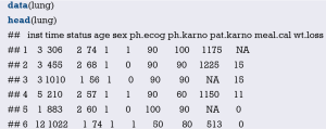
Read the lung data set and display the first 6 lines of the lung data set.
You can further use the following command to display the variable descriptions in the lung dataset.
Variable tags can be added to dataset variables for subsequent explanation.
“Packaging” data before the building of regression model and Nomogram by rms package. This is very important step for Nomogram building. Commend “?datadist” can enable you see the detailed helper document of this function.
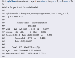
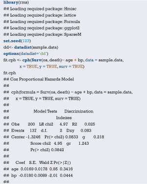
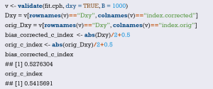
Cox regression fit will be built based on dependent variable time, status and independent variable age, sex. Show the parameter of this model. Dxy =0.206. C-Index =0.206/2+0.5 =0.603.
Median survival time calculating,
Build the survival function object surv.
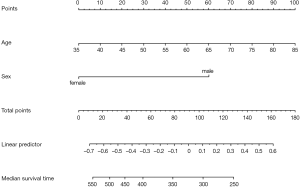
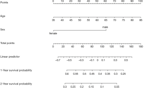
Build Nomogram of median survival based on Cox regression by commends as follow. As show in Figure 11.
The interpretation of this Nomogram can be referred to that of Example 1.
Next, Nomogram of survival rate will be built based on Cox regression. The unit for the survival time of lung data set is “day”. So, we will set the survival object (surv1, surv2) based on survival function firstly.
Or you can build survival Nomogram of Cox regression directly by commends as follow. As show in Figure 12.
The interpretation of this Nomogram can be referred to that of Example 1.
C-Index can be calculated by commends as follow. This will give objective assessment of this model.
The parameter C here is 0.397 (C=0.397). It is actually the complement of C-Index. So, we know C-Index is 0.603 (C-Index = 1 − 0.397 =0.603), which is totally exactly the same as we calculated before.
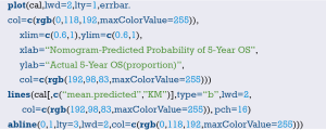
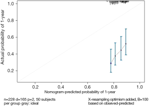
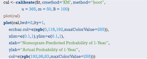
We can modify the curve by commends as follow (Figure 13). Firstly, calibrate() function is used to build the object cal. Then we print the graph, and you can use the graph parameters to beautify the calibration curve. Commend “?calibrate” can help you see more details about the parameters.
The interpretation of this graph can be referred to that of Example 1.
Brief summary
This episode has introduced the build of survival prediction model and Nomogram. A good model should be in convenient application and with accurate predicting efficiency. External validation is as important as internal validation in accuracy assessment. In our examples, external validation is not present for better external data set is not available. Many articles about Nomogram of clinical prediction have been published. It is better in “fortune-telling” than that of TNM staging. However, practitioners are still used to TNM staging system in “fortune-telling”. Maybe, TNM staging is much more convenient. From this perspective, less variables should be included during the building of Nomogram to ensure much more convenience in clinical practice. That will lead to another question: which one should be put in priority, the accuracy or the practicality? It really depends on purpose of this research.
Calculation C-Statistics of Logistic regression model with R
Background
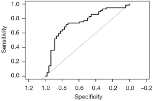
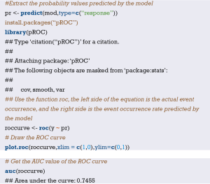
In the previous two sections, we mentioned the R building Logistic regression model and the Cox regression model, and briefly introduced the C-Statistics and C-index calculation methods of the model, but did not focus on it. In this section, we will detail the C-Statistics for calculating Logistic regression models using R. In fact, the receiver operating characteristic curve (ROC) of the Logistic regression model was based on the predicted probability. The area under the ROC curve (AUC) is equal to C-Statistics, so the IBM SPSS software can also calculate C-Statistics, which is not repeated here (15,17).
When we build a regression model through the training set, how do we scientifically evaluate the accuracy of a regression model prediction? For example, there are two fortune tellers each with a stall on a street corner. Miss Wang wishes to get her marriage fortunes told by one of these fortune tellers. Who should she ask? Mr. Zhang or Mr. Li? A simple choosing method would be to go with whomever is more accurate. However, this can only be known by past customers’ word of mouth. Clinical prediction models are similar to this. The most fundamental requirement is to ensure that the predictions are accurate. So how do you evaluate if a prediction model is accurate? In general, the merits of a prediction model can be evaluated using the following three aspects (22-24).
Discrimination index
It refers to the predictive ability of the regression model to distinguish between diseased/no disease, effective/ineffective, and dead/alive outcomes. For example, there are 100 people, 50 are diagnosed to have the disease, and 50 do not have the disease; we used the prediction method to predict that 45 are sick and 55 are not. Then the number of the 45 people that overlap with the 50 people who are really sick directly determines the accuracy of your model’s predictive ability, which we call “accuracy”. It is usually measured by ROC curve and C-Statistics (the AUC in the Logistic regression model is equal to C-Statistics). Of course, Net Reclassification Index (NRI) and integrated discrimination improvement (IDI) are parts of the other metrics. We will explain these further in the following sections (25-27).
For each individual, we do not want to misdiagnosis or failure to diagnosis. Therefore, for the Logistic regression prediction model, the ROC curve is often drawn as a diagnostic test to judge the degree of discrimination. The difference is that the indicator we use to plot the ROC curve is no longer a clinical test result, but the predicted probability of the Logistic regression model. Judging whether the event occurs based on the magnitude of the predicted probability, we will get a series of sensitivity and specificity for plotting the ROC curve, which will help us to understand whether the constructed predictive model can accurately predict the occurrence of the event.
Consistency and calibration
It refers to the consistency of the probability of actual occurrence and the probability of prediction. It seems a bit puzzling that we still cite the above example. The 100 people we predicted do not mean that we really use the model to predict whether a person has the disease or not. The model only gives us the probability of people being sick, based on the probability being greater than a certain cutoff value (e.g., 0.5) to determine if the person has the disease or not. For example, there are 100 people, we will finally get 100 probabilities through the model which range from 0 to 1. We ranked the 100 probabilities in order from small to large, and then divided them into 10 groups with 10 people in each group. The actual probability is actually the proportion of diseases in these 10 people, the predicted probability is the average of the 10 ratios predicted by each group, and then compare the two numbers, one as the abscissa and one as the ordinate. A calibration Plot is obtained, and the 95% range of the plot can also be calculated. In the logistic regression model, sometimes the consistency can also be measured by the Hosmer-Lemeshow goodness-of-fit test. The calibration curve is a scatter plot of the actual incidence and predicted incidence. Statistically, the calibration curve is a visualized result of the Hosmer-Lemeshow goodness of fit test (28-30).
It is worth noting that a well-differentiated model may have a poor calibration. For example, it can determine that the risk of a person’s disease is five times that of another person. It determines that the risk of the two people is 5% and 1%, respectively. In fact, the risk of the two is 50% and 10%, respectively. The model is also quite outrageous, which is a bad calibration. The calibration of the model can be tested with Hosmer-Lemeshow. If the results are statistically significant, there is a difference between the predicted and observed values. Discrimination and calibration are important evaluations for a model, but many newly developed models are not fully evaluated. A systematic review of cardiovascular system risk prediction models found that only 63% of the models reported Discrimination, and even fewer models reported Calibration, at 36%.
R-squared (R2)
The Coefficient of determination, also commonly known as “R-squared”, is used as a guideline to measure the accuracy of the model, which is a combination of metrics discrimination and consistency. The model determines the coefficient R2 to be more comprehensive, but slightly rough (31,32).
Below we will explain the method of calculating C-statistics in R language in a classic case of Logistic regression. As with the previous Sections, the focus is on the process of using R language calculation instead of complex statistical principles.
Case analysis
[Case 1]
Hosmer and Lemeshow studied the influencing factors of low birth weight in infants in 1989. The outcome variable was whether or not to deliver low birth weight infants (variable name “low”, dichotomous variable, 1= low birth weight, which birth weight <2,500 g; 0= non-low birth weight), consideration influencing factors (independent variable) may include: maternal pre-pregnancy weight (lwt, unit: pounds); maternal age (age, unit: year);maternal smoking during pregnancy (smoke, 0 = not sucked, 1 = smoking); pre-pregnancy premature births (Ptl, unit: times); whether the birth mother has high blood pressure (ht, 0= not suffering, 1= sick); uterus stress on contraction, oxytocin and other stimuli (ui, 0= no, 1= yes); the number of community physician visits in the first three months of pregnancy (ftv, unit: times); race (race, 1= white, 2= black, 3= other ethnic groups). We sorted out the data in this example and named it “Lowweight.sav”, which is stored in the current working path. For the convenience of the reader, the data and code can be downloaded in the attachment to this Section.
[Case 1] analysis
The dependent variable is a binary outcome variable (whether low birth weight or not) in this case. The purpose of the study was to investigate the independent influencing factors of low birth weight infants, which is consistent with the application conditions of binary Logistic regression. We construct a Logistic regression equation with “age + ftv + ht + lwt + ptl + smoke + ui + race” as the independent variable and “low” as the dependent variable. Based on this Logistic regression model, we have three methods to calculate its C-Statistics:
- Method 1. Use the lrm() function in the rms package to construct a logistic regression model and directly read the model “Rank Discrim. Indexes” Parameter C, which is C-Statistics.
- Method 2. Construct a logistic regression model, predict() function to calculate the model prediction probability, then use the ROCR package to draw the ROC curve according to the predicted probability, and calculate the area under the curve (AUC), which is C-Statistics. Note: This method is consistent with the calculation method in SPSS.
- Method 3. Construct a logistic regression model, predict() function to calculate the model prediction probability, and directly calculate the area under the ROC curve AUC by using the somers2 function in the Hmisc package. Note: This method is consistent with the calculation method in SPSS.
R codes of calculation process
Load the foreign package and the rms package.
Import external data in .sav format and convert the data into a data frame structure while presenting the first 6 rows of the data frame.
Set the ending variable to two categories, define “low weight” as “1”, and set the unordered multi-class variable “race” to a dummy variable.
Load the data into the current working environment and “package” the data using the datadist() function.
The logistic regression model was fitted using the lrm() function in the rms package.
- Method 1. Directly read the Rank Discrim. parameter C in the model parameters, ie C-Statistics = 0.738.
- Method 2. Calculate the AUC using the ROCR package, the code is as follows:
- Method 3. Hmisc package somers2 () function calculation, we can see that AUC = 0.7382, consistent with the above calculation results.
First, calculate the prediction probability of constructing the logistic regression model.
Load the ROCR package.
Use the prediction() function to build the object “pred”, and the performance() function to build the object perf to plot the ROC curve.
Draw the ROC curve as shown in Figure 14 below.
Calculating the area under the ROC curve (AUC) is C-statistics =0.7382008, which is consistent with the above calculation results.
Brief summary
In fact, no matter which method we use, the standard error of C-Statistics is not directly given, so the calculation of the confidence interval is very troublesome, which is not as convenient as SPSS software. If you want to report the C-Statistics confidence interval for various practical needs, you can consider using SPSS software for ROC analysis. SPSS software can directly give the standard error and confidence interval of AUC. Readers can try it themselves. If you want to compare the area under the ROC curve of two models, AUC or C-Statistics, you can refer to the following formula:
You can check the Z distribution table according to the Z value to get the P value.
So far, the demonstration of the three methods of calculating C-Statistics in Logistic regression in this section has completed.
Calculation C-Index of Cox regression model with R
Background
In the past decade, there has been an increase in the number of articles in the clinical research that have a predictive model for construction and validation. What is the predictive model? In short, the predictive model predicts clinically unknown outcomes by known parameters, and the model itself is a mathematical formula. That is, by using the so-called model with the known parameters to calculate the probability of an unknown outcome, which is called prediction.
The statistical nature of the clinical prediction model is regression modeling analysis. The essence of regression is to find the mathematical relationship between the dependent variable Y and multiple independent variables X. There are three types of regression modeling that are most commonly used in clinical research: multiple linear regression, Logistic regression, and Cox regression. When we construct a regression model through variable selection in the training set, how do we scientifically evaluate the accuracy of a regression model prediction? As the example given in the previous section, there are two fortune tellers each with a stall on a street corner. Miss Wang wishes to get her marriage fortunes told by one of these fortune tellers. Who should she ask? Mr. Zhang or Mr. Li? A simple choosing method would be to go with whomever is more accurate. However, this can only be known by past customers’ word of mouth. Clinical prediction models are similar to this. The most fundamental requirement is to ensure that the predictions are accurate. So how do you evaluate if a prediction model is accurate? In general, the merits of a prediction model can be evaluated using the following three aspects (15,17).
Discrimination ability
It refers to the predictive ability of the regression model to distinguish between diseased/no disease, effective/ineffective, and dead/alive outcomes. For example, there are 100 people, 50 are diagnosed to have the disease, and 50 do not have the disease; we used the prediction method to predict that 45 are sick and 55 are not. Then the number of the 45 people that overlap with the 50 people who are really sick directly determines the accuracy of your model’s predictive ability, which we call “accuracy”. It is usually measured by ROC curve and C-Statistics (AUC in the Logistic regression model is equal to C-Statistics). Of course, NRI and IDI are parts of the other metrics. We will explain these further in the following sections (25-27).
C-Index is a general indicator, especially for the evaluation of the discriminative ability of the Cox regression model (33,34). The C-Index has a range between 0.5 to 1.0. C-Index =0.5 is completely inconsistent, indicating that the model has no predictive effect; C-Index =1.0 is completely consistent, indicating that the model prediction results are completely consistent with the actual. It is generally considered that the C-Index is lower accuracy between 0.50 and 0.70, moderate accuracy between 0.71 and 0.80, higher accuracy above 0.80, and extremely high accuracy above 0.9. C-Index (the full name Concordance Index) is also often written as Harrell’s C-Index, Concordance C, C-statistic, etc., which mainly used to reflect the discriminative ability of predictive models, first proposed by Harrell, professor of biostatistics at Vanderbilt University in 1996, to see if the model can make accurate predictions.
The definition of C-Index is very simple, C-Index = concordant pairs/useable pairs. Imagine pairing all the subjects randomly, N subjects will produce N*(N-1)/2 pairs. If the sample size N is large, the calculation is huge and must be done with computer software. We first find the concordant pairs as molecules. What is the concordant pair? Taking the survival analysis Cox regression analysis as an example, if the actual survival time is longer, the predicted survival probability is larger, or the survival time with shorter survival time is smaller, that is, the prediction result is consistent with the actual result, on the contrary, it is inconsistent. Then we find useable pairs in so many pairs as the denominator. What is a useable pair? In the case of Survival Analysis Cox Regression Analysis, for example, at least one of the two pairs of useable pairs required to have a target endpoint event. That is to say, if the paired two people do not have an end point event throughout the observation period, they are not included in the denominator. In addition, there are two other situations that need to be excluded:
- If one of the paired two people has an end point event and the other person loss of follow-up, this situation cannot compare the survival time of the two, these parried should be excluded;
- The two pairs of people who died at the same time should also be excluded. After finding a useable pair as the denominator, how do we determine the molecule?
What is the relationship between C-Index and AUC? We have said that C-Index is an indicator that can be used to evaluate the distinguish ability of various models. For the binary logistic regression model, C-Index can be simplified as: the probability of predicting the disease of a patient with a disease is greater than the probability of predicting the disease. It has been shown that the C-Index for the binary logistic regression is equivalent to AUC. AUC mainly reflects the predictive ability of the binary logistic regression model, but C-Index can evaluate the accuracy of various model prediction results. It can be easily understood that C-Index is an extension of AUC, and AUC is a special case of C-Index.
Consistency and calibration
It refers to the congruency of the probability of actual occurrence and the probability of prediction. It seems a bit puzzling that we still cite the above example. The 100 people we predicted do not mean that we really use the model to predict whether a person has the disease or not. The model only gives us the probability of people being sick, based on the probability being greater than a certain cutoff value (e.g., 0.5) to determine if the person has the disease or not. For example, there are 100 people, we will finally get 100 probabilities through the model which range from 0 to 1. We ranked the 100 probabilities in order from small to large, and then divided them into 10 groups with 10 people in each group. The actual probability is actually the proportion of diseases in these 10 people, the predicted probability is the average of the 10 ratios predicted by each group, and then compare the two numbers, one as the abscissa and one as the ordinate. A Balance Plot is obtained, and the 95% range of the plot can also be calculated. In the logistic regression model, sometimes the consistency can also be measured by the Hosmer-Lemeshow goodness-of-fit test. The calibration curve is a scatter plot of the actual incidence and predicted incidence. Statistically, the calibration curve is a visualized result of the Hosmer-Lemeshow goodness of fit test (28,29,35).
It is worth noting that a well-differentiated model may have a poor calibration. For example, it can determine that the risk of a person’s disease is five times that of another person. It determines that the risk of the two people is 5% and 1%, respectively. In fact, the risk of the two is 50% and 10%, respectively. The model is also quite outrageous, which is a bad calibration. The calibration of the model can be tested with Hosmer-Lemeshow. If the results are statistically significant, there is a difference between the predicted and observed values. Discrimination and calibration are important evaluations for a model, but many newly developed models are not fully evaluated. A systematic review of cardiovascular system risk prediction models found that only 63% of the models reported Discrimination, and even fewer models reported Calibration, at 36%.
R-squared (R2)
The Coefficient of determination, also commonly known as “R-squared”, is used as a guideline to measure the accuracy of the model, which is a combination of metrics discrimination and consistency. The model determines the coefficient R2 to be more comprehensive, but slightly rough.
Calculation methods of C-Index
In many clinical articles, it is often seen that the discriminating ability of the description method in the statistical method is measured by C-Statistics or C-Index. Below we use the R language to demonstrate the calculation method of C-Index in this Cox regression. The C-Statistics calculation for Logistic regression has been introduced in Section 5. As with the previous Sections, the focus of this article is on the R language calculation process. We try to avoid the complex statistical principles.
Strictly speaking, C-Index includes the following types. We only introduce the first one that is more commonly used in clinical practice.
- Harrell’s C;
- C-statistic by Begg et al. (survAUC::BeggC);
- C-statistic by Uno et al. (survC1::Inf.Cval; survAUC::UnoC);
- Gonen and Heller Concordance Index forCox models (survAUC::GHCI, CPE::phcpe, clinfun::coxphCPE).
There are two common calculation methods for C-index in the Cox regression model:
- Method 1: output directly from the function coxph() of the survival package, the version of R needs to be higher than 2.15. You need to install the survival package in advance to see that this method outputs C-Index (corresponding to model parameter C). The standard error is also output, and the 95% confidence interval can be obtained by adding or subtracting 1.96*se from C. This method is also applicable to many indicators combined (22-24).
- Method 2: using the cph() function and the validate() function in the rms package, both un-adjusted and bias adjusted C-Index are available (23).
R code and its interpretation
Simulate a set of survival data and set it to the data frame structure, age and bp are the independent variables, os and death are the survival ending, the data frame is named “sample.data“, and the first 6 lines of the data frame are displayed:
- Method 1. survival package, load the survival package, coxph () function to fit the cox regression model, summary () function to display the model results and assign to the object sum.surv, the model parameter concordance is displayed, it is C-Index. This example C-Index =0.5416, se(C) =0.02704
- Method 2. rms package, build a Cox regression model, read the model parameter Dxy, Dxy*0.5+0.5 is C-Index. Note: the seed is set here using the set.seed() function in order to repeat the final result because the adjusted result of the validate function is random.
Calculate the adjusted C-Index and the un-adjusted C-Index, and the result is as follows.
Un-adjusted C-Index =0.5416, adjusted C-Index =0.5276.
Brief summary
C-Index is one of the most important parameters in the evaluation of Cox regression model. It reflects the pros and cons of the model prediction effect and is an important parameter to measure the discrimination of the model. However, this parameter cannot be calculated in IBM SPSS. This Section has described two methods of R language calculation and grasping one of them would be sufficient. The author recommends the first one, because it reports C-Index and its standard error at the same time and can thus conveniently calculate the confidence interval of C-Index.
Calculation method of NRI with R
Background
NRI was originally used to quantitatively evaluate the improvement in classification performance of the new marker over the original marker. Since NRI is capable of evaluating the precision of a diagnostic test, NRI could also be used to evaluate the performance of a predictive model because statistically diagnostic test and predictive model are the same. Based on published clinical trials, NRI has been widely used to compare the accuracy of two predictive models. We have discussed the methods to compare the accuracy and discrimination of two predictive models such as C-Statistics and AUC. However, both methods have several limitations.
- C-Statistic/AUC lacks sensitivity. When evaluating the improvement of predictive performance of a predictive model after incorporating a new marker, the improvement of C-Statistic/AUC is always small, therefore the new marker sometimes fails to significantly improve C-Statistic/AUC.
- The meaning of C-Statistic/AUC is hard to understand and properly explain in clinical use.
NRI overcomes these two limitations.
Calculation method of NRI
We use a dichotomous diagnostic marker as an example to explain the principle of NRI calculation and then quantitatively compare predictive performance of different models. Calculation of NRI could be done by using customized function in R or by using formula. Comparison of performance of predictive models requires statistical software. In short, the original marker would classify study objects into patients and non-patients while the new marker would reclassify study objects into patients and non-patients. When comparing results of classification and reclassification, some objects may be mistakenly classified by original marker but corrected by new marker and vice versa. Therefore, classification of study objects changes when using different markers. We use the change to calculate NRI (26,27,36). It may look confusing, but calculation below could help readers to understand the concept.
First, we classify study objectives into diseases group and healthy group using gold standard test. Two matched fourfold tables are generated from the classification results using original and new markers within two groups, as shown below in Tables 3 and 4.

Full table
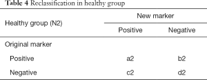
Full table
We mainly focus on study objects who are reclassified. As shown in Tables 3 and 4, in disease group (N1 in total), c1 objects are correctly classified by new marker and mistakenly classified by original marker, b2 objects are correctly classified by original marker and mistakenly classified by new marker. So, comparing to original model, improved proportion of correct classification in new model is (c1 − b1)/N1. Similarly, in healthy group (N2 in total), b2 objects are correctly classified by new marker and mistakenly classified by original marker, c2 objects are correctly classified by original marker and mistakenly classified by new marker. improved proportion of correct classification in new model is (b2 − c2)/N2. At last, combining two groups together, NRI = (c1 − b1)/N1 + (b2 − c2)/N2, which is often refer to as absolute NRI.
If NRI > 0, it means positive improvement, which indicates that new marker has better predictive value comparing to original marker; If NRI <0, it means negative improvement, which indicates that new marker has worse predictive value comparing to original marker; If NRI =0, it means no improvement. We could calculate z-score to determine whether the difference between new model and original model reaches a significant level. Z-score obeys standard normal distribution. Formula for Z-score calculation is listed below. P value could be calculated from Z-score.
The example described above is a dichotomous diagnostic marker. In predictive model studies, situation is more complicated. But the principle is the same. Making diagnosis solely based on a dichotomous diagnostic marker seems to be too “crude”, researchers may be more concerned with the risk of having disease in the future instead of the present status of having or not having a disease. And predictive model could offer the probability of developing a disease or other outcome. For example, study objects could be classified into low-risk group, intermediate-risk group and high-risk group based on predicted risk probability. If outcome variable is multiple categorical variable, ROC analysis is not appropriate because outcome variable of ROC analysis is often dichotomous. If outcome variable is multiple categorical variable, ROC may present to be spherical surface, which is hard to draw. Even if ROC was drawing, it is also hard to compare AUC of two predictive model directly, which makes it complicated to explain its clinical significance. However, NRI could easily solve these problems. So how does NRI solve these problems?
Take the paper about the methodology of NRI calculation published on Stat Med for example (26). Based on the famous Framingham Heart Study, researchers assessed the improvement of new model which incorporate high density lipoprotein-C (HDL-C) with classic model in the prediction of 10-year risk of coronary heart disease (CHD). Researchers compare the AUC of the new model and classic model. Results showed that AUC of two models were 0.774 and 0.762, respectively. AUC only increased 0.012 after incorporating HDL-C and failed to reach a significant level (P=0.092), which indicated that new model had no significant improvement as shown in Figure 1 in the paper (26). Researchers further classified study objects into low-risk group (<6%), intermediate-risk group (6–20%) and high-risk group (>20%) as shown in Table 2 (26). Researchers also calculated NRI (NRI =12.1%), z-score (z-score =3.616) and P value (P<0.001), which indicated that incorporating new marker improved the predictive performance and the proportion of correct classification increased 12.1%.
The Principle of NRI has been fully discussed above. Here we discuss how to calculate NRI using R software. There are three circumstances:
- To calculate how much predictive performance of a new marker improves comparing to original marker could use formula listed above or use R code in reference material to calculate NRI;
- To calculate NRI of two predictive models constructed by Logistic regression;
- To calculate NIR of two predictive models constructed by Cox regression.
The calculation method using R is listed below (Table 5) (27,37-39). We mainly demonstrate how to calculate NRI using “nricens” package, which is highly recommended.

Full table
Case analysis
The calculation of NRI of two markers
[Case 1]
Researchers wanted to assess the predictive value of two diagnostic tests for diabetes. They used three methods (gold standard test, diagnostic test1 and diagnostic test2) to evaluate the disease status of 100 patients. The data used here is documented in appendix “diagnosisdata.csv”. Disease status predicted by gold standard test and assessing diagnostic test were listed, of which “gold” represented results of gold standard test (1= disease, 0= healthy); “t1” represented results of diagnostic test1 (1= positive, 0= negative); “t2” represented results of diagnostic test2 (1= positive, 0= negative). Readers could use formulas listed above. Here we use our own R codes to calculate NRI of two diagnostic tests. We have sorted the data, renamed it as “diagnosisdata.csv” and stored in current working directory. To make it easier for readers to practice, data and codes are available for download in appendix of this article.
R codes and its interpretation
Because there is no function available for direct calculation of NRI, we need to define function named NRIcalculate() function based on the definition we describe above. R Codes are presented below:
Copy case data set to current working directory, load case data and set data format as data frame. Codes are presented below:
Using NRI calculation function NRIcalculate() to calculate NRI. Codes are presented as below:
m1 is variable name of diagnostic test1, m2 is variable name of diagnostic test2 and gold is gold standard test. NRI is 0.566, NRI of diagnostic test1 is significantly higher than diagnostic test2.
NRI calculation of dichotomous outcome
[Case 2]
This data is from the Mayo Clinic trial in primary biliary cirrhosis (PBC) of the liver conducted between 1974 and 1984. A total of 424 PBC patients, referred to Mayo Clinic during that ten-year interval, met eligibility criteria for the randomized placebo-controlled trial of the drug D-penicillamine. The first 312 cases in the data set participated in the randomized trial and contain largely complete data. The additional 112 cases did not participate in the clinical trial, but consented to have basic measurements recorded and to be followed for survival. Six of those cases were lost to follow-up shortly after diagnosis, so the data here are on an additional 106 cases as well as the 312 randomized participants.
We use data from the first 312 patients to predict survival status at the time point of 2,000 days. It should be noted that the original data is a survival data. Here we define a dichotomous outcome (alive or dead), regardless of survival time. First load the dataset, as shown in Table 6. “Status” is the outcome variable, “0” means censored, “1” means liver transplant, “2” means dead. But outcome of our study is dichotomous, therefore it requires data conversion. As for “time” variable, some samples failed to reach 2,000 days, which showed that these patients died or censored before 2,000 days. Here we deleted data which failed to reach 2,000 days. The detailed description of other variables is available using “?pbc”.
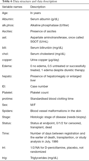
Full table
A nearly identical data set found in appendix D of Fleming and Harrington; this version has fewer missing values.
R codes and its interpretation
Firstly, we load “nricens” package and the dataset, then extract first 312 observations.
We delete the data of which follow-up time is shorter than 2,000 days. “[]” stands for filter, “|” stands for “or”, “&” stands for “and”. So, data with “time” >2,000 and data with “time” <2,000 but “status” is “dead” are selected. Do not miss the last “,”. “,” means selecting all rows which fits the filter.
Define the endpoint: 1 stands for time <2000 and status = 2 (dead), 0 stands for others.
Build a matrix out of a subset of dat containing age, bili and albumin.
Build a matrix out of a subset of dat containing age, bili, albumin and protime.
Construct two logistic regression model: mstd and mnew. Model “mnew” has one more variable “protime”. Calculation using “nricens” package requires x = TRUE, which means that output contains the matrix.
Calculating the predicted risk of two models.
Logistic models are fitted.
There are many ways to calculate NRI. Readers could choose any one. The first method is recommended.
- Calculation of risk category NRI using (‘mdl.std’, ‘mdl.new’).
- Calculation of risk difference NRI using (‘event’, ‘z.std’, ‘z.new’).
- Calculation of risk difference NRI using (‘event’, ‘z.std’, ‘z.new’).
- Calculation of risk difference NRI using (‘mdl.std’, ‘mdl.new’), updown = ‘diff’.
- Calculation of risk difference NRI using (‘event’, ‘z.std’, ‘z.new’), updown = ‘diff’.
- Calculation of risk difference NRI using (‘event’, ‘p.std’, ‘p.new’), updown = ‘diff’.
R code interpretation: the comparison of the predictive performance of two models. “cut” represents the cut-off value of predicted risk. Here we define two cut-off value, which stratifies the risk into three groups: low risk (0–20%), intermediate risk (20–40%) and high risk (40–100%). We convert the continuous variable to a categorical variable based on cut-off value of actual risk. “updown” is defined as how the predicted risk of one sample changes. “category” is categorical variable defined as low, intermediate and high risk. “diff” is a continuous value. When selected, “cut” is defined as one value, for example 0.02, which means that the difference of predicted risk between new and original model predicted risk more than 0.02 is defined as reclassification. “niter” is the number of iterations, namely number of resampling in bootstrap. The calculation of the standard error of NRI requires resampling method. If “niter” =0, standard error of NRI would not be calculated. Generally, set “niter” =1,000. If “niter” is too large, it takes a longer computing time and faster computing speed. However, the larger the “niter” is, the higher accuracy is. Significant level α is 0.05.
Results are listed as below:
Tables of all outcomes, positive outcomes and negative outcomes. In a predictive model, case means that outcome takes place, control means that outcome fails to take place.
Point estimation, standard error and confidence interval of NRI. Comparing to the original model, the proportion of correct reclassification improves −2.2727%. Incorporating a new variable reduces the predictive accuracy, the new model is worse than original model.
Outcome of survival data
[Case 3]
We use the same data with Case 2. The difference between NRI of survival data and NRI of categorical data is that the former needs to construct a cox regression model. So, we need to construct two cox models and calculate NRI of these two models.
R codes and its interpretation
Firstly, we load necessary packages and data.
Here consider pbc dataset in survival package as an example.
predciting the event of ‘death’.
standard prediction model: age, bilirubin, and albumin.
new prediction model: age, bilirubin, albumin, and protime.
Using coxph() to construct cox regression model: mnew and mstd
predicted risk at t0=2,000, predicted risk at the tome point of 2,000 days
There are many ways to calculate risk categorical NRI. Readers could choose any one. The first method is recommended.
- By the KM estimator using (‘mdl.std’, ‘mdl.new’).
- By the KM estimator using (‘time’, ‘event’, ‘z.std’, ‘z.new’).
- By the KM estimator using (‘time’,‘event’,‘p.std’,‘p.new’).
Calculation of risk difference NRI by the KM estimator, updown = ‘diff’.
Calculation of risk difference NRI by the IPW estimator, updown = ‘diff’.
The interpretation of R codes is the same with the NRI of dichotomous outcome mentioned above.
Results are presented as below.
Tables of all outcomes, positive outcomes and negative outcomes. In a predictive model, case means outcome takes place, control means that outcome fails to take place.
Point estimation, standard error and confidence interval of NRI. Comparing to the original model, the proportion of correct reclassification improves 11.028%. Incorporating a new variable improves the predictive accuracy, the new model is better than original model.
Brief summary
It is necessary to have a correct understanding of NRI. NRI and C-statistics evaluate the discrimination of models. Improvement of C-statistics sometimes is limited but NRI could significantly improves, which means that predictive performance of the new model improves significantly comparing to the original model. It should be noted that there is a little difference between R codes for dichotomous data and survival data. In this Section, we discuss the calculation of NRI. In the next Section, we will introduce the calculation theory and definition of another index, IDI.
Calculation method of IDI with R
Background
In the previous section about the principle and calculation methods of NRI, we compare AUC (also known as C-statistics) with NRI. NRI has two advantages:
- NRI is more sensitive than C-statistics/AUC derived from ROC (26);
- NRI is easier to understand in clinical practice when a cut-off value is given, for example, a cut-off value of a diagnostic marker or cut-off values to stratify low risk, intermediate risk and high risk (27).
However, NRI has its disadvantages: NRI only considers performance improvement at one time point and fail to evaluate the overall improvement of a predictive model. Therefore, we could use another index: IDI (Integrated Discrimination Index) (40,41).
Some readers may ask: is AUC/C-statistics able to evaluate the overall improvement of a predictive model? To answer this question, we must go back to the limitation of AUC/C-statistics. If we must compare IDI with AUC/C-statistics, IDI is more sensitive and easier to understand in clinical practice. It should be noted that we could calculate AUC/C-statistics of one predictive model, but we could not calculate NRI or IDI of one predictive model. IDI and NRI are calculated from the comparison of two models. One model does not have IDI or NRI.
We don’t know whether the last paragraph makes sense to readers. But when we are dealing with difficult problems, we could put them aside and forget about the advantages and disadvantages of AUC/C-statistics, NRI and IDI. What we should remember is that when comparing diagnostic power of two markers or comparing two predictive models, we could use not only AUC/C-statistics but also NRI and IDI, which could give a comprehensive perspective on how much the predictive performance improves.
Calculation principle of IDI
The formula of IDI reflects the difference between the predictive probability of two models (26,36). Therefore, IDI is calculated based on the predictive probability of each study object using given predictive models. The formula is:
IDI = (Pnew,events–Pold,events) – (Pnew,non-events – Pold,non-events)
Pnew,events, Pold,events are the average value of the predictive probability of each study object in disease group using the new model and the original model. Pnew,events-Pold,events represents the improvement of predictive probability. For disease group, the higher the probability of disease is, the more accurate the predictive model is. Therefore, the larger difference means that the new model is better.
Pnew,non-events, Pold,non-events means the average value of the predictive probability of each study object in healthy group using the new model and the original model. Pnew,non-events − Pold,non-events represents the reduction of predictive probability. For healthy group, the smaller the probability of disease is, the more accurate the predictive model is. Therefore, the smaller difference means that the new model is better.
At last, IDI is calculated by doing subtraction. In general, larger IDI means better predictive performance of the new model. Like NRI, If IDI >0, it means positive improvement, which indicates that new model has better predictive value comparing to original marker; If IDI <0, it means negative improvement, which indicates that new model has worse predictive value comparing to original marker; If IDI = 0, it means no improvement. We could calculate z-score to determine whether the difference between new model and original model reaches a significant level. Z-score approximately obeys standard normal distribution. Formula for Z-score calculation is listed below.
SEevents is the standard error of (Pnew,events − Pold,events). First, calculate predictive probability of each patient using new and original model in disease group and its difference. Then calculate standard error of the difference. SEnon-events is the standard error of (Pnew,non-events − Pold,non-events). First, calculate predictive probability of each patient using new and original model in healthy group and its difference. Then calculate standard error of the difference.
Case study
Calculation of IDI
[Case 1]
Researchers want to evaluate the predictive value of two diagnostic markers for diabetes. Three diagnostic methods (gold standard test, diagnostic marker 1 and diagnostic marker2) are applied to 100 study objects. Data used in this case is available in appendix “diagnosisdata.csv”. Disease status predicted by gold standard test, diagnostic test1 and diagnostic test2 were listed, of which “gold” represented results of gold standard test (1= disease, 0= healthy); “t1” represented results of diagnostic test1 (1= positive, 0= negative); “t2” represented results of diagnostic test2 (1= positive, 0= negative). Readers could use formulas listed above. Here we use our own R codes to calculate IDI of two diagnostic tests. We have organized our data, renamed as “diagnosisdata.csv” and stored in current working directory. To make it easier for readers to practice, data and codes are available for download in appendix.
R codes and its interpretation
Because there is no function available for calculation of IDI, we need to define function named “IDIcalculate()” function based on the definition we describe above. Codes are presented below:
Load case data to current working directory, load case data and set data format as data frame. Codes are presented below:
Using IDI calculation function IDIcalculate() to calculate IDI. Codes are presented below:
m1 is variable name of diagnostic test1, m2 is variable name of diagnostic test2 and gold is gold standard test. IDI is 0.599, IDI of diagnostic test1 is significantly higher than diagnostic test2.
IDI calculation of dichotomous outcome
[Case2]
Data used here is a dataset from mayo clinic which could be imported from “survival” package. Data contains clinical data and PBC status of 418 patients of which first 312 patients participated in randomized trial and other were from cohort studies. We use data from the first 312 patients to predict survival status. “Status” is the outcome variable, “0” means censored, “1” means liver transplant, “2” means dead. But outcome of our study is dichotomous, therefore it requires data conversion. We construct a logistic model based on patients’ survival status. The detailed description of other variables is available using “?pbc”. R packages for IDI calculation were shown in Table 7.
R codes and its interpretation
Here consider pbc dataset in survival package as an example.
First, we load “survival” package and the dataset, then extract first 312 observations.
subjects censored before 2000 days are excluded.
predciting the event of ‘death’ before 2000 days.
standard prediction model: age, bilirubin, and albumin.
new prediction model: age, bilirubin, albumin, and protime.
glm() fit (logistic model)
Using PredictABEL package.
use cbind() to add pre-defined variable “event” to data and rename as “dat_new”.
Calculate NRI and IDI. IDI is irrelevant to cut-off value. cOutcome is the column index for outcome variable. Furthermore, predrisk1, predrisk2 are the original and new model, respectively.
IDI is 0.0044, indicating that new model improves 0.44% comparing to original model.
IDI of survival outcome data
[Case 3]
Data used here is the same data with case 2. The data is from mayo clinic which could be imported from “survival” package. Data contains clinical data and PBC status of 418 patients of which first 312 patients participated in randomized trial and other were from cohort studies. We use data from the first 312 patients to predict survival status. “Status” is the outcome variable, “0” means censored, “1” means liver transplant, “2” means dead. But outcome of our study is dichotomous, therefore it requires data conversion. We construct a logistic model based on patients’ survival status. The detailed description of other variables is available using “?pbc”.
R codes and its interpretation
Here consider pbc dataset in survival package as an example.
First, we load “survival” package and the dataset, then extract first 312 observations.
Define survival outcome. Define “dead” as endpoint.
Define time point.
Construct a basic matrix containing regression model variables.
Construct a new matrix adding one new regression model variable.
Variable matrix in basic regression models
Variable matrix in the new regression models.
dat[,2:3] is the survival outcome. The second column and third column are the survival time and status, respectively. covs0,covs1 are the original and new variable matrix, respectively. t0 is the time point. npert is the number of iteration. Calculation result of IDI is listed below:
IDI is 0.025, indicating that predictive performance of new model improves 2.5% comparing to the original model.
Furthermore, the result is illustrated as (Figure 15):
Brief summary
We introduce AUC, NRI, IDI and DCA in evaluating and comparing predictive performance of two models in a series of articles. These indices reflect the predictive performance from different angles. Here we do a summary of the three indices.
- AUC/C-statistic derived from ROC analysis is the classic method and the foundation of discrimination evaluation. Although NRI and IDI were recently developed and highly recommended, AUC/C-statistic still is the basic method to evaluate predictive performance improvement of two models. Of course, we recommend that C-Statistics/AUC, NRI and IDI should all be calculated. It would be perfect if DCA analysis is also available. But Done is better than perfect.
- If the outcome variable is a multiple categorical variable, for example, low risk, intermediate risk and high risk, NRI and IDI are better. AUC/C-statistic is more complicated and harder to explain which we have discussed before.
- The calculation of NRI is related to the cut-off point. If the cut-off point is too high or the number of cut-off point is too low, NRI could be underestimated and failed to reach a significant level. If the cut-off point is too low or the number of cut-off point is too large, NRI could be overestimated in clinical practice. Therefore, setting the cut-off value is important for NRI calculation. It is necessary to set the correct cut-off point based on clinical need. If the cut-off point is too hard to determine, IDI and AUC are better. If cut-off value could be determined, NRI is better.
- Using DCA in clinical utility analysis is the icing on the cake. DCA is not the only method to do clinical utility analysis which we will discuss in the next Section.
In addition, we need to consider a question which could be easily neglected. After adding a new marker, the new model is more complicated than the original model. Is the complicated model acceptable? Is the new marker accessible? Is the new marker convenient? Everything has its pros and cons. Researchers need make a decision between model improvement and the cost of adding a new marker.
Decision Curve Analysis for Binary Outcome with R
Background
In the previous sections we have explored the C-Statistics (i.e., AUC, the area under the ROC curve) that evaluates the discrimination of a predictive model. But is it good enough? The answer is: no best, only better. For example, predicting whether a patient is ill by a continuous index has a certain probability of false positive and false negative regardless of which value is selected as the cutoff value. Since neither of these situations can be avoided, we will start from the original motivation of constructing the predictive model and try to find a model that predicts the greatest net benefit. but how do we can calculate the net benefit of this forecast?
In 2006, Andrew Vickers et al. who working for Memorial Sloan-Kettering Cancer Center invented a new calculation method called Decision Curve Analysis (DCA) (42-44). Compared with the ROC analysis that was born during the Second World War, DCA is obviously still “innocent“, but “green out of blue, and better than blue“, many top medical journal, such as Ann Intern Med, JAMA, BMJ, J Clin Oncol and others have encouraged to use DCA decision curve analysis method (45). Then how to draw an attractive Decision Curve Analysis?
Statisticians always firstly think of using R to implement new algorithms. In fact, this is true. The DCA algorithm based on R language was firstly announced, followed by SAA and Stata-based DCA algorithms. Kerr et al. also created a R packagepackage called DecisionCurve for the implementation of the decision curve method which cannot be downloaded in the CRAN official website. All the functions of the original DecisionCurve package have been integrated into the rmda package. So, when you need to draw the decision curve, you just have to install the rmda package in R (46). The tutorial on how to install the DecisionCurve package in the new version of R software on the Internet is not appropriate (47). The correct way is to install the rmda package directly. Below we will focus on the method of drawing DCA curves, and do not explain too much complicated statistical principles.
Case study
Dichotomous Outcome
[Case 1]
The data is a subset of the famous Framingham Heart Study data set from the NHLBI (National Heart, Lung, and Blood Institute), containing 4,699 samples and 10 variables. The independent variables include sex (sex), SBP, diastolic blood pressure (DBP), serum cholesterol (SCL), age (age), body mass index (BMI), etc., and the dependent variable is CHD-related death event (chdfate). In this case, the dependent variable was a two-category variable with a death of 1 and no death of 0 during the follow-up period. The data structure is shown in Table 8. We sorted out and named it ‘Framingham.csv’ which is stored in the current working path of the R software. For the convenience of the reader, data and code readers can be downloaded from the attachments in this section.
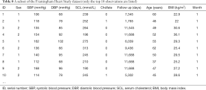
Full table
[Case 1] Interpretation
We will use the [Case 1] dataset CHD-related death event (chdfate) to establish two logistic regression models for the outcome variable to demonstrate the DCA curve method. One is a simple logistic regression model (simple) with SCL as a predictor, outcome for CHD-related deaths (outcome); the other is a multivariate logistic regression model (complex), in which gender, age, BMI, SCL, SBP were predictors, and DBP, and CHD-related death events were outcomes (outcome).
R codes and its interpretation
Load the rmda package (you need to install it in advance) and then load the data.
DCA model construction. We firstly build a simple model using the decision_curve() function, named simple.
R Code interpretation: In the decision_curve() function, family=binomial(link=‘logit’) uses Logistic regression to fit the model. The threshold sets the threshold of the abscissa threshold probability, which is generally 0–1; but if there is a specific situation, everyone agrees that the threshold probability is above a certain value, such as 40%, then intervention must be taken, then the study after 0.4 doesn’t make sense, it can be set to 0–0.4. By is the calculation of a data point every other distance. “study.design” can set the type of research, whether it is “cohort” or “case-control”. When the research type is “case-control“, the “population.prevalance” parameter should also be added, because in the case-control study the prevalence rate cannot be calculated and needs to be provided in advance.
Then we use the decision_curve() function to construct a complex logistic regression model and name it complex. The syntax and simple model construction are basically the same, it only add the independent variable SBP + DBP + age + BMI + sex on the basis of the original simple model.
We combine the fitted simple and complex models into a single model and name it List.
We use the plot_decision_curve() function to plot the DCA curve, as shown in Figure 16 below.
Code interpretation: The object of the plot_decision_curve() function is the List defined earlier. If you only draw one curve, you can directly replace the List with simple or complex. Curve.names is the name of each curve on the legend when the plot is drawn. The order of writing is the same as when the List is synthesized above. “cost.benefit.axis” is an additional axis of abscissa, loss-to-return ratio, the default value is TRUE. When you don’t need it remember to set to FALSE. col sets the colors. “confidence.intervals” sets whether to plot the confidence interval of the curve, and the standardize set whether corrects the net benefit rate (NB) by using prevalence rate .The DCA curve is shown in Figure 16 below.
Curve interpretation: It can be seen that the net benefit rate of the complex model is higher than the simple model with the threshold in the range of 0.1–0.5.
You can view the data points on the complex model curve by the command shown below, where NB can also be changed to sNB, indicating a standardized prevalence.
The result has been omitted.
Draw a clinical impact curve.
We use the plot_clinical_impact() function to plot the clinical impact curve of the simple model. Use the simple model to predict the risk stratification of 1,000 people, display the “loss: benefit” axis, assign 8 scales, display the confidence interval, and get the result shown in Figure 17.
We continue to use the plot_clinical_impact() function to plot the clinical impact curve of the complex model. Use the complex model to predict the risk stratification of 1,000 people, display the “loss: benefit” axis, assign 8 scales, display the confidence interval, as shown in Figure 18.
Curve interpretation: the red curve (number of high risk) indicates the number of people classified as positive (high risk) by the simple model (Figure 17) or the complex model (Figure 18) at each threshold probability; the blue curve [(number high) risk with outcome] is the number of true positives for each threshold probability.
Survival outcome data
[Case 2]
The Melanoma data frame has data on 205 patients in Denmark with malignant melanoma. This data frame contains the following columns:
- Time: survival time in days, possibly censored;
- Status: 1 died from melanoma, 2 alive, 3 dead from other causes;
- Sex: 1= male, 0= female;
- Age: age in years;
- Year of operation;
- Thickness: tumour thickness in mm;
- Ulcer: 1 = presence, 0 = absence.
R codes and its interpretation
In this case, the outcome is survival data, CRAN does not currently have a corresponding package about DCA analysis of the survival data. We can take a custom function or use a function that has been written by other researchers. The stdca.R file in the attached file is the source code of the function that other researchers have written (48), which you can use directly. We firstly load the source code for stdca.R, the reader can download it in the attachment to this article.
Load the MASS package and call the Melanoma data set.
Define the survival outcome.
Use the stdca() function defined in the previous step to perform Decision Curve Analysis.
stdca() function usage:
stdca(data=data.set, outcome=“diedcancer”, ttoutcome=“time”, timepoint=545, predictors=“thickness”, probability=“FALSE”, xstop=.25, intervention=“TRUE”)
The DCA curve interpretation principle of survival data is similar to the DCA curve of the binary data (Figure 19).
Brief summary
The Decision Curve Analysis method is currently used to predict the clinical utility evaluation. The processing method for the two-category outcome is relatively mature, but the processing of the survival data outcome is a bit tricky, and further improvement and update of the method is needed. However, readers should understand the truth: DCA analysis is not the only way to assess the clinical utility of predictive models, nor is it a perfect one (49). In fact, the method we use most often is mentioned in the first section. For predicting the outcome of the two classifications, we should see if the prediction model has a better sensitivity and specificity; for predicting survival outcomes, we generally see whether patients can be classified into good prognosis and poor prognosis based on predictive models, such as calculating the score of each subject by Nomogram, and treating the patient according to a cutoff value, and divided into a good prognosis and poor prognosis, and then draw Kaplan-Meier survival curve.
Decision curve analysis (DCA) for survival outcomes with R
Background
The DCA of survival outcome data are summarized in this Section. In the previous Section, we introduced using rmda package to perform DCA for binary outcome, but there is no information about the survival function of DCA in the rmda package and though in CRAN currently no package available for process of survival outcome data of DCA. Here we introduce how to perform DCA analysis of survival outcome data based on the source code provided on the MSKCC website (48). We authors are just a knowledge porter. The copyright of the R source code in this paper belongs to the original author. We only own the original copyright of the text annotation and result interpretation part of the code.
Case analysis
DCA analysis of multivariate Cox regression
[Case 1]
Read in the data file “dca.txt” under the current working path.
This is a dataframe of survival data, include 750 observations, 10 variables:
$ patientid: number.
$ cancer: whether cancer occurs, binary variable, 1= cancer, 0= non-cancer. dependent variable.
$ dead: dead or not, binary variable,1= dead, 0= alive.
$ ttcancer: the time from follow-up to the occurrence of cancer, continuous variable, time variable.
$ risk_group: risk factor, the factor variable, ordinal variable, 3= “high”, 2= “intermediate”, 1= “low”.
$ casecontrol: grouping variable, binary variable, 1= “case”, 0= “control” .
$ age: Age, continuous variable.
$ famhistory: family history, 0= no, 1= yes
$ marker: a biomarker level, a continuous variable.
$ cancerpredmarker: tumor biomarker level, continuous variables.
[Case 1] R codes and its interpretation
The source() function is used to load the source code downloaded from the MSKCC website, which is downloaded in advance and saved to the current working path.
Subsequently, we can directly use the stdca() function of DCA analysis of survival data defined by this function.
Usage of stdca() function are as follows:
stdca(data, outcome, predictors, timepoint, xstart =0.01, xstop =0.99, xby =0.01, ymin =-0.05, probability = NULL, harm = NULL, graph = TRUE, intervention = FALSE, interventionper =100, smooth = FALSE, loess.span =0.10, cmprsk = FALSE).
Notes of stdca() function parameters are as follows:
Data: a data frame containing the variables in the model.
Outcome: the outcome, response variable. Must be a variable contained within the data frame specified in data=.
Predictors: the predictor variables. Must be a variable contained within the data frame specified in data=.
timepoint: specifies the time point at which the decision curve analysis is performed.
Probability: specifies whether or not each of the independent variables are probabilities. The default is TRUE.
xstart: starting value for x-axis (threshold probability) between 0 and 1. The default is 0.01.
xstop: stopping value for x-axis (threshold probability) between 0 and 1. The default is 0.99.
xby: increment for threshold probability. The default is 0.01.
ymin: minimum bound for graph. The default is –0.05.
Harm: specifies the harm(s) associated with the independent variable(s). The default is none.
Graph: specifies whether or not to display graph of net benefits. The default is TRUE.
Intervention: plot net reduction in interventions.
interventionper: number of net reduction in interventions per interger. The default is 100.
Smooth: specifies whether or not to smooth net benefit curve. The default is FALSE.
loess.span: specifies the degree of smoothing. The default is 0.10.
cmprsk: if evaluating outcome in presence of a competing risk. The default is FALSE.
For the statistical analysis of the above cases, we first need to define a survival function object, which contains the outcome of the study and the time when the outcome occurred, namely the “cancer” and “ttcancer” variables of the dataframe in this case.
Next, we need to build the Cox regression model named coxmod using the coxph() function in the survival package. The code is as follows:
The coxmod survival function was used to calculate the complement of the incidence of cancer at 1.5 years, i.e., the incidence of no cancer, as shown below:
This step is necessary, according to the mentioned above stdca() function parameters regulation about “predictors”, can only pass in a variable here, obviously using model prediction probability as a new variable is introduced to reflect the entire model predictive power here. If only pass in a predictor, the factors that represent only a factor for outcome prediction ability, rather than the entire model prediction ability.
Use the stdca() function for DCA analysis of survival outcome data. DCA curve of “coxmod” is shown in Figure 20 below.
data = data.set, specified data set; outcome =“cancer”, to define dichotomous outcome; ttoutcome = “ttcancer”, specified time variable; timepoint =1.5; define time point =1.5 years; predictors =“pr_failure18”, the prediction probability calculated according to the Cox regression model is passed in, and here it needs to be specified that the probability is passed in here; probability = TRUE, this is also the default setting, only If you use a single factor for prediction, set to FALSE.
Now let’s construct two Cox regression models:
According to the survival function, the complement number of cancer incidence at 1.5 years, namely the incidence without cancer, was calculated for the two models respectively, with the code as follows:
The stdca() function is used for DCA analysis of the two Cox regression models. DCA curves of “coxmod1” and “coxmod1” based on Cox regression model was shown in Figure 21 below.
Univariate Cox regression and DCA analysis
[Case 2]
We use the built-in dataset in the MASS package.
This is the dataframe structure with 7 variables and 205 observations in total:
$ Time: time variable, continuous variables.
$ Status: outcome variables, 1= death from melanoma, 2= alive, and 3= death from other causes.
$ Sex: sex variable, 1= male, 0= female, binary variable.
$ Age: age, continuous variable.
$ Year: time point of surgery, continuous variable.
$ Thickness: tumor thickness, unit: mm, continuous variable.
$ Ulcer: whether the tumor has ulcer or not, 1 represents the presence of ulcer, 0 represents the absence of ulcer, the dichotomous variable.
R codes and its interpretation
The stdca() function is used for DCA analysis of the univariate Cox regression analysis. DCA curves of a single predictor “thickness” based on Cox regression model was shown in Figures 22 and 23
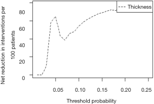
Note that we use a single variable to predict the outcome, so probability = FALSE, and other parameter settings are basically the same as Case 1.
External validation of Logistic regression model with R
Background
Logistic regression can be used to establish a clinical prediction model for dichotomous outcome variables, and can also be used to predict binary clinical events, such as effective/ineffective, occurrence/non-occurrence, recurrence/non-recurrence and so on. There is the difference between good and bad of the prediction models. Not only can the good one accurately predicts the probability of endpoint events, which means a good Calibration, but also distinguish the objects with different probabilities of endpoint events in the data set, which means a good discrimination. And it can also find out the possible influence of certain factors on the endpoint event, including the independent risk factors or protective factors. Therefore, how to judge and verify the model is particularly important. As for the evaluation indexes of the model, we have mentioned before. This paper mainly introduces the external validation of Logistic regression model.
Out time validation can be adopted for model validation. For example, we can use the 2005–2010 samples for modeling, and then use the 2010–2015 samples for model validation. In this way, it can evaluate whether the prediction of the model is still accurate over time. Across modeling techniques can also be adopted. In other words, for a certain data set, to select the best model in testing data, not only can the logical regression be adopted, but also the discriminant analysis, decision tree, support vector machine (SVM) and other methods. Regardless of what kind of methods we use, external validation of the model with a data set different to the one used in modeling is an important part of the process.
When modeling, the samples which are extracted from the sample data set for modeling are called training set. When validating the completed model, the samples which are reserved from the sample data set for internal validation are called testing set. A model that performs well in a single data set does not necessarily perform satisfactorily in other data sets, so external validation of the model in a new data set, which is called validation set, is required.
Calibration evaluation
The following hoslem.test () in the ResourceSelection package is used to perform the Hosmer-Lemeshow goodness of fit test, which is usually used to evaluate the calibration degree of the Logistic model (50). We should load the R package we need at first:
Logistic regression model construction
To establish the Logistic regression model, we simulate a data set, namely training set, for modeling, in which all samples of the data set are used for modeling. And we can also extract parts of samples for modeling while use the rest of it, namely testing set, for internal validation of this model.
Carry the Hosmer-Lemeshow test out on the model, and divide the data into a certain number of groups “g”. The meaning of parameter “g” here has been explained when explaining the concept of calibration degree in the previous Section. If we predict the probability of the outcome of 100 people, it does not mean that we actually use the model to predict the result of disease/no disease. The model only gives us the probability of disease. And we diagnose disease/no disease according to the probability which is greater than a certain cut-off value, such as 0.5. If there are 100 people in data set, we finally got 100 probabilities from the model, namely 100 numbers between 0 and 1.0. We rank these numbers from smallest to largest and then divide them into 10 groups of 10 people. So, the actual probability is the percentage of those 10 people who get sick. The predicted probability is the average of these 10 proportions of each set of predictions. Compare these two numbers, take one as the abscissa and the other one as the ordinate, and we can get the Calibration Plot. So, the 95% confidence interval we can calculate. In Logistic regression model, calibration can also be measured by Hosmer-Lemeshow goodness of fit test.
The first parameter is whether the target event actually occurred in the function hoslem.test(). The second parameter is the event occurrence probability predicted by the variable x. The third parameter is the grouping parameter g. Then, calculate the goodness of fit statistics in the Hosmer-Lemeshow test. If the model is well fitted, the statistic should follow the Chi-square distribution with g-2 degrees of freedom. If the P value of the hypothesis test is less than test level α, it indicates that the model does not fit well. Then, output the results of the Hosmer-Lemeshow test.
P value is 0.5964, It cannot be considered that the model does not fit well yet.
Generate Hosmer-Lemeshow contingency table. Among them, y0 is the number of events that didn’t occur; y1 is the number of events that occurred; yhat0 represents the probability of events that will not happen predicted by the model; yhat1 represents the probability of events that will happen predicted by the model.
Validation in external data set
Simulate the generated external data set in the same way, and conduct external validation on the model:
P=0.2437>0.05. So, it cannot be considered that the model fitting is poor, suggesting that the model performs well in the new data set. If P<0.05, the model is poorly fitted.
Hosmer-Lemeshow test
The calculation principle of Hosmer-Lemeshow test statistics is as follows: calculate the prediction probability of the model, and divide the data into ten groups according to the prediction probability from largest to smallest, which refers to the parameter g in the above function.
Then calculate the Hosmer-Lemeshow test statistics.
Calculate the Hosmer-Lemeshow test statistics. It has been proved that if the model fits well, the statistic should obey the chi-square distribution of g-2 degree of freedom. The invalid hypothesis is that Hosmer-Lemeshow test statistic obeys chi-square distribution with g-2 degree of freedom. The alternative hypothesis is that Hosmer-Lemeshow test statistic does not obey the chi-square distribution of g-2 degree of freedom. Significance level =0.05.
The calculated statistics are consistent with the calculated results of the above functions.
Calibration plot
Use the calibration curves (Figure 24) to evaluate the model visually. We use plotCalibration() function in PredictABEL package to draw the calibration plots (51).
The horizontal axis of the calibration plot is the predicted risk rate, and the vertical axis is the actual risk rate. Each point represents a group, and its basic idea is consistent with the Hosmer-Lemeshow test.
It is not enough to just evaluate the calibration of the model. Assuming a short-term mortality rate is 0.1% after a particular surgery, there is now a poor model that predicts a mortality rate is 0.1% for all patients regardless of their health status, smoking status, diabetes status, and only one patient died in 1,000 patients after surgery. Although the model prediction is consistent with the facts (both short-term mortality rate is 0.1%), which means the model is in high fit degree. But the model does not differentiate the patient with a high risk of death and the patients with low risk of dying, which means the discrimination of the model is not enough. That’s why we need to evaluate the model discrimination that to differentiate the patient with a high risk of death and the patients with low risk of dying. We need the further external validation of the model.
Discrimination evaluation
ROC curve
Use the Logistic regression model fitted above to draw the ROC curve by pROC package (52) (Figure 25).
In intern. data, the AUC value of the model is 0.7455.
ROC curve in external dataset
Then, verify the model’s discrimination in the external dataset and draw ROC curve (Figure 26).
The model was verified in the external data set, AUC =0.6723, indicating that the model has a good discrimination in the validation of the external data set.
Summary and discussion
We summarize the methods of external verification for Logistic regression model above, including calibration evaluation and discrimination evaluation. A good prediction model, should have the characteristics of robust enough, no matter for the training set, internal validation set or external validation set, has better discrimination and calibration. A good performance in the training set does not necessarily mean a good performance in the validation set. In addition, a good discrimination does not necessarily mean a good calibration, and vice versa.
The evaluation of Cox regression model based on pec package with R
Background
According to the logistic regression equation, the rate of outcome occurrence could be predicted based on the patient’s independent variables. In Cox regression, many scholars may be confused about how to use the established Cox model of survival outcome data to predict the survival probability of an individual patient. The function of cph() in rms package, the function of coxph() in survival package and the function of survfit() in survival package were synthesized by the function of predictSurvProb() in the R language pec package, which could calculate the individual patient’s survival probability (53).
The useage of predictSurvProb() in the R pec package is predictSurvProb (object, newdata, times,…).
Among these, the object is a well-fitted model by the function of survival::coxph() or the function of rms::cph(). The newdata is a dataset of data.frame style. The rows represent observations and the columns represent the variables to be used in the prediction model. The time is a vector that contains the points to be predicted.
Case analysis
We used the clinical data of 232 patients with renal clear cell carcinoma downloaded from TCGA database (https://portal.gdc.cancer.gov/) for practical operation. There were 8 variables in the dataset. Among the eight variables, death was the outcome variable (dependent variable), OS was the length of survival time. In addition, age, gender, TNM, SSIGN and Fuhrman were the independent variables.
R code and its interpretation
The pec package and other necessary auxiliary package should be loaded firstly. Then, the data of Case_in_TCGA.csv will be identified. The codes of R language were shown as follows.
Two hundred and thirty two patients were randomly divided into training set and validation set, in which data.1 was the training set and data.2 was the validation set.
Then, the Cox regression model was fitted with 116 cases of training set data.1.
The survival time points of the predicted survival rate need to be set. In this case, the survival probability rate of each patient in validation set at the first, third and fifth year would be predicted according to the model built by the training set.
The excellence of this package is that it can calculate the survival probability rate of each patient in the validation set based on the prediction model built by the training set. Moreover, it can also calculate the C-index in the validation set. C-index, namely Concordance Index, is mainly used to reflect the differentiation ability and accuracy of the prediction model. The definition of C-Index is as simple as the number of consistent pairs/ the number of useful pairs. There will be N*(N-1)/2 pairs if N subjects were randomly paired. However, if the sample size is very large, the calculation work cannot be completed without the assistant of computer software. First, we should find out the consistent pair number as the numerator. While, what is a consistent pair number? Taking Cox regression analysis for survival data as an example, if the actual survival length is long and the predicted survival rate is also high, or the predicted survival rate is low when the actual survival length is short, we could make the conclusion that the predicted result is consistent with the actual result. Otherwise, it is inconsistent. Then, the useful number of pairs should be found out for denominator. What is a useful pair number? Taking Cox regression analysis as an example, the so-called useful pair number requires that at least one of the two paired individuals have a target endpoint. That is to say, if the paired patients did not show an endpoint event during all the observation period, it cannot be included in the denominator. In addition, there are two other situations that need to be excluded:
- If one of the paired object reach to an endpoint, while the other one cannot reach to an endpoint due to the loss of follow-up;
- The pair died at the same time.
Now the denominator had been identified, how to get the numerator?
In fact, the function of cindex() in pec package can calculate the C-index of the prediction model. Meanwhile, it can evaluate the discrimination of different regression modeling strategies for the same data via cross validation.
C-Index could be verified by the model discrimination in data.2.
The figure above (Figure 27) showed that model Cox (2 variables) is better than Cox (5 variables) in terms of the discriminability of the regression model. However, this result has not been cross-verified and may be unstable. Therefore, we can further compare the discriminability of the two regression models with the method of cross-validation.
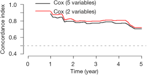
The model discrimination was verified in data.2, and the cross-validation was performed using bootstrap re-sampling method.
The figure above (Figure 28) showed that the discriminability of the two Cox regression models is similar. However, the model with only two variables is obviously more convenient than the model with five variables. Therefore, the simpler the model, the better to perform.
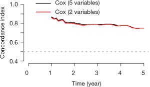
The pec package can not only calculate the survival rate of each object and C-index in the validation set, but a Calibration plot can be drawn in the validation set, which cannot be completed by rms package. Calibration refers to the consistency between the actual rate of the outcome and the predicted rate. For example, when we need to predict the disease prevalence in 100 subjects, the models cannot directly calculate the rate of disease/no disease. In fact, the model just provides us the probable prevalence of this disease, and we need to judge the rate of illness/no illness based on the probability greater than a certain cut-off value (such as 0.5). Then, 100 numbers between 0 and 1 could be obtained via the model. Then we divided these 100 objects into ten groups. The actual probability is the percentage of those ten objects who suffered from the disease. The probability of prediction is the average of the ten proportions in all of the ten groups. Then we compared the predicted probability and actual probability, one as the abscissa and the other one as the ordinate. Finally, Calibration Plot could be obtained. Meanwhile, the 95% confidence interval of Calibration Plot could be calculated.
We used the calPlot() function in pec package to demonstrate the performance of Calibration Plot in the validation set (Figure 29).
Similarly, we can use bootstrap method to re-sample 232 cases, and perform cross-validation for the model (Figure 30).
Brief summary
Above we summarize the Cox regression model method for external validation, including the discrimination index and calibration evaluation. For the outcome in the Cox regression model include the time, so the calculation method is slightly different from Logistic regression. However, whether the Cox regression model or Logistic regression model, as a good prediction model, should have the characteristics of robust enough, no matter for the training set, internal validation set or external validation set, has better discrimination and calibration. A good performance in the training set does not necessarily mean a good performance in the validation set. In addition, a good discrimination does not necessarily mean a good calibration, and vice versa.
Fine-Gray test and competing risk model with R
Background
When observing whether an event occurs or not, if the event is obstructed by other events, there may be multiple outcome events in the so-called competitive risk research, and some outcomes will prevent the occurrence of interested events or affect the probability of their occurrence. All outcome events form a competitive relationship and are mutually competitive risk event.
For example, some researchers collected in this city in 2007 diagnosed with mild cognitive impairment (MCI) of 518 cases of elderly patients with clinical data, including basic demographic characteristics, lifestyle, physical examination, and merge disease information, etc., and complete six follow-up survey in 2010–2013, the main outcome is whether Alzheimer’s disease (AD) occurs. During the follow-up period, a total of 78 cases of AD occurred, including 28 cases of relocation, 31 cases of withdrawal and 25 cases of death. What are the factors that affect the transition of MCI to AD?
In this case, if the MCI patient dies of cancer, cardiovascular disease, car accident and other causes during the observation period without AD, he cannot contribute to the onset of AD, that is, the end of death “competes” with the occurrence of AD. According to traditional survival analysis method, the death of the individual occurs before the AD, lost to the individual, and not the AD individuals, are considered to be censored data, may lead to bias (54) For the elderly population with high mortality rate, when there are competitive risk events, the traditional survival analysis methods (Kaplan-Meier method, Log-rank test, Cox proportional hazard regression model) will overestimate the risk of the diseases of interest, thus leading to competitive risk bias. Some studies have found that about 46% of the literatures may have such bias (54).
In this case, the competitive risk model is appropriate. The so-called competing risk model is an analytical method to process multiple potential outcome of survival data. As early as 1999, Fine and Gray proposed the partially distributed semi-parametric proportional hazard model, and the commonly used endpoint index is cumulative incidence function (CIF) (55,56). In this case, death before AD can be taken as a competitive risk event of AD, and the competitive risk model is adopted for statistical analysis. Univariate analysis of competitive risk is often used to estimate the incidence of end-point events of interest, and multivariate analysis is often used to explore prognostic factors and effect sizes.
Case analysis
[Case 1]
This case data was downloaded from http://www.stat.unipg.it/luca/R/. Researchers plan to investigate the curative effect of bone marrow transplantation compared blood transplantation for the treatment of leukemia, endpoint event defined as “recurrence”. Some patients after transplantation, unfortunately because of adverse reactions to the death, that the transplant related death cannot be observed in patients with the end of the “recurrence”. In other words, “transplant-related death” and “recurrence” are competitive risk events. Therefore, competitive risk model is adopted for statistical analysis (57,58).
Firstly, import the data file ‘bmtcrr.csv’ from the current working path.
This is a data of dataframe structure with 7 variables and a total of 177 observations.
$ Sex: sex variable, factor variable, 2 levels: “F”, “M”.
$ D: disease type, factor variable, 2 levels “ALL (acute lymphocytic leukemia)”, “AML (acute myelocytic leukemia)”.
$ Phase: phase of disease, factor variables, 4 levels: “CR1”, “CR2”, “CR3”, “ Relapse”.
$ Age: age variable, continuous variable.
$ Status: outcome variables, 0= censored, 1= recurrence, 2= competitive risk events.
$ Source: type of intervention, factor variables, 2 levels: “BM + PB (bone marrow transplantation + blood transplantation)”, “PB (blood transplantation)”.
$ ftime: time variable, continuous variable.
The package “cmprsk” of the competitive risk model was loaded, the data box “bmt” was loaded, and the outcome was defined as the factor variable.
Fine-Gray test (univariate variable analysis)
Similar to the Log-rank test comparing survival outcome data of the two groups, univariate analysis can also be carried out considering competitive risk events. Next, we can use the cuminc() function to carry out univariate variable Fine-Gray test.
Interpretation of results: “1” represents the defined endpoint and “2” represents competitive risk events. Statistics in the first row =2.8623325, P value =0.09067592, indicating that after controlling competitive risk events (i.e., statistics calculated in the second row and P value), there was no statistical difference in cumulative recurrence risk of “ALL” and “AML” P=0.09067592.
$est: represents the estimated cumulative recurrence rate and cumulative competitive risk event rate of “ALL” and “AML” groups at each time point (the defined endpoint and competitive risk events distinguished by “1” and “2” respectively, consistent with the results in line 1 and line 2 above).
$var: represents the variances of the estimated cumulative recurrence rate and the cumulative competitive risk event rate for the “ALL” and “AML” groups at each time point (the defined endpoint and competitive risk events identified by “1” and “2” respectively, consistent with the results in line 1 and line 2 above).
Below, we draw the survival curve of cumulative recurrence rate and cumulative competitive risk event incidence rate to intuitively represent the above digitized results (Figure 31).
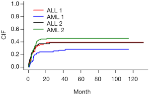
Figure interpretation: the vertical axis represents the CIF, and the horizontal axis is the time. We looked at the red curve corresponding to ALL1 and the blue curve corresponding to AML1 (1 represents the defined endpoint and 2 represents competitive risk events). From the figure, it can be concluded that the recurrence risk of ALL group was higher than that of AML group, but it did not reach statistical significance, P=0.09067592. Similarly, if we look at the black curve corresponding to ALL2 below the grass green curve corresponding to AML2, we can conclude that the incidence of competitive risk events in ALL group is lower than that in AML group, which also fails to reach statistical significance, P=0.50322531. As can be seen from the curve, the curves were “entangled” in the first 20 months, so no statistically significant results were obtained. Simply put, this figure can be summarized in one sentence: after controlling competitive risk events, there is no statistical difference in cumulative recurrence risk of “ALL” and “AML”, P=0.09067592.
Competitive risk model (multivariate analysis)
The following is a multivariate analysis of survival data considering competitive risk events. In the cmprsk package, the crr() function is convenient for multifactor analysis. The function is used as follows:
crr(ftime, fstatus, cov1, cov2, tf, cengroup, failcode =1, cencode =0, subset, na.action = na.omit, gtol =1e-06, maxiter =10, init, variance = TRUE)
You can refer to the crr() function help documentation for detailed explanation of each parameter. It should be noted here that the function must specify the time variable and the outcome variable, and then pass in the covariate matrix or dataframe. Firstly, the covariates entering the model are defined and positioned as dataframe.
Construct a multivariate competitive risk model. In here, failcode =1 and cencode =0 need to be specified, respectively representing: endpoint event assignment “1” and censored assignment “0”, and other competitive risk events are assigned a default value “2”.
Interpretation of results: after controlling for competitive risk distribution events, phase variable, that is, the stage of disease, is an independent risk factor for patient recurrence. The patients in the “Relapse ” stage are taken as the reference, the accumulated recurrence rate of patients in the CR1, CR2 and CR3 stages compared with those in the “Relapse” stage, Hazard Ratio and 95% CI were 0.332 (0.159, 0.695), 0.361 (0.180, 0.724), and 0.481 (0.155, 1.490), respectively, corresponding P values were 0.0034, 0.0041, and 0.2000, respectively.
Brief summary
This Section introduces in detail the Fine-Gray test and competitive risk model of cmprsk programmed package using R. The author thinks that readers in the process of concrete application should pay attention to two points:
Firstly, the use of selective Fine-Gray test and competition risk model, if the endpoint has competing risk events, and are likely to affect the conclusion, that using this model is suitable, this model is not necessarily better than the Cox model, these two models should complement each other;
Secondly, competitive risk events are also limited in the consideration of competitive risk model. Currently, only the binary end point of Cox model is extended to triple classification, namely, outcome events, censored and competitive risk events. Even so, it is difficult to interpret the results. Therefore, readers should evaluate and experiment more fully when choosing statistical methods.
Nomogram of competing risk model with R
Background
The cmprsk package of the competitive risk model is loaded in R, and the univariate analysis and multivariate analysis considering the survival data of competitive risk events can be carried out by using the cuminc() function and crr () function. We have described the implementation method based on R language in detail in the previous Section, which is not shown here.
So how do you visualize the competitive risk model? How do I draw a nomogram of competitive risk model?
Here we demonstrate how to draw a nomogram based on R.
Case analysis
[Case 1]
This case data was downloaded from http://www.stat.unipg.it/luca/R/. Researchers plan to investigate the curative effect of bone marrow transplantation compared blood transplantation for the treatment of leukemia, endpoint event defined as “recurrence”. Some patients after transplantation, unfortunately because of adverse reactions to the death, that the transplant related death cannot be observed in patients with the end of the “recurrence”. In other words, “transplant-related death” and “recurrence” are competitive risk events. Therefore, competitive risk model is adopted for statistical analysis (57,58).
R codes and its interpretation
Firstly, import the data file ‘bmtcrr.csv’ from the current working path.
This is a data of dataframe structure with 7 variables and a total of 177 observations.
$ Sex: sex variable, factor variable, 2 levels: “F”, “M”.
$ D: disease type, factor variable, 2 levels “ALL (acute lymphocytic leukemia)”, “AML(acute myelocytic leukemia)”.
$ Phase: phase of disease, factor variables, 4 levels: “CR1”, “CR2”, “CR3”, “Relapse”.
$ Age: age variable, continuous variable.
$ Status: outcome variables, 0= censored, 1= recurrence, 2= competitive risk events.
$ Source: type of intervention, factor variables, 2 levels: “BM + PB (bone marrow transplantation + blood transplantation)”, “PB (blood transplantation)”.
$ ftime: time variable, continuous variable.
Firstly, the variables in the dataset bmt are further processed.
View the data structure and present the first six rows of data. It can be seen that we have re-assigned the covariables in the data set and binarized the multi-classification variables. Note that dummy variables are not set here for multi-classification variables. The main reason is that if dummy variables appear in the nomogram, interpretation of the results will be confusing. Therefore, dummy variables should be avoided in the nomogram.
The regplot() function in the regplot package can draw more aesthetic nomogram. However, it currently only accepts regression objects returned by the coxph(), lm(), and glm () functions. Therefore, in order to draw the nomogram of the competition risk model, we need to weight the original data set to create a new data set for the competition risk model analysis (59,60). The main feature of the crprep() function in the mstate package is to create this weighted data set, as shown in the R code below. We can then use the coxph() function to fit the competitive risk model of the weighted dataset and pass it to the regplot() function to plot the nomogram. For specific weighting principles, readers may refer to the literature published by Geskus et al. (60), which is not shown here.
Next, we create the weighted dataset for the original data set bmt and name it df.w. Where, the parameter trans = specifies the endpoint event and competitive risk event that need to be weighted; cens = designated censored; id = the id of the incoming data set bmt; keep = covariables to be retained in the weighted dataset.
The above code has created a weighted dataset df.w on which we can then use the coxph() function for competitive risk analysis.
Next, we can plot the nomogram using the regplot() function. In the nomogram, the values of covariates of patients with id=31 in the data set are mapped to corresponding scores, and the total scores are calculated, and the cumulative recurrence probability at 36 and 60 months is calculated respectively, which is the cumulative recurrence probability with considering competitive risk events. The calculated results are: 0.196 and 0.213, respectively (Figure 32).
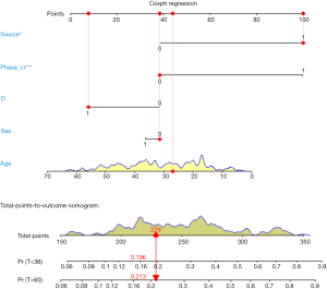
In order to facilitate the comparison, Cox regression model can be further constructed in the original data set bmt, and the values of covariates of patients with id =31 can be calculated to the corresponding scores, and the total scores can be calculated, and the cumulative recurrence probability of patients with id =31 at 36 and 60 months can be calculated, respectively. The calculated results are: 0.205 and 0.217 respectively (Figure 33).
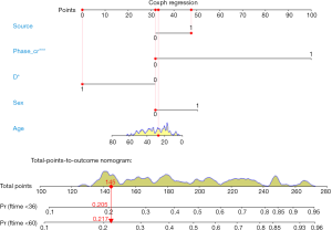
It can be seen that the cumulative recurrence risk calculated by the competition risk model and Cox proportional hazard model is slightly different, and the cumulative recurrence risk calculated by the competition risk model for patient No. 31 is slightly lower. The endpoint event we defined occurred in patient No. 31, that is, the patient relapsed after transplantation. The results calculated according to the competition risk and Cox proportional hazard model showed little difference. When a patient is truncated or a competitive risk event occurs, the settlement results of the two models are significantly different, so readers can try by themselves.
Brief summary
This paper describes in detail the use mstate and regplot R packages to plot the nomogram of competition risk model. In fact, this is a flexible method, namely, first, the original data set is weighted, then the Cox regression model is used to build the competitive risk model based on the weighted data set, and then the nomogram is drawn. This paper does not introduce the further evaluation of the competitive risk model. The riskRegression package in R can further evaluate the prediction model built based on the competitive risk analysis, such as calculating C-index and drawing calibration curve.
Outlier recognition and missing data handling with R
Background
In Section 1, we describe the sources of data for clinical predictive model construction. Whether it is prospective data collection or retrospective data collection, it is common to have outliers or missing values in the data set. Outliers and missing values are often a tricky issue for statisticians and can lead to errors if not handled properly. Outliers may cause our results to deviate from the real results, and the loss of information caused by missing values may lead to modeling failure. Therefore, it is important to correctly identify outliers and properly handle missing values before performing data analysis. The content discussed in this Section should be carried out before modeling. We can’t just put this thing in the end or think it doesn’t matter because our article is the last Section in this series of articles.
Outliers
What is an outlier? In a word, the value of a variable beyond human common sense and non-conformity is an outlier. For example, we collected fasting blood glucose from a group of patients, one of whom had a fasting blood glucose of more than 50 mmol/L, which is obviously an abnormal value. For another example, we investigated the prevalence of hypertension in the elderly over 60 years old in Xuhui District, Shanghai. If there is a subject with a SBP exceeding 1,400 mmHg, this is obviously an abnormal value. It is likely to be a recording error, and the true SBP is more May be 140.0 mmHg. Sometimes outliers are a relative concept that is related to the context in which our clinical research data is collected. For example, if our study is for children under the age of 10, then children of this age group are unlikely to be graduate students, and their height is unlikely to exceed 170 cm, the weight is unlikely to exceed 100 kg. There is also a situation in which abnormal values may be generated. When the sample we sampling is not good, for example, 1,000 people are extracted from Area A and 100 people are extracted from Area B. 100 people from Area B are likely to become a collection alone. The value of this set is abnormally higher or abnormally lower than that of Area A. This situation corresponds to clinical studies. When we study the efficacy of an intervention, if only some patients have a significant effect, this part of the data is “outliers” compared to other patients with less obvious effects. “, but these outliers are exactly what we care about the most. Therefore, for the judgment of abnormal values, it is necessary to contact the actual situation, and it is not arbitrary, so as to avoid serious mistakes. When we are not sure about the data, the best solution is to check the original data record.
Below I will introduce several commonly used functions to identify outliers in the dataset. Suppose we have collected the height of 1,000 subjects. First, we can use the boxplot() function to draw a box plot to describe the data. Further use of the range() function to help us find the maximum and minimum values of these values.
First, we simulated 1,000 subjects with a height of 100–250 cm. Use range() to see the range of SBP in this group of patients.
Use the min() and max() functions to return the minimum and maximum values of an object.
If there are missing values in the data, you must adjust the parameter settings, na.rm = TRUE, otherwise the results may not be calculated.
We can use mean() and median() functions to calculate the mean and median, respectively, and use na.rm = TRUE for missing values.
We can also use the sd(), quantile() or fivenum() functions to calculate the standard deviation and quartile.
Note that the na.rm parameter in fiveum() defaults to TRUE, but the sd() and quantile() functions require us to set na.rm=TRUE, otherwise the result will not be calculated.
The above method can help us identify maxima or minima, but sometimes the extremum does not appear as a single independent, but in clusters, then the above method of identifying outliers is not enough. We generally define the outliers of the data according to the mean and standard deviation of the variables, or the median and quartiles (Tukey method) in the actual research background. For example, we can set the greater or less than the mean. The ±3 standard deviations are all outliers. Of course, we can also make an outlier judgment on a certain value of the categorical variable. For example, the gender value is 1= male, 2= female. If there is an assignment value of 3, then outliers. Here we introduce a custom function (61). This function judges the outliers according to the quartile Tukey method, which can effectively avoid the influence of extreme values on the mean and standard deviation. The function is as follows:
The custom function has only two parameters, the first parameter is the name of the data set, and the second parameter is the variable name; the reader can run the code directly, as long as the data set and the name of the variable are properly replaced. Here we are based on the out value of the box plot as an outlier, we can also re-set the definition of outlier according to the expertise, such as greater than or less than the mean ± 3 standard deviation. At the end of the function, a user-entered code is also set. The user can determine whether to eliminate the outliers recognized by the function in the dataset by typing “yes” or “no”.
Below we simulate a set of data to verify the functionality of this custom outlier recognition function.
Missing value recognition
Data loss is common in clinical studies. For example, when collecting data, the nurse may forget to record the amount of urine at a certain point in time due to busy work; when the researcher wants to study the effect of lactic acid changes on mortality, the patient may only monitor the blood lactate value at a certain point in time. Other reasons for the lack of data include coding errors, equipment failures, and non-response of respondents in the survey study (15). In statistical packages, some functions, such as Logistic Regression, may automatically delete missing data. If there are only a small number of incomplete observations, then this processing will not be much of a problem. However, when there are a large number of observations that contain missing values, the default row deletion in these functions can result in a large loss of information. In this case, the analyst should carefully look at the mechanisms that may result from data loss and find an appropriate way to handle it.
How to deal with missing values is a headache for clinical statisticians, so I decided to use a Section to discuss this thorny topic. Whether the data is missing or missing degree directly affects the quality of the data, and the quality of the data ultimately affects our research results. If the processing of missing data is not appropriate, it is likely to cause the entire statistical analysis to fail. This section describes how to handle missing data in R-project and introduces some basic skills for dealing with missing data.
In the R-project, “NA” is represented as a missing value. When an Excel table with empty cells is imported into the R console, these empty cells will be replaced by NA. This is different from STATA replacing “empty cells” with “.”The same missing value symbol is used for numeric variables and character variables in R.R provides some functions to handle missing values. To determine if a vector contains missing values, you can use the is.na() function. “is.na()” function is the most common method used to determine if an element is an NA type. It returns an object of the same length as the incoming parameter and all data is a logical value (FALSE or TRUE). Suppose we have 6 patients, but only 4 values are recorded, and 2 are missing.
The is.na() return vector has a length of 6, and the third and fifth digits have a value of TRUE, indicating that the patient is missing the value.
Use the which() function to find the location of the NA. Someone might use a logic check (such as x==NA) to detect missing data. This method cannot return TRUE because the missing values are not comparable, you must use the missing value function. The value returned by the “==“ operator is NA. By using the which() function, you can find out which element’s vector contains NA. In this example the which() function returns 3 and 5, indicating that the third and fifth patients’ x values are missing.
Using the sum() function to calculate the number of NAs in the vector
We can remove missing values in x.
Here we use the “!” in the logical operator, which is the “non” operation. The code means to find out all the elements of the vector x those are not missing values. When there is an NA in a vector, whether it is adding, subtracting, multiplying, dividing, or averaging, and finding the standard deviation, the return is all NA. Because by default, R will calculate the NA as one of the elements, that leads to no solution, such as
In this case, we need to use the na.rm parameter in these calculation functions to change it from the default FALSE to TRUE.
The above R codes all deal with the missing in the vectors. But, in practice, what we encounter more is to deal with the missing in a data frame. Next, we will simulate a data frame with missing values. Be careful that the third patient had a sex-value deletion and the fourth patient had a x-value deletion.
Now, we can calculate the proportion of missing values in the df data box, also the mean, standard deviation and so on after removing the missing values. Lots of functions can do it. Here we recommend the describe() function in the psych package, which is more convenient for giving a series of statistical descriptive indicators’ values.
The describe() function returned the basic statistic of the dataset. “n” represents the number of non-missing observations in the variable. “mean”, “sd” and “median” represent the mean, standard deviation, and median after removing the NA. “trimmed” represents the recalculated mean after removing 10% of the data from the beginning and the end of the data, which aims to remove the influence of extreme values; “mad”, “min”, “max”, and “range” represent the mode, minimum, maximum, and range respectively; “skew”, “kurtosis”, and “se” represent skewness, kurtosis, and standard error respectively. The first two indicators are aimed to measure whether the data is fitted with a normal distribution.
Although some default settings in the regression model can effectively ignore missing data, it is also necessary to create a new data frame that excludes missing data. We only need to use na.omit() in the dataset of the data frame structure, then it returns a new data frame with the missing values removed.
The above na.omit() returns a new data frame with missing values removed. It can be seen that the third and fourth patients with missing data were removed from the variables.
Missing value visualization
The visualization of missing values can help us visualize the missing values in the dataset more intuitively, which will help us to interpolate the missing value later. In this section, the author will mainly introduce the use of VIM packages to the reader. The demo dataset for this section is the built-in dataset “airquality” of the R language.
The airquality dataset contains 153 observations and 6 variables. From the above results we can see that there are missing values in this dataset. Before visualizing, explore the missing data pattern using the md.pattern() function in the mice package first.
In the output table body, “1” represents a non-missing value, and “0” represents a missing value. The first column shows the number of unique missing data patterns. In our example, 111 observations don’t contain missing data, 35 observations have only missing data in the Ozone variable, 5 observations have only Solar. R missing, and so on. The rightmost column shows the number of missing variables in a particular missing mode. For example, if there is no missing value in the first line, it is displayed as “0”. The last line counts the number of missing values for each variable. For example, the Wind variable has no missing values and displays “0”, as well as the Ozone variable has 37 missing values. In the study, some variables with more missing values may be eliminated. Then, the form can provide useful reference information.
Below we call the VIM package to visualize the missing values. Studying missing data patterns is necessary for choosing a suitable interpolation method to estimate missing values. Therefore, the visualization tool should be performed before the interpolation operation, and usually a diagnosis should be made to determine whether the interpolation value is reasonable after the missing data interpolation. The functions that can be used to visualize missing data are as follows: aggr(), matrixplot(), scattMiss() and marginplot().
The aggr() function helps us visualize the missing values. The left graph is a missing value proportional histogram. It can be seen from the graph that Ozone and Solar.R have missing values, with the Ozone’s missing value ratio more than 20%. The right graph reflects the pattern of missing values, red indicates no deletion, and blue indicates deletion. As it can be seen from the figure, only Ozone is missing 22.9%, Solar.R alone is 3.3%, and both are missing 1.3%. While the observations with complete data account for 72.5%.
In addition, the marginplot() function can help us visualize the distribution of missing values.
In the below graph (Figures 34 and 35), the open lake blue circle indicates the non-missing value, the solid point of red indicates the missing value, and the dark purple point indicates that both variables are all missing. The red box plot on the left side of the figure shows the distribution of Solar.R in the case of Ozone missing values, and the blue box plot shows the distribution of Sloar.R after removing the missing values of Ozone. The box plot on the bottom side of the graph is just the opposite, reflecting the distribution of Ozone in the absence and non-absence of Solar.R.
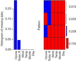
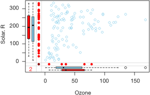
Imputation of missing values
Interpolation of missing values is a more complicated problem. First, readers must consider whether it is necessary to interpolate the missing values. The premise of an imputable data set is that data deletion is a random deletion. In addition, we have to consider some actual situations. For example, there is only 5% of your data missing. Because the ratio is very small, you can directly remove it from the original data; But if there is 20% of the data missing, we will lose a lot of information after they are all eliminated. Therefore, we should try to interpolate the missing values at this time. If you have 50% missing values in your original data, obviously, how powerful method can make up for this “congenital defect.” “At this time, we must find the reason from the source of data collection. However, in the real world, it is often difficult to collect the missing data repeatedly. Therefore, the question that the readers need to consider is: What method could be used to interpolate the missing value in the case that the missing data is not available? What method can you use to restore the original appearance of the missing value in the greatest extent?
There are many types of data missing, which are summarized in the following three cases (15,17):
- Missing completely at random (MCAR): deletion formation is not related to other variables (including observed and unobserved values), and there is no systematic reason.
- Missing at random (MAR): missing is related to other variables and is not related to its own unmeasured value.
- Not missing at random (NMAR): exclude MCAR and MAR.
There are various interpolation methods for missing values. Simple interpolation method, such as filling the mean or median directly and slightly complicated interpolation method, such as regression interpolation. However, no matter which method is used, it is difficult to measure the quality of the imputation, because in the real world, we can’t get the missing value, so we can’t verify the correctness of the interpolation. However, in the computer, we can evaluate different interpolation methods by simulation, and this evaluation is effective later.
In this section, the author will introduce several missing value interpolation methods to the reader for reference.
To better show how to interpolate data, we simulated 200 observations in the first time. The data frame contains three variables: sex, mean arterial pressure (MAP), and lactic acid (lac). In order to enable the reader to get the same results as this article, we set the seed value for each random simulation. Here we use the mean of each variable to fill in the missing values.
In these data, the lactic acid content is assumed to be related to the MAP. The blood lactate value reflects the perfusion of the tissue, which is associated with MAP. We hypothesized that the relationship between MAP and lactic acid is negatively correlated. To increase randomness, we use the rnorm() function to generate the intercept. We assume that the absence of gender variables is consistent with MCAR.
The following steps can use the summary() function to observe the data set and calculate its standard deviation.
In the above output, we found that there are 55 missing values for lactic acid, the average value is 2.015, and the standard deviation is 0.4012707.
Using the mean, mode, or median to estimate missing values is a quick and easy way. The initialise() function in the VIM package in the R software does the job. However, it is mainly used internally in some functions, and it has no advantage over other methods of doing a single insertion. For example, we want to insert a missing value into a continuous variable with an average value. The following R code returns a lac.mean variable containing the complete data information, and the missing value in lac.miss is replaced by the average of the other values. The round() function is used to keep the result one decimal place.
Next, we use a visual method to check the distribution of the missing value after replacing it with the average.
Unsurprisingly, all values inserted were 2.1 mmol/L of lactic acid (Figure 36), so the mean and standard deviation of the new sample were biased compared to the actual sample. The insertion of the mode and the median can also be inserted in the same way, which can be left to the readers. Although these rough methods provide convenience for missing value interpolation, this method underestimates the variance value (less than the actual value), ignores the relationship between the variables, and finally causes some statistical values (such as the mean standard deviation) to be generated. Therefore, these rough estimates can only be used to deal with a small amount of data missing and cannot be widely used. Therefore, we need to further master the handling of complex problems. Next, I will use the BostonHousing dataset in the mlbench package to demonstrate the various common filling methods for missing values.
The BostonHousing dataset contains 506 observations and 14 variables that reflect the basic situation of Boston city dwellers, including crime rates in each town and the number of non-retail businesses. Since the BostonHousing dataset itself has no missing values, we randomly generate some missing values.
Here we set 80 missing values for rad and ptratio. The former is a factor variable and the latter is a numerical variable. Next, we call the mice package md.pattern() function to observe the missing mode, and we have decided how to further process the missing values.
The md.pattern() function is used to view missing value patterns in the dataset. According to the above results, 0 indicates a deletion and 1 indicates no deletion. It can be seen that there are 80 missing values in each of “rad” and “ptratio”. There were 365 observations that were not missing, 61 observations were missing rad variables, 61 observations were missing ptratio, and 19 observations were missing.
Similarly, we interpolate missing values in a simple way. First, we need to download and load the Hmisc package beforehand. We can use the impute() function in this package to perform automatic interpolation of missing values.
In the above code, the author uses three simple methods to interpolate the missing values. The number in the upper right corner with an asterisk indicates that the data is imputed, instead of the original data. Obviously, this method is only applicable to continuous data, rather than classified data.
Then we focus on the advanced interpolation methods for missing values in the mice package. Mice are Multivariate Imputation by Chained Equations. The mice package provides a variety of advanced missing value processing methods. It uses an unusual method for two-step interpolation: first use the mice() function to modelling, then use the complete() function to generate the complete data. mice(df) returns multiple complete copies of df, each of which interpolates different values for missing data. The complete() function returns one (default) or more of these data sets. The following demonstrates how to interpolate the two variables rad and ptratio using this method:
The algorithm of random forest can be used here. You can skip it here. This is a common machine learning algorithm, which is not covered in this book. We are just here to show you how to use advanced statistical methods to interpolate missing values. As for the choice of random forest algorithm here, or a simple linear regression algorithm, although the principle is different, but the goal is the same. The miceoutput is the imputed data set. The anyNA() function indicates that there is no missing value in this data set, while the missing value has been interpolated. Since we have the original unmissed data set, we can use it to make the missing. The calculation of the value of the interpolation precision.
Readers can see that the error rate of interpolation is 12.5%, which means that most of the missing values are interpolated correctly, which is obviously much more accurate than purely using the mean interpolation. It should be emphasized that the regression method takes into account the dependence between the data, but the estimation of the variation of the default value is not accurate, and the degree of variation can be adjusted by increasing the random error of the regression model (15,17).
In addition to the mice package, the VIM package described earlier can also interpolate missing values and provide advanced methods such as hotdeck, K-nearest neighbor, linear regression, and more. More content readers can explore on their own.
Brief summary
This Section systematically introduces the method of outlier identification and introduces a function for custom outlier recognition, but this function is only used for continuous variable outlier recognition. This Section introduces several methods for filling the missing values. It is simple to interpolate with mean, median, and specific values. While you can also apply complex ways to fill missing values, such as linear regression and random forest methods. No matter which method is used for interpolation, there is a certain risk, and readers need to be cautious when using it. In addition, missing value recognition and imputation should be individualized, and it is difficult to have a method that is universal.
Ridge regression and LASSO regression with R
Background
As the dimensions and depth of data continue to be complex, variable selecting becomes more and more difficult. In Section 1, we mentioned that from the perspective of clinicians, there are three types of current clinical predictive model researches.
- Using traditional clinical features, pathological features, physical examination results and laboratory test results to construct clinical predictive models. Because the predictive variables are easily acquired in clinical practice, so this type of model is more feasible than the other two types.
- With the development of imaging omics research methods, more and more researchers are aware that some manifestations or parameters of imaging can represent specific biological characteristics. Using these massive imaging parameters, no matter color Doppler ultrasound, CT, MR, or PET parameters, combined with clinical features to construct clinical predictive models can often further improve the accuracy of the predictive model. This type of model needs to be based on screening imaging omics, so the pre-workload is much larger than the first type, and the imaging omics parameters are more abundant than the clinical features (62).
- With the widespread using of high-throughput biotechnology such as genomics and proteomics, clinical researchers are attempting to mine biomarkers characteristics from these vast amounts of biological information to construct clinical predictive models. This type of predictive model is a good entry point for basic medicine to clinical medicine (63).
Because there are too many features related to “omics” in the second and third types of model, the variable selecting is very difficult. It is very difficult to use the traditional variable selecting methods described in Section 2. So, is there a better solution? The answer is YES. The regularization method described in this Section is one of the solutions. Regularization can limit the regression coefficient and even reduces it to zero. Now, there are many algorithms or algorithms combinations that can be used to implement regularization. In this Section, we will focus on ridge regression and LASSO regression.
Introduction of regularization
The general linear model is Y=β0+β1X1+…+βnXn+e, the best fit attempts to minimize the residual sum of squares (RSS). RSS is the sum of the squares of the difference between the actual numbers minus the estimated numbers, which can be expressed as e12+e22+…+en2. We can add a new parameter in the minimization process of RSS using regularization, called the contraction penalty term. This penalty term contains a λ and normalized results for the β coefficients and weights. Different regularization technologies have different methods for standardizing weights. In brief, we replaced RSS with RSS + λ (normalized coefficients) in the model. We choose λ, which is called the tuning parameter in model building. If λ=0, the model is equivalent to the least square method (OLS) because all the normalization items are offset (64).
What are the advantages of regularization? Firstly, the regularization method is very computationally efficient. If we use the regularization method, we only need to fit one model for each λ, so the efficiency will be greatly improved. Secondly, it is the deviation/variance trade-off problem. In a linear model, the relationship between dependent variables and predictor variables is close to linear, and the least squares estimate is almost unbiased, but may have a high variance, which means that small changes in the training set can lead to large changes in the least squares coefficient estimation results. Regularization can properly select appropriate λ to optimize the deviation/variance tradeoff, then to improve the fitness of the regression model. Finally, the regularization of the coefficients can also be used to solve the over-fitting problem caused by multicollinearity (64).
Introduction of ridge regression
We will briefly introduce what is ridge regression and what it can do and what is cannot do. In ridge regression, the norm term is the squares sum of all coefficients, called L2-Norm. In regression model, we try to minimize RSS+λ (sumβj2). As λ increases, the regression coefficient β decreases, tending to 0 but never equal to 0. The advantage of ridge regression is that it can improve the prediction accuracy, but because it can’t make the coefficient of any variable being equal to zero, it is difficult to meet the requirements of reducing numbers of variable, so there will be some problems in the model interpretability. To solve this problem, we can use the LASSO regression mentioned below.
In addition, ridge regression is more often used to deal with collinearity in linear regression. It is generally believed that collinearity will lead to over-fitting and the parameter estimates will being very large. Therefore, adding a penalty function to the objective function of the least squares to the regression coefficient β can solve this problem. The regularization thoughts are consistent, so the ridge regression can resolve the problem.
LASSO regression
Different from L2-norm in ridge regression, LASSO regression uses L1-Norm, which is the sum of the absolute values of all variable weights, that is, to minimize RSS+λ (sum|βj|). This contraction penalty can shrink the weight to zero, which is a distinct advantage over ridge regression because it greatly increases the interpretability of the model.
If the LASSO regression is so well, do we need ridge regression? The answer is YES. When there is a high degree of collinearity or correlation, LASSO regression may delete some important predictive variables, which will lose the predictive power of the model. For example, if both variable A and B should be including in the prediction model, LASSO regression may reduce the coefficient of one to zero (64). So, the ridge regression and LASSO regression should be complementary to each other. Choosing a suitable method to solve the problem is the key to statistical applications.
The currently published clinical prediction model articles using LASSO regression include two types, one is the screening of image omics features mentioned above, and the other is genomics screening. There are usually dozens to hundreds of group features. However, these features cannot all be included in the predictive model, because if we do this, the model will be very bloated, and many features may not be related to the outcome, so it is sensible to use LASSO regression to reduce features. Generally, the tens to hundreds of features are reduced to several or a dozen, and then the score is calculated for each patient according to the regression coefficient of the LASSO regression equation and the value of each feature. This score is then converted to a categorical variable based on the appropriate cutoff value and included in the regression model as a predictive feature (62,63).
Case analysis
In the following examples, we use the glmnet packages to select the appropriate variables and generate the appropriate models. The regularization technique used above is also applicable to classified outcomes, including binary and multinomial outcomes. We will introduce the sample data that can be used for Logistic regression. We can use the biopsy dataset of the breast cancer in the MASS package. In regression models with quantitative response variables, regularization is an important technique for handling high-dimensional data sets. Because there is a linear part of the Logistic regression function, the L1 norm and the L2 norm regularization can be used in combination.
[Example 1] analysis
[Example 1]
The biopsy dataset in the MASS package is a dataset from the Wisconsin breast cancer patient. The aim is to determine whether the biopsy result is benign or malignant. The researchers used fine needle aspiration (FNA) techniques to collect samples and perform biopsies to determine the diagnosis (malignant or benign). Our task is to develop predictive models that are as accurate as possible to determine the nature of the tumor. The data set contains tissue samples of 699 patients and is stored in a data frame with 11 variables. This data frame contains the following columns:
ID: sample code number (not unique).
V1: clump thickness.
V2: uniformity of cell size.
V3: uniformity of cell shape.
V4: marginal adhesion.
V5: single epithelial cell size.
V6: bare nuclei (16 values are missing).
V7: bland chromatin.
V8: normal nucleoli.
V9: mitoses.
class: “benign” or “malignant”.
Data processing
We first load the MASS package and prepare the breast cancer data:
Ridge regression modeling
We first build the model using ridge regression and store the results in an object ridge. Please note: the glmnet package standardizes the input value before lambda value is calculated. We need to specify the distribution of the response variable as “binomial” because it is a binary outcome; Also specify alpha = 0 to indicate ridge regression at this point. The R code is as follows:
This object contains all the information we need to evaluate the model. The first thing to do is use the print() function, which shows the value of the nonzero regression coefficient, explaining the percentage deviation or the corresponding lambda value. The default number of computations in the package is 100, but if the improvement in the percentage deviation by two lambda values isn’t significant, the algorithm will stop before 100 computations. In other words, the algorithm converges to the optimal solution. We listed all the lambda outcomes:
Taking the 100th row as an example, it can be seen that the non-zero regression coefficient, that is, the number of features contained in the model is 9. In ridge regression, this number is constant. You can also see the percentage of interpretation deviation was 0.8389, or the tuning factor for this line is 0.03951. But for simplicity’s sake, we’ll set lambda equal to 0.05 for the test set.
So, let’s see graphically how the regression coefficient varies with lambda. Simply add the argument xvar = “lambda” to the plot() function.
This graph shows that when lambda falls, the compression parameter decreases, but the absolute coefficient increases (Figure 37). To look at the coefficient for lambda at a particular value, use the predict() function. Now, let’s see what the coefficient is when lambda is 0.05. We specify the parameter s=0.05 and the parameter type = “coefficients”. The glmnet() function is configured to use lambda—specific value when fitting the model, rather than insert value from either side of the lambda-specific. The R code is as follows:
It can be seen that a non-zero regression coefficient is obtained for all the features. Next, we verify on the test set that the features need to be transformed into matrix form, just as we did on the training set:
The predict() function is then used to build an object named ridge.y, specifying the parameter type= “response” and lambda value of 0.05. The R code is the following:
By calculating the error and AUC, we can see the performance of this model on the test set:
This misclassification rate is only 0.0191, indicating that the model has a higher level of classification and prediction ability (Figure 38).
LASSO regression modeling
It is easy to run LASSO regression by changing one parameter of the ridge regression model. That is, in glmnet() function, alpha =0 in ridge regression is changed to alpha=1. Run the R code to see the output of the model and check all the fitting results:
Notice that the model-building process stops after 84 steps, because the explanatory bias doesn’t decrease with lambda. Notice also, the Df column varies with lambda. At first glance, all nine characteristics should be included in the model when lambda is 0.0001750. For the purpose of learning and practice, we first tested the model with fewer features, such as the seven features model. The result line below shows that the model changes from seven features to eight when lambda is 0.0560, 000. So, when we evaluate the model using the test set, we use this lambda value.
As with ridge regression, the results can be plotted in the graph (Figure 39). R code is shown as follows:
The same thing can be done for ridge regression to look at the coefficient value of the 7 characteristic model, which passes the established lambda value to the predict() function. The R code is the following:
The LASSO algorithm returns the coefficient of the adhsn or mit variables to zero at 0.056. Here’s how the LASSO model looks on the test set:
This misclassification rate is only 0.0383, indicating that the model has a higher level of classification and prediction ability (Figure 40).
Cross-validation
In the function cv.glmnet, set the value of family to binomial, set the value of measure to the area under the ROC curve (auc), and use 5 folds cross-validation:
Drawing fitCV, we can see the relationship between AUC and λ (Figure 41):
Adding only one feature can result in a significant improvement in AUC. Let’s look at the model coefficients at Log(λ)+a standard error:
It can be seen that the four selected features are thickness, u.size, u.shape and nucl. As with the previous Section, we will look at the performance of this model on the test set by error and AUC (Figure 42):
The results show that the effect of this model is basically the same as the previous logistic regression model. It seems that lambda.1se is not the optimal choice. Let’s see if the model selected with lambda.min can improve the sample prediction again:
This misclassification rate is only 0.0239, indicating that the model has a higher level of classification and prediction ability.
[Example 2] analysis
[Example 2]
The example is a prostate cancer data. Although this data set is relatively small, only 97 observations and 9 variables, it is enough to make us master the regularization method to compare with the traditional methods. Stanford University Medical Center provided prostate-specific antigen (PSA) data for 97 patients who underwent radical prostatectomy. Our goal is to establish a predictive model to predict postoperative PSA levels using the data from clinical testing. PSA may be a more effective prognostic variable than other variables when predicting patients can or should be restored after surgery. After the operation, the doctor will check the patient’s PSA level at every time intervals and determine whether the patient is recovering through various formulas. Preoperative predictive models and postoperative data (not provided here) work together to improve the diagnosis and prognosis of prostate cancer. The data set collected from 97 males is stored in a data box with 10 variables as follows:
- lcavol: logarithm of tumor volume;
- lweight: logarithm of prostate weight;
- age: patient age (years);
- lbph: logarithm of benign prostatic hyperplasia (BPH), non-cancer prostatic hyperplasia;
- svi: whether the seminal vesicle is invaded, indicating whether the cancer cells have invaded the seminal vesicle through the prostate wall (1= yes, 0= no);
- lcp: logarithm of the envelope penetration, indicating the extent to which cancer cells spread beyond the prostate capsule;
- Gleason: patient’s Gleason score. It is given by a pathologist after biopsy, indicating the variation degree of cancer cells. The higher the score, the more dangerous of disease;
- pgg45: the percentage of Gleason score is 4 or 5;
- lpsa: logarithmic value of PSA value, this is the result variable;
- Train: a logical vector (TRUE or FALSE to distinguish between the training data set and the test data set).
Data processing
This data set is included in the ElemStatLearn package of R. After loading the required packages and data frames, examining the possible connections between variables, as follows:
After loading the package, bring up the prostate dataset and look at the data structure as follows:
Some problems need to be considered when examining the data structure. The first 10 observations of svi, lcp, Gleason, and pgg45 have the same number, with one exception: the third observation of Gleason. To ensure that these features are indeed feasible as input features, we convert the Gleason variable into a dichotomous variable, with 0 representing a score of 6, and 1 indicating a score of 7 or higher. Deleting variables might lose the predictive power of the model. Missing values can also cause problems in the glmnet package. We can easily encode the indicator variables in a single line of code. Use the ifelse() command to specify the column you want to convert in the data frame and then convert according to this rule: if the eigenvalue of the observation is ‘x’, encode it as ‘y’, otherwise encode it as ‘z’.
Firstly, we establish a training data set and a test data set. Because there is already a variable in the observation indicating whether the observation belongs to the training set, we can use the subset() function to assign the observation with the train value TRUE to the training set, and the observation with the train value FALSE to the test set. It is also necessary to remove the train feature because we don’t want to use it as a predictive variable. As follows:
Ridge regression model
In the ridge regression, the model includes all eight features, so the comparison between the ridge regression model and the optimal subset model is expected. We use the package glmnet. This package requires input variables to be stored in the matrix instead of in the data frame. The demand for ridge regression is glmnet (x = input matrix, y = response variable, family = distribution function, alpha =0). When alpha is 0, it means that ridge regression is performed; when alpha is 1, it means LASSO regression. It’s also easy to prepare the training set data for glmnet, use the as.matrix() function to process the input data, and create a vector as the response variable, as shown below:
Now we can use ridge regression. We save the result in an object and give the object an appropriate name, such as ridge. There is a very important point, please be sure to note: the glmnet package will first normalize the input before calculating the λ value and then calculate the non-normalized coefficients. So, we need to specify the distribution of the response variable as gaussian because it is continuous; also specify alpha =0 for the ridge regression. As follows:
This object contains all the information that we need to evaluate the model. First try the print() function, which will show the number of non-zero coefficients, explain the percentage of deviation and the corresponding λ value. The default number of calculations for the algorithm in the package is 100, but if the percentage increase between the two λ values is not significant, the algorithm will stop before 100 calculations. That is, the algorithm converges to the optimal solution. All the λ results are listed below:
Take the line 100 as an example. It can be seen that the non-zero coefficient, that is, the number of variables included in the model is 8. Remember that in the ridge regression, this number is constant. It can also be seen that the interpretation deviation percentage is 0.6971, and the value of the tuning coefficient λ is 0.08789. Here we can decide which λ to use on the test set. This λ value should be 0.08789, but we can try 0.10 on the test set for simplicity. At this point, some charts are very useful. Let’s take a look at the default chart in the package. Set label = TRUE to annotate the curve as follows:
In the default graph, the Y-axis is the regression coefficient and the X-axis is the L1 norm. The relationship between the coefficient and the L1 norm is shown in Figure 43. There is another X-axis above the graph, and the number on it represents the number of features in the model. We can also see how the coefficient changes with λ. Just adjust it slightly using the plot() function and the parameter xvar = “lambda”. Another option is to replace lamda with dev and see how the coefficient varies with the percentage of interpretation deviation.
This graph shows that as λ decreases, the compression parameter decreases and the absolute value of coefficient increases (Figure 44). We can use the predict() function to see the coefficient values when λ is a specific value. If we want to know the value of coefficient when λ is 0.1, we can specify the parameter s=0.1 and specify the parameter type = “coefficients”, when using glmnet() to fit the model, we should use the specific λ value, rather than use values from both sides of λ. As follows:
It is important to note that the coefficients of the age, lcp, and pgg45 variables are very close to zero, but not yet zero. Don’t forget to look at the relationship between the deviation and the coefficient:
Compared with the previous two graphs, from this graph, we can see that as λ decreases, the coefficient and the fraction deviance explained will increase (Figure 45). If the λ value is 0, the shrink penalty will be ignored and the model will be equivalent to the OLS. In order to prove this on the test set, we need to convert the features as we did on the training set:
Then we use the predict() function to create an object named ridge.y, specifying the parameter type=“response” and the λ value of 0.10. Draw a statistical graph representing the relationship between the predicted value and the actual value, as shown below:
The graph below showing the relationship between predicted and actual values in the ridge regression (Figure 46). Similarly, there are two interesting outliers at the larger number of the PSA measurement. In practical situations, we suggest a more in-depth study of outliers to find out whether they are really different with other data or what we have missed. A comparison with the MSE benchmark may tell us something different. We can calculate the residual first, then calculate the average of the residual square:
MSE =0.4783559 in ridge regression. Then we test LASSO and see if we can reduce the error.
LASSO regression model
Now running LASSO is very simple, just need to change one parameter of the ridge regression model. That is, use glmnet() grammar to change alpha =0 to alpha =1 in the ridge regression. Run the code to see the output of the model and check all the fitting results:
Note that the model constructing process stops after step 69 because the interpretation bias no longer decreases as the λ value increases. It is should be noted that the Df column also varies with λ. When the λ value is 0.001572, all eight variables should be included in the model. However, for testing purposes, first we use models with fewer variables to test, such as the 7 variables model. From the result row as shown below, we can see that the model changes from 7 to 8 variables when the λ value is approximately 0.045. Therefore, this λ value should be used when evaluating the model using the test set.
Like the ridge regression, we can draw the results in the graph. As follows:
This graph shows how LASSO works (Figure 47). Note the curves labeled 8, 3, and 6, which correspond to the variables pgg45, age, and lcp, respectively. It seems that lcp is always close to 0 until the last variable is included in the model. We can calculate the coefficient values of the 7 variable model by the same operation as in the ridge regression, and put the λ value into the predict() function. As follows:
The LASSO algorithm zeros the coefficient of lcp when the λ value is 0.045. Below is the performance of the LASSO model on the test set (Figure 48):
Calculate the value of MSE as below:
It seems that our statistical chart is the same as above, but the MSE value has a minor improvement. The major improvement can only be relied on elastic network. To perform elastic network modeling, we can continue to use the glmnet package. The adjustment is to not only solve the λ value but also the elastic network parameter α. Remember that α=0 represents the ridge regression penalty, α=1 represents the LASSO regression, and the elastic network is 0≤α≤1. Solving two different parameters at the same time can be very cumbersome and confusing, but we can resort to the caret package in R.
Cross-validation
Now we try K-fold cross-validation. The glmnet package uses 10-fold cross-validation by default when estimating the λ value using cv.glmnet(). In the K-fold cross-validation, the data is divided into k identical subsets (folds), each time using k-1 subsets to fit the model, then the remaining subset is used as the test set, and finally combine the k results (generally use average) to determine the final parameters. In this method, each subset is used only once as a test set. It is very easy to use K-fold cross-validation in the glmnet package. The results include the λ value for each fit and the corresponding MSE. The default setting is α=1, so if we want to try ridge regression or elastic network, we must specify the α value. Because we want to see as few input variables as possible, we still use the default settings, but because of the amount of data in the training set, there are only 3 folds:
The CV statistical chart is quite different from other charts in glmnet, it represents the relationship between the logarithm of λ and the mean square error, and the number of variables in the model (Figure 49). The two vertical dashed lines in the chart represent the log λ (left dashed line) of the minimum MSE and the log λ of a standard error of the minimum distance. If there is an overfitting problem, then the distance from the minimum to a standard error position is a very good starting point for solving the problem. We can also get the two specific values of λ. As follows:
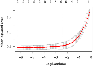
Use lambda.1se can complete the following process, view the coefficients and perform model validation on the test set:
The error of the model is 0.45, and there are only 5 features of the model, excluding age, lcp and pgg45.
We get three different models through the analysis of the data set. The errors of these models on the test set are as below:
- Ridge regression model: 0.48;
- LASSO model: 0.44;
- LASSO cross-validation model: 0.45.
Just consider the error, the LASSO model which includes seven features is the best. But can this optimal model solve the problem we are trying to answer? We obtained a model with a λ value of about 0.125 by cross-validation, which is simpler and may be more suitable. We prefer to choose it because it is more explanatory. It is important that expertise from oncologists, urologists and pathologists is needed to help us figure out what makes the most sense. This is true, but it also requires more data. Under the sample size of this example, only change the random number seed or re-dividing the training set and the test set may result in a large change in the results. In the end, these results will not only provide no answers, but may also cause more problems.
Brief summary
The aim of this Section is to introduce how to apply advanced feature selection techniques to linear models through a prostate dataset with a small amount of data. The dependent variables of the data set are quantitative, but the glmnet package we use also supports qualitative dependent variables (binary and multinomial) and survival outcome data. We introduced the regularization and applied these techniques to build the model, and then compared it. Regularization is a powerful technology that improves computational efficiency and extracts more meaningful features than other modeling techniques. In addition, we also use the caret package to optimize multiple parameters while training the model.
The data used in this article can be found online at:
http://cdn.amegroups.cn/static/application/1091c788c0342c498b882bd963c5aafb/2019.08.63-1.zip
Acknowledgments
Funding: This work was partly financially supported by the National Natural Science Foundation of China (grant numbers: 81774146, 81602668 and 81760423), Beijing NOVA Programme (grant number: xxjh2015A093 and Z1511000003150125), the Shanghai Youth Medical Talents-Specialist Program and the Shanghai Sailing Program (grant number 16YF1401700).
Footnote
Conflicts of Interest: The authors have no conflicts of interest to declare.
Ethical Statement: The authors are accountable for all aspects of the work in ensuring that questions related to the accuracy or integrity of any part of the work are appropriately investigated and resolved.
References
- Reza Soroushmehr SM, Najarian K. Transforming big data into computational models for personalized medicine and health care. Dialogues Clin Neurosci 2016;18:339-43. [PubMed]
- Bibault JE, Giraud P, Burgun A. Big Data and machine learning in radiation oncology: State of the art and future prospects. Cancer Lett 2016;382:110-7. [Crossref] [PubMed]
- Collins GS, Reitsma JB, Altman DG, et al. Transparent reporting of a multivariable prediction model for individual prognosis or diagnosis (TRIPOD): the TRIPOD statement. The TRIPOD Group. Circulation 2015;131:211-9. [Crossref] [PubMed]
- Adams ST, Leveson SH. Clinical prediction rules. Bmj 2012;344:d8312. [Crossref] [PubMed]
- Ranstam J, Cook JA, Collins GS. Clinical prediction models. Br J Surg 2016;103:1886. [Crossref] [PubMed]
- Moons KG, Royston P, Vergouwe Y, et al. Prognosis and prognostic research: what, why, and how? BMJ 2009;338:b375. [Crossref] [PubMed]
- Kannel WB, McGee D, Gordon T. A general cardiovascular risk profile: the Framingham Study. Am J Cardiol 1976;38:46-51. [Crossref] [PubMed]
- Han K, Song K, Choi BW. How to Develop, Validate, and Compare Clinical Prediction Models Involving Radiological Parameters: Study Design and Statistical Methods. Korean J Radiol 2016;17:339-50. [Crossref] [PubMed]
- Lee YH, Bang H, Kim DJ. How to Establish Clinical Prediction Models. Endocrinol Metab (Seoul) 2016;31:38-44. [Crossref] [PubMed]
- Steyerberg EW, Vergouwe Y. Towards better clinical prediction models: seven steps for development and an ABCD for validation. Eur Heart J 2014;35:1925-31. [Crossref] [PubMed]
- Su TL, Jaki T, Hickey GL, et al. A review of statistical updating methods for clinical prediction models. Stat Methods Med Res 2018;27:185-97. [Crossref] [PubMed]
- Woodward M, Tunstall-Pedoe H, Peters SA. Graphics and statistics for cardiology: clinical prediction rules. Heart 2017;103:538-45. [Crossref] [PubMed]
- Hickey GL, Grant SW, Dunning J, et al. Statistical primer: sample size and power calculations-why, when and how? Eur J Cardiothorac Surg 2018;54:4-9. [Crossref] [PubMed]
- Norman G, Monteiro S, Salama S. Sample size calculations: should the emperor’s clothes be off the peg or made to measure? BMJ 2012;345:e5278. [Crossref] [PubMed]
- Zhou Z, Hu Z. Intelligent Statistics. Changsha: Central South University Press, 2016.
- Zhang W. Advanced Course of SPSS Statistical Analysis. Beijing: Higher Education Press, 2004.
- Zhou Z, Hu Z. Crazy Statistics. Changsha: Central South University Press, 2018.
- Stone GW, Maehara A, Lansky AJ, et al. A prospective natural-history study of coronary atherosclerosis. N Engl J Med 2011;364:226-35. [Crossref] [PubMed]
- Keteyian SJ, Patel M, Kraus WE, et al. Variables Measured During Cardiopulmonary Exercise Testing as Predictors of Mortality in Chronic Systolic Heart Failure. J Am Coll Cardiol 2016;67:780-9. [Crossref] [PubMed]
- Mody P, Joshi PH, Khera A, et al. Beyond Coronary Calcification, Family History, and C-Reactive Protein: Cholesterol Efflux Capacity and Cardiovascular Risk Prediction. J Am Coll Cardiol 2016;67:2480-7. [Crossref] [PubMed]
- Zhou X, Chen J, Zhang Q, et al. Prognostic Value of Plasma Soluble Corin in Patients With Acute Myocardial Infarction. J Am Coll Cardiol 2016;67:2008-14. [Crossref] [PubMed]
- Wang Y, Li J, Xia Y, et al. Prognostic nomogram for intrahepatic cholangiocarcinoma after partial hepatectomy. J Clin Oncol 2013;31:1188-95. [Crossref] [PubMed]
- rms: Regression Modeling Strategies. Available online: https://cran.r-project.org/web/packages/rms/rms.pdf
- Iasonos A, Schrag D, Raj GV, et al. How to build and interpret a nomogram for cancer prognosis. J Clin Oncol 2008;26:1364-70. [Crossref] [PubMed]
- Leening MJ, Vedder MM, Witteman JC, et al. Net reclassification improvement: computation, interpretation, and controversies: a literature review and clinician’s guide. Ann Intern Med 2014;160:122-31. [Crossref] [PubMed]
- Pencina MJ, D’Agostino RB Sr, D’Agostino RB Jr, et al. Evaluating the added predictive ability of a new marker: from area under the ROC curve to reclassification and beyond. Stat Med 2008;27:157-72; discussion 207-12. [Crossref] [PubMed]
- Pencina MJ, D’Agostino RB Sr, Steyerberg EW. Extensions of net reclassification improvement calculations to measure usefulness of new biomarkers. Stat Med 2011;30:11-21. [Crossref] [PubMed]
- Fagerland MW, Hosmer DW. A goodness-of-fit test for the proportional odds regression model. Stat Med 2013;32:2235-49. [Crossref] [PubMed]
- Fernández D, Liu I. A goodness-of-fit test for the ordered stereotype model. Stat Med 2016;35:4660-96. [Crossref] [PubMed]
- Hosmer DW, Hosmer T, Le Cessie S, et al. A comparison of goodness-of-fit tests for the logistic regression model. Stat Med 1997;16:965-80. [Crossref] [PubMed]
- Rigby AS. Statistical methods in epidemiology. VI. Correlation and regression: the same or different? Disabil Rehabil 2000;22:813-9. [Crossref] [PubMed]
- Wang X, Jiang B, Liu JS. Generalized R-squared for detecting dependence. Biometrika 2017;104:129-39. [Crossref] [PubMed]
- Fisher LD, Lin DY. Time-dependent covariates in the Cox proportional-hazards regression model. Annu Rev Public Health 1999;20:145-57. [Crossref] [PubMed]
- Moolgavkar SH, Chang ET, Watson HN, et al. An Assessment of the Cox Proportional Hazards Regression Model for Epidemiologic Studies. Risk Anal 2018;38:777-94. [Crossref] [PubMed]
- Demler OV, Paynter NP, Cook NR. Reclassification calibration test for censored survival data: performance and comparison to goodness-of-fit criteria. Diagn Progn Res 2018. doi: 10.1186/s41512-018-0034-5. [Crossref]
- Alba AC, Agoritsas T, Walsh M, et al. Discrimination and Calibration of Clinical Prediction Models: Users’ Guides to the Medical Literature. JAMA 2017;318:1377-84. [Crossref] [PubMed]
- Risk Prediction Modeling: R Code. Available online: http://ncook.bwh.harvard.edu/r-code.html
- Hsu CH, Taylor JM. A robust weighted Kaplan-Meier approach for data with dependent censoring using linear combinations of prognostic covariates. Stat Med 2010;29:2215-23. [Crossref] [PubMed]
- Uno H, Tian L, Cai T, et al. A unified inference procedure for a class of measures to assess improvement in risk prediction systems with survival data. Stat Med 2013;32:2430-42. [Crossref] [PubMed]
- Hilden J, Gerds TA. A note on the evaluation of novel biomarkers: do not rely on integrated discrimination improvement and net reclassification index. Stat Med 2014;33:3405-14. [Crossref] [PubMed]
- van Smeden M, Moons KGM. Event rate net reclassification index and the integrated discrimination improvement for studying incremental value of risk markers. Stat Med 2017;36:4495-7. [Crossref] [PubMed]
- Talluri R, Shete S. Using the weighted area under the net benefit curve for decision curve analysis. BMC Med Inform Decis Mak 2016;16:94. [Crossref] [PubMed]
- Vickers AJ, Cronin AM, Elkin EB, et al. Extensions to decision curve analysis, a novel method for evaluating diagnostic tests, prediction models and molecular markers. BMC Med Inform Decis Mak 2008;8:53. [Crossref] [PubMed]
- Vickers AJ, Elkin EB. Decision curve analysis: a novel method for evaluating prediction models. Med Decis Making 2006;26:565-74. [Crossref] [PubMed]
- Rousson V, Zumbrunn T. Decision curve analysis revisited: overall net benefit, relationships to ROC curve analysis, and application to case-control studies. BMC Med Inform Decis Mak 2011;11:45. [Crossref] [PubMed]
- mdbrown/rmda. Available online: https://github.com/mdbrown/rmda/releases
- Decision Curve Analysis, DCA. Available online: https://www.plob.org/article/12455.html
- Decision Curve Analysis. Available online: https://www.mskcc.org/departments/epidemiology-biostatistics/biostatistics/decision-curve-analysis
- Kerr KF, Brown MD, Zhu K, et al. Assessing the Clinical Impact of Risk Prediction Models With Decision Curves: Guidance for Correct Interpretation and Appropriate Use. J Clin Oncol 2016;34:2534-40. [Crossref] [PubMed]
- ResourceSelection: Resource Selection (Probability) Functions for Use-Availability Data. Available online: https://cran.r-project.org/web/packages/ResourceSelection/index.html
- PredictABEL: Assessment of Risk Prediction Models.
- Robin X, Turck N, Hainard A, et al. pROC: an open-source package for R and S+ to analyze and compare ROC curves. BMC Bioinformatics 2011;12:77. [Crossref] [PubMed]
- pec: Prediction Error Curves for Risk Prediction Models in Survival Analysis. Available online: https://cran.r-project.org/web/packages/pec/index.html
- He P, Eriksson F, Scheike TH, et al. A Proportional Hazards Regression Model for the Sub-distribution with Covariates Adjusted Censoring Weight for Competing Risks Data. Scand Stat Theory Appl 2016;43:103-22. [Crossref] [PubMed]
- Fine JP, Gray RJ. A Proportional Hazards Model for the Subdistribution of a Competing Risk. Journal of the American Statistical Association 1999;94:496-509. [Crossref]
- Gray RJ. A Class of K-Sample Tests for Comparing the Cumulative Incidence of a Competing Risk. Ann Stat 1988;16:1141-54. [Crossref]
- Scrucca L, Santucci A, Aversa F. Competing risk analysis using R: an easy guide for clinicians. Bone Marrow Transplant 2007;40:381-7. [Crossref] [PubMed]
- Scrucca L, Santucci A, Aversa F. Regression modeling of competing risk using R: an in depth guide for clinicians. Bone Marrow Transplant 2010;45:1388-95. [Crossref] [PubMed]
- Zhang Z, Cortese G, Combescure C, et al. Overview of model validation for survival regression model with competing risks using melanoma study data. Ann Transl Med 2018;6:325. [Crossref] [PubMed]
- Geskus RB. Cause-specific cumulative incidence estimation and the fine and gray model under both left truncation and right censoring. Biometrics 2011;67:39-49. [Crossref] [PubMed]
- Zhang T, Chen X, Liu Z. Medical Statistics Graphics with R. Beijing: People’s Medical Publishing House, 2018.
- Huang YQ, Liang CH, He L, et al. Development and Validation of a Radiomics Nomogram for Preoperative Prediction of Lymph Node Metastasis in Colorectal Cancer. J Clin Oncol 2016;34:2157-64. [Crossref] [PubMed]
- Tang XR, Li YQ, Liang SB, et al. Development and validation of a gene expression-based signature to predict distant metastasis in locoregionally advanced nasopharyngeal carcinoma: a retrospective, multicentre, cohort study. Lancet Oncol 2018;19:382-93. [Crossref] [PubMed]
- Lesmeister C. Mastering Machine Learning with R. Second ed. Birmingham, UK: Packt Publishing Ltd., 2017.

